By the end of 2018, the number of apps in Google Play and App Store surpassed 4 million. On average, smartphone owners use 10 apps a day and 30 apps per month. Although mobile app owners think about ways to make their apps stand out by spending millions on advertising, its still upto the users to uninstall those apps from their phones.
We’ve prepared a checklist for you on how to take your app to the top of Google Play and App Store rankings using ASO (App Store Optimization) in 2019.
This guide is suitable for people new to ASO, people launching a new app, and developers who’ve had their apps in stores for a while, but want to take them to the top charts.
Let’s get started.
ASO or App Store Optimization involves changing app text, graphics, and other metadata to increase the number of downloads and the conversion rate. It’s like SEO for mobile apps.
ASO approaches apps and games the same way, the only difference being the traffic channel. For example, users look for apps based on their capabilities and the issues they solve while game searches are conducted by name and genre. In this article, we use the term “app” interchangeably with games.
These steps are listed in order from the highest indexed to the least.
The app title is the first thing users look at. Keywords in the title carry the most weight in indexing. That’s why you should include the queries you want to bring up your app and that potential users can search by. App Store allows up to 30 characters to be used in titles, while Google Play allows up to 50.
In addition, the App Store features a subtitle where you can also add keywords. The keywords from the subtitle are indexed as well as the title. We don’t advise filling the entire subtitle with keywords. It is better to add a call to action here since this text affects conversion rate.
The description explains what the app does and its advantages. You can use this section to include announcements and links, everything to give the user full information about your app. In both app stores, the description length is limited to 4,000 characters.
Descriptions in the App Store don’t impact search results, but they do attract users’ attention. When writing the description, keep an eye on the first three lines of the description, which are up to 170 characters long. This is the promotional text that users see without opening the full description.
Google Play features two descriptions: the Short Description (80 characters long) and the Long Description (4,000 characters long). Keywords used here affect search results. To improve search result ranking, you can use different word forms, like I/we, game/games, etc. (remember SEO for websites).
Additionally, the App Store allows you to add keywords in the special keyword field that will be indexing by their search engines. While filling in the keyword field, add words separated by commas and without spaces to fit more keywords in.
Here, you can add up to 100 keywords per country. You can increase the word limit by adding a localized description. By doing so, you’ll have an additional 100 characters for each country. If you launch a new app, don’t try to fill this section with the most popular keywords, as this will lead you to have a tough time competing with the most popular apps. Select words that are relevant to your topic but aren’t at the top of search volume results. This will help you appear more often based on narrow search queries. Unfortunately, Google Play doesn’t offer this feature.
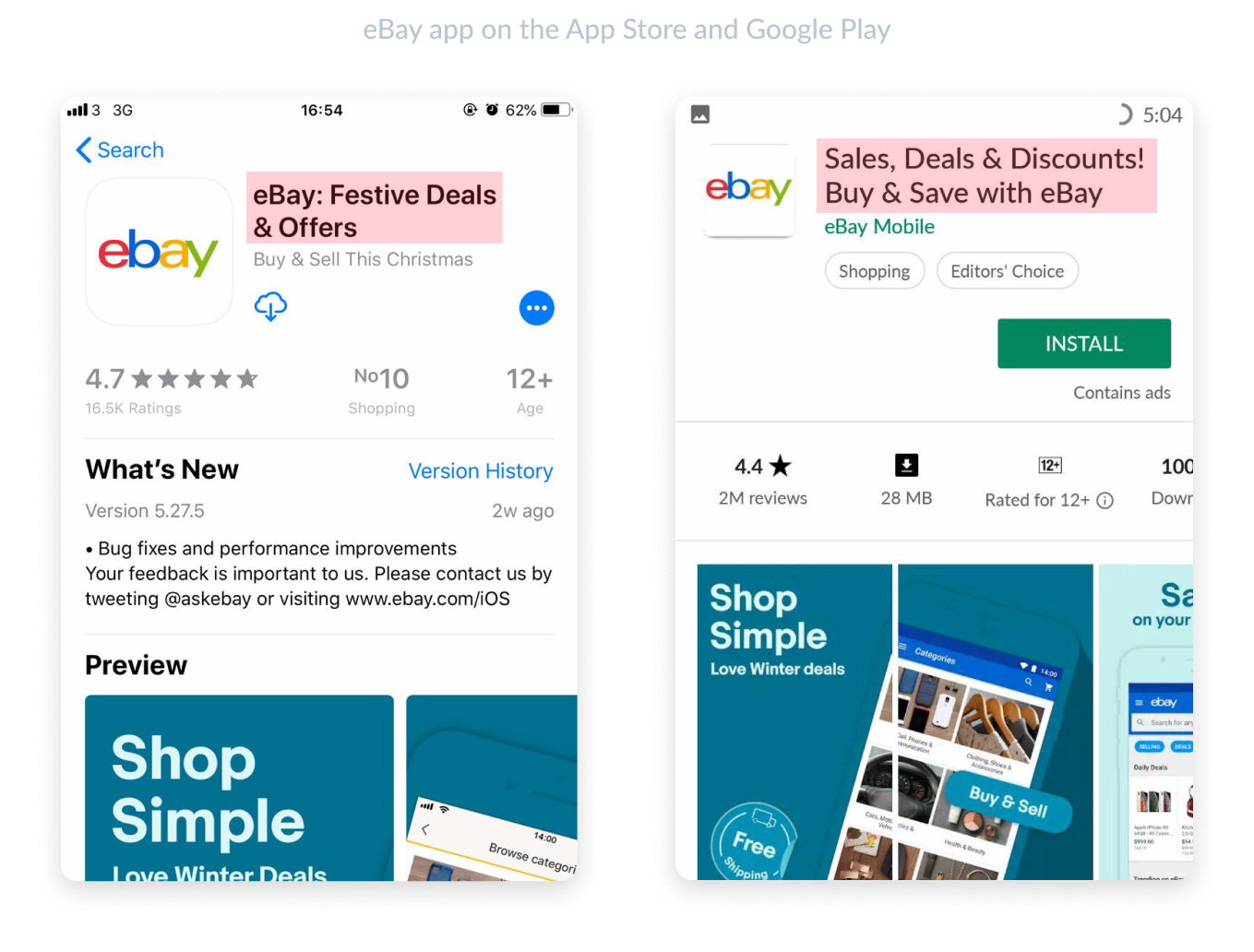
Developers use this section to describe what changed in the new update, what new features are available, and which bugs have been fixed. This section is, first and foremost, for current and returning users. If a user has installed the app before, they’ll see information about the new release instead of the description.
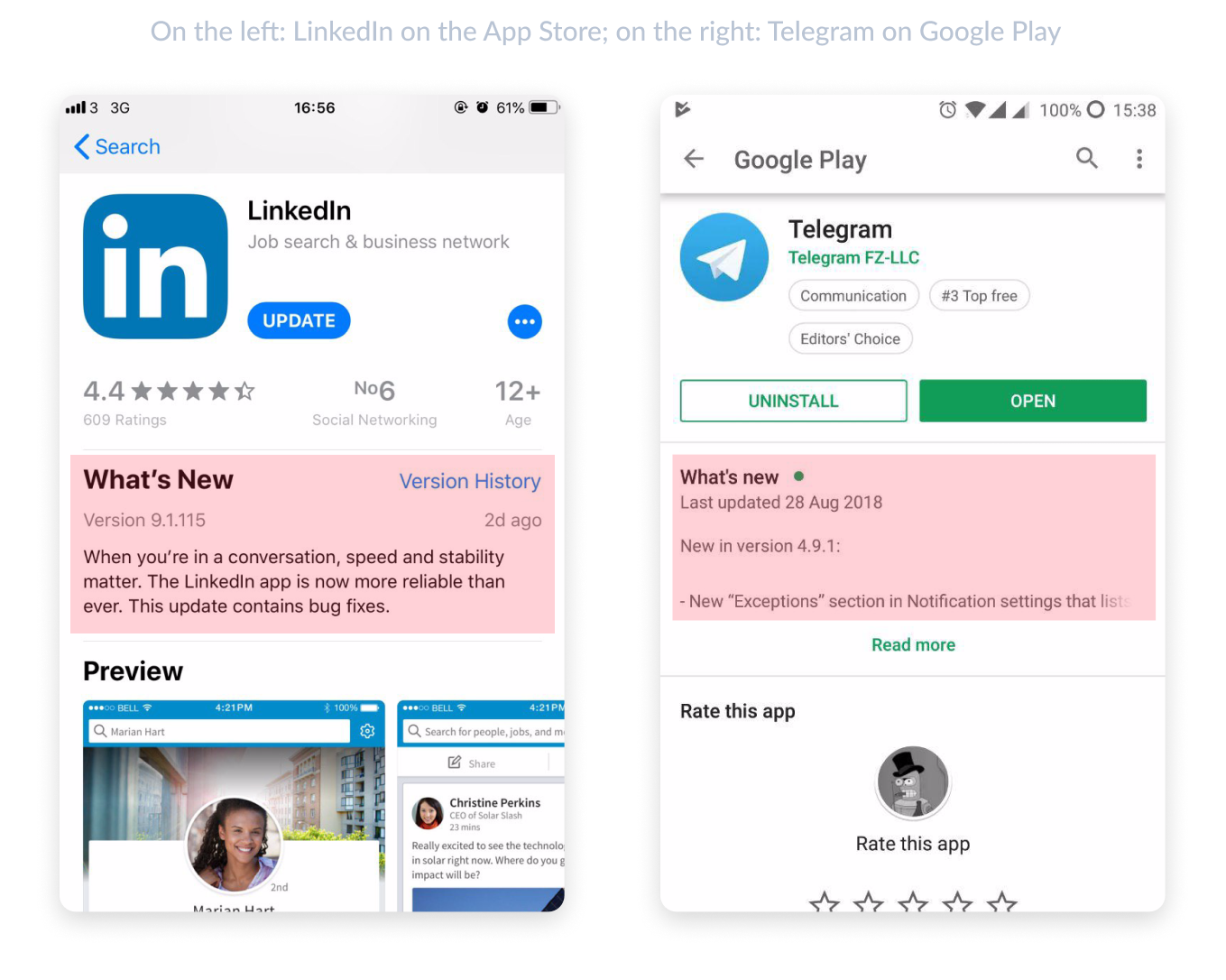
This is the most basic element of any app. It’s displayed everywhere the app is mentioned and attracts attention. This includes places like search results, charts, the featured apps section, etc. For brands that are already well-known, it’s best to use a logo. For new and little-known apps, an image that stands out is best.
The icon size in the App Store is 1024 × 1024 pixels. Google Play’s icon size is 512 × 512 pixels with a max size of 1024 KB. In addition, an icon in Google Play can be any shape, while App Store icons can only be square with no rounded edges.
Everything you need to know about mobile pixels, points and resolutions.
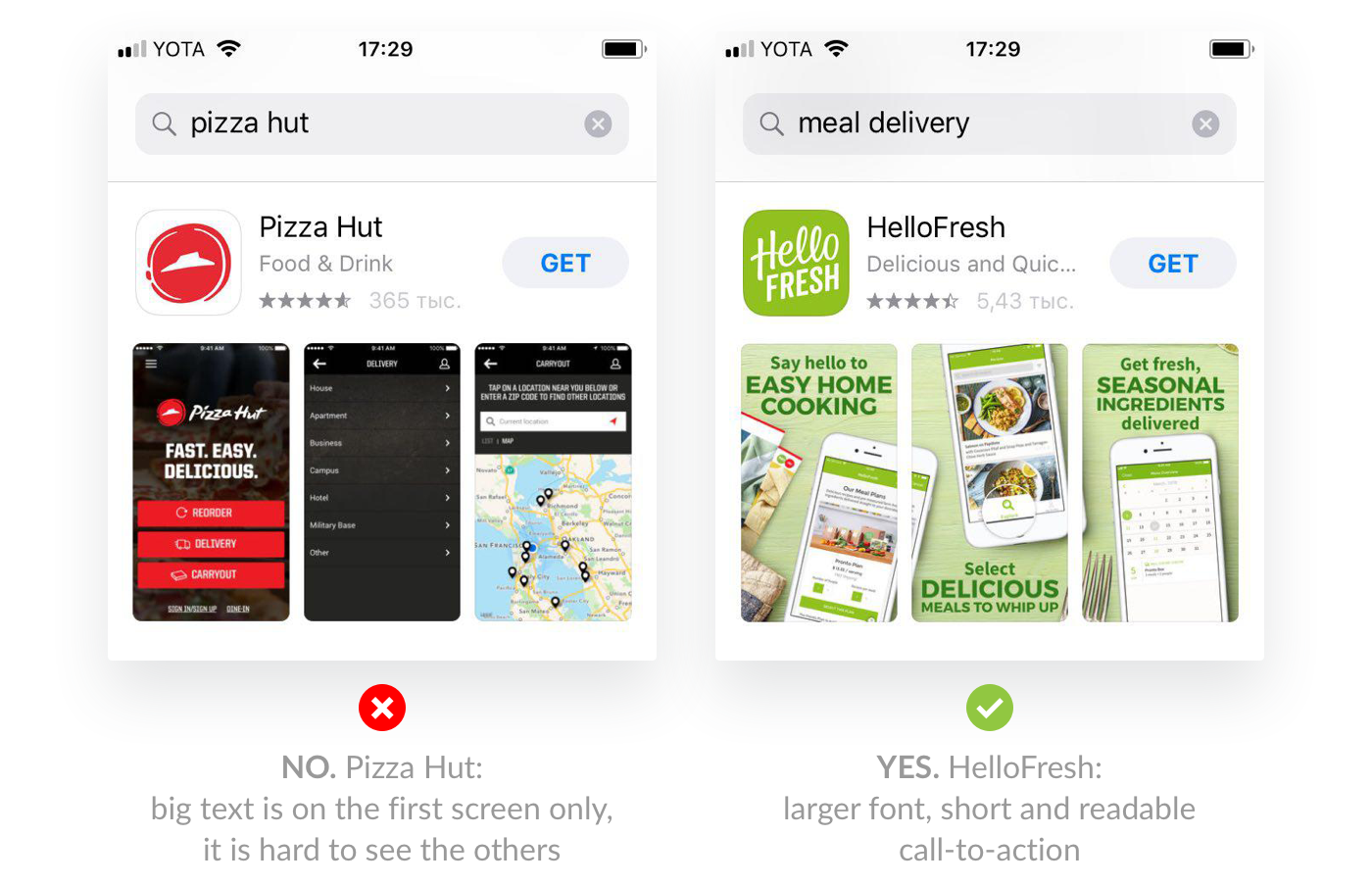
Screenshots are displayed in search results of the app page. That’s why we suggest adding a call to action to them. Be sure to use the screenshots for more than just images. This is how you show users what they’ll get after downloading the app. The App Store allows 10 screenshots to be uploaded and Google Play allows 8. They can be either portrait or landscape format, with a minimum of 3 landscape screenshots.
Google Play and the App Store require different images for different devices so that the graphics and text appear equally well across a variety of smartphones.
Everything you need to know about device resolutions.
You can also place large text and short, catchy phrases. Small or long text won’t be legible on the search page. The user flips to the next pages without visiting the app page, which decreases your Page Views to Installs conversion rate.
This is the best way to show the app in action and encourage the user to download it. Most users watch 7-15 seconds of video, so don’t overload them with a lot of information in one video.
Videos in the App Store need to be uploaded directly with the app. Apple plays the video automatically with the sound muted. Google Play, on the other hand, takes the video from YouTube. It opens in a new window without autoplay.
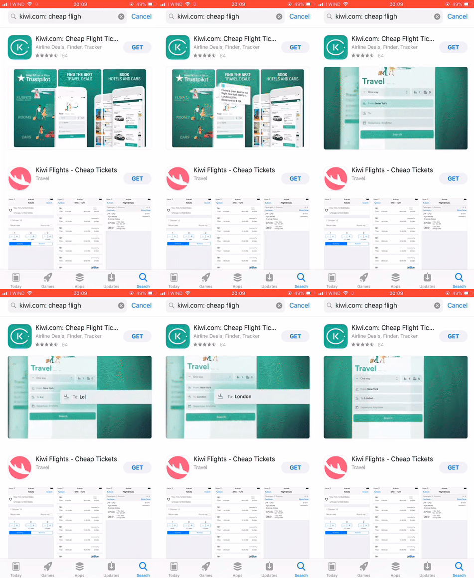
Perform A/B testing to see which texts, screenshots, icons, and videos bring you the most installs. You can do that in Google Play using Google Experiments. For iOS devices, you can perform tests in Store Maven. For example, last summer, Search Ads unveiled the ability to test screenshots in the same way as A/B tests. You can try AppFollow’s App Preview section to see how new graphics and text will look in the App Store. You can also try other ASO tools to anaylze your app to improve its visibility and ranking in the stores.
The App Store features additional locales. For example, for the US you can use Mexican and Australian locales. By adding an additional locale, you can expand the number of search queries that display your app and catch up with competitors in search results. On top of that, each locale added gives you an additional 100 characters for keywords and another 60 characters for the title and subtitle.
App users use stars to give ratings based on their thoughts about the app. Apps with a rating lower than 4 stars lose half of their potential downloads. A low rating can scare users, which impacts the install conversion rate.
These reviews are directly displayed on the app page without clicking to the reviews section. These reviews can have an especially noticeable impact if the user is trying to choose between several apps or the app is paid. Keep in mind that Google Play displays 3 reviews on devices and 4 in browsers. The App Store shows 6 on devices and 3 in browsers. It’s important to reply to reviews (especially if they’re negative) and show that you care about user opinions. If a helpful/featured review mentions a problem, you have to reply to the user that you’ve corrected the issue when you do so. If you are in doubts on where to start working with reviews, check out this guide.
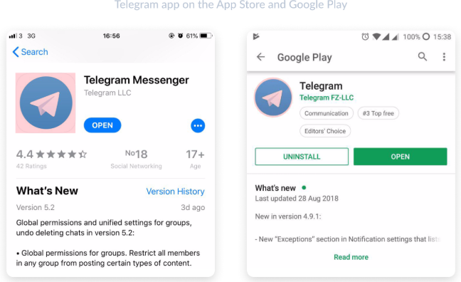
These are featured signs in both stores that show the app’s overall rating, its category ranking, age restrictions, and mentions in featured apps. An additional “Editor’s Choice” badge or the ranking in a category’s top ten list attracts users’ attention.
Both the App Store and Google Play limit downloading apps without a WiFi connection (at 150 MB). Make sure your app is within the size limitations so that users can download it on mobile internet instead of postponing it for later.
Google can lower an app with critical errors in search results. Meanwhile, dissatisfied users will leave negative reviews with a low rating, which also affects the number of installs.
The higher the conversion rate, the higher the app will be displayed in search results and the more often it will show in recommendations. Keep in mind that the rate changes every month in every country.
Author Bio:
Olga Padulosi is a CMO at AppFollow — a mobile product management solution that helps companies increase their apps’ visibility and improve customer retention. In her free time she mentors at Startup Weekend Dublin and masters growth hacking skills. Connect with her on LinkedIn.