When Google initially announced the mobile-first index back in November of 2016, an online firestorm of epic proportions began brewing.
But for over a year, nothing changed. Google released minor announcements, but nothing major shifted in those first twelve months.
Now, after over a year of experiments and testing, things have changed.
The mobile-first index is under way as you read this post.
It’s literally more important now than ever before to get your mobile landing pages ready to drive more mobile traffic, rank better, and capture more leads.
Here are four tips to do that ASAP.
It’s been a while since Google has really given us insight into mobile-first indexing.
So don’t blame yourself if you’ve forgotten their updates and plans.
To recap, the mobile-first index is simple:
With a continual rise / trend of mobile traffic surpassing desktop traffic, Google has decided to test (and now implement) their indexing to mobile versions of your site first rather than your desktop site.
Why?
Because most traffic is mobile. Indexing desktop sites first is likely to provide inaccurate and possibly poor experiences for users, most of which are mobile.
Simple enough, right?
As of March 26, 2018, Google has provided a new update bringing this testing phase to an end:
“Today we’re announcing that after a year and a half of careful experimentation and testing, we’ve started migrating sites that follow the best practices for mobile-first indexing.”
It’s official: the mobile-first index testing phase is complete, and the effects are starting to take place.
Now is the time to prepare your mobile landing pages for the mobile-first index.
Here are four ways you can do just that.
In 1997, Nielsen studied how users interact on the web. More specifically, they studied how users read and consumed online, text-based content.
They found that 79% of people “always scanned” any new page they landed on. Only 16% of people read content word for word.
Yikes.
That means that all of that hard-fought content you produced is barely getting the recognition it deserves. To make matters worse, four million blog posts are published on a daily basis. The deck is stacked against you.
More recently, in 2013, Slate and Chartbeat put this idea to the test to see how relevant it still was.
They saw a slightly better trend: 60% of visitors read content on your page. But the method of their test left it unclear as to whether they read it word for word or simply scan it. They used heat mapping to measure engagement, which can’t track word for word reading which means it’s likely that scanning still plays a big role in how your visitors read your content.
More recently, in 2016, Buffer found that 55% of your visitors will read your online content for 15 seconds or less.
The rest? They skim and scan.
It’s nearly impossible to keep people around and reading. Still.
And when it comes to mobile, you can bet that attention spans are even worse. In fact, they are.
Unlimited access to apps, games, and data make mobile devices hotspots for distractions.
When it comes to mobile landing pages in the mobile-first index era, long-form content isn’t going to win.
Concise marketing and using landing page builders specifically for mobile visitors is going to be key. We’ve already seen this trend increasing as mobile traffic has been skyrocketing, even in the workplace.
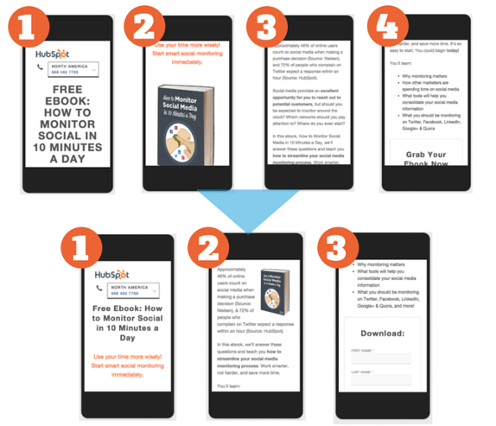
In a recent case study, HubSpot found that their mobile landing pages were converting at 20-30% less than their desktop variants.
The content and offering were exactly the same. In terms of demographics, the audience was the same, too.
So what did they do? They made a separate mobile landing page for the same content. But instead of leaving it be, they shortened everything.
Fewer form fields. Less content. Less necessary scrolling. They cut their form length by 75%. They cut content by 25%.
The results were outstanding:
They achieved a 27% average decrease in bounce rate for each landing page due to concise content. Shorter forms led to an additional 10.7% decrease in bounces. Ultimately, conversion rates increased on every single landing page, leading to increase in all major KPIs.
This HubSpot case study wasn’t a one-off study, either.
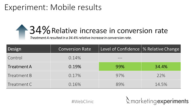
MarketingExperiments tested mobile landing pages and found that condensing pages by reducing total text and replacing it with video led to a 34% increase in conversion rates.
Video has the power to include long-form content in a short-form landing page that won’t scare mobile visitors away. Snowboard Addiction used this strategy and drove a million in sales in less than a year when sales were virtually stagnant. So yes, video really can change the mobile game.
Even if you don’t use video, keep your content short and sweet. For instance, Slack excels at this with their mobile landing pages:
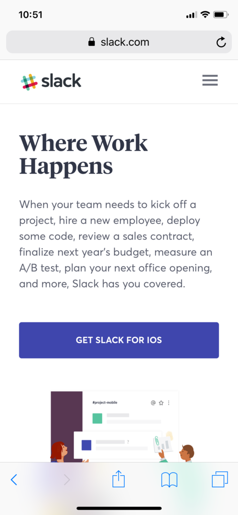
Without ever scrolling below the fold, users see a strong headline, a short value proposition, and an actionable CTA.
You can:
All within seconds of landing on the mobile page.
HubSpot’s mobile landing page takes a similar approach, keeping it simple with a headline, value proposition, and CTA button:
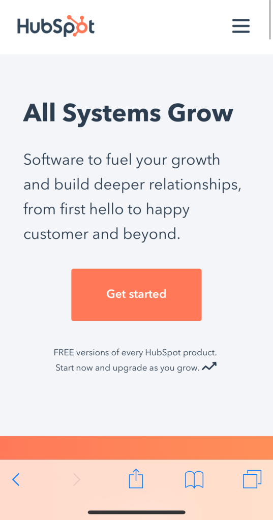
Without a single image or any extra scrolling, they can convey value to a busy mobile user.
Moral of the story: get to the point ASAP on mobile landing pages. People are impatient, and on-the-go users don’t have time to read your 5,000-word value proposition.
Speed is everything. Your site has to load fast.
We’ve all heard it before.
But the truth is that it’s more important than virtually any “hack” for a mobile landing page.
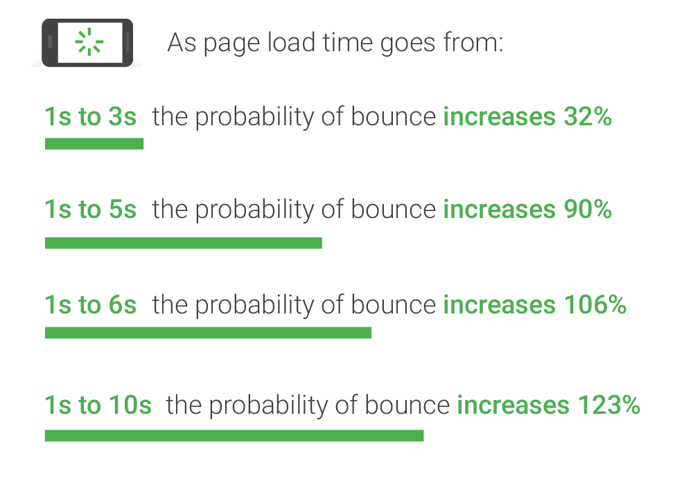
Google’s own benchmarks state that it’s critical for your mobile site to load in three seconds or less. And while we’ve all heard it before, we aren’t practicing what we preach.
Latest Google benchmarks show that the average website in every single industry is too slow.
Most are loading at 3-4x the best practice. In 2018. Why should you care?
Even an increase in load time of just a few seconds can skyrocket your bounce rate. If your site is loading at the ten-second mark — and most are in every industry — then a user is 123% more likely to bounce.
You can’t afford to give bad mobile experiences in 2019. 85% of people are not willing to forgive your site or return to it after a bad mobile experience.
Beyond the potential to lose almost all of your hard-earned traffic, slow mobile speeds create bad experiences that negatively impact your brand perception and the willingness of users to give you another shot. This all lowers your website’s future chances of making money online.
Depending on your site, anything from images to hosting to JS and caching could be heavily impacting site speed. Here are a few ways to address these issues.
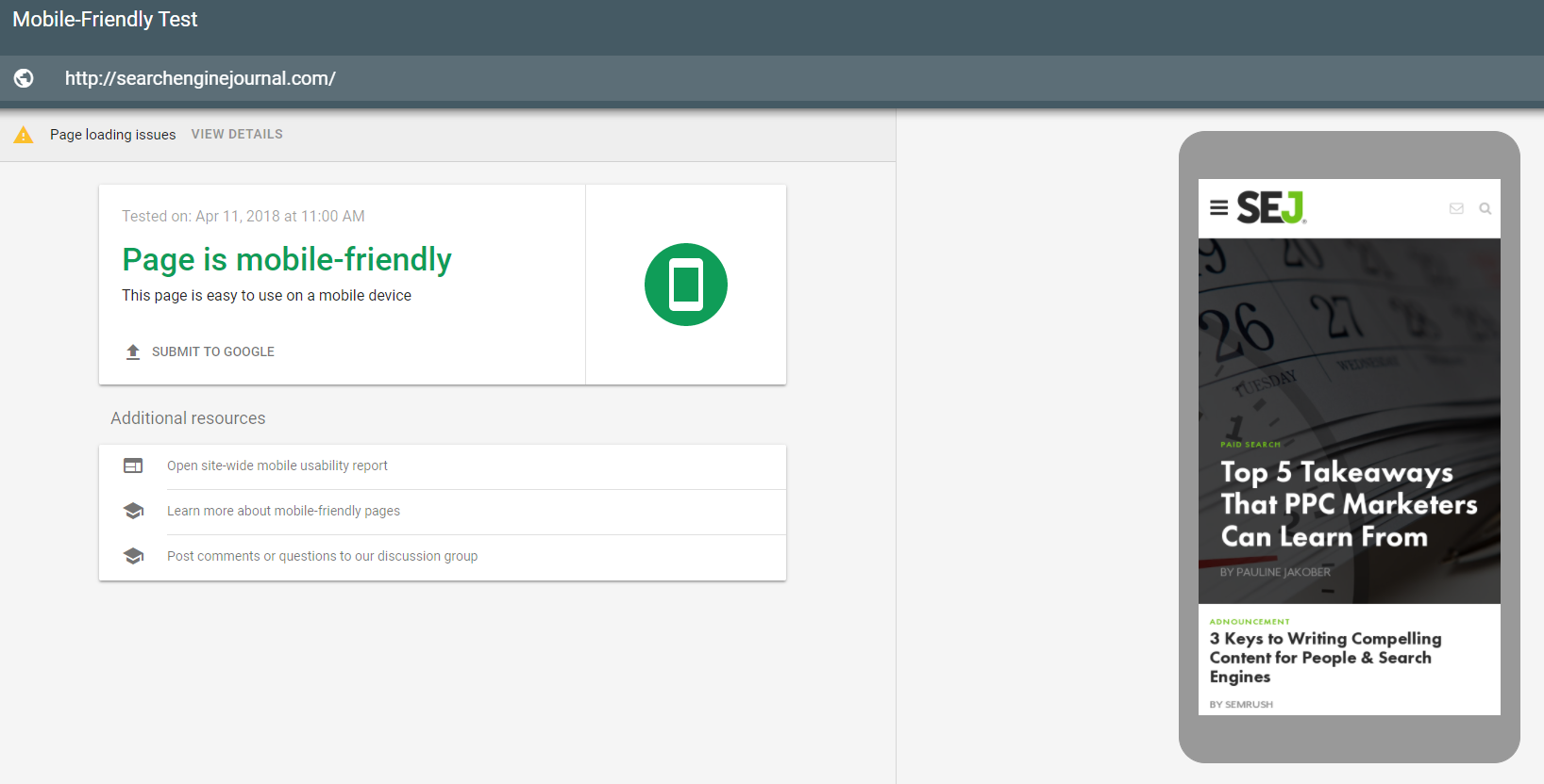
Use a tool like Test My Site or Google’s Mobile-Friendly Test to find out which fixes can help you save time and generate more conversions from existing traffic:
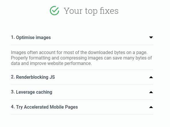
These reports can tell you if any specific page elements are slowing down your mobile landing pages. Or, they can give you the “all clear” to proceed with your current process:
Once you’ve optimized your site speed, address your hosting. Are you using shared hosting or cheap web hosting? If so, take a moment to consider the impact.
Faulty or shared hosting can result in slower speeds and downtime. And downtime plays a big role in growth and profit. Just ask Amazon, who lost $66,240 per minute their site was down years ago.
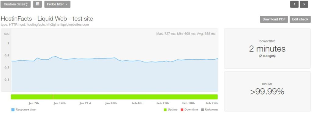
Every second counts. Consider dedicated server hosting once you’ve optimized your site speed. Dedicated server hosting means that you have an entire host to yourself, not on a shared network.
This works to increase speed, uptime, and prevent your website from crashes or lost profits. Dedicated servers like Liquid Web, Bluehost and more all provide great uptime and speed:
Speed is critical for everything from brand perception and user experience to driving real online mobile sales.
Want better speed? Optimize your site and upgrade your hosting.
Learn more about different ways to instantly improve your website performance.
With the latest news from Google, the mobile-first index is already in progress. It’s rolling out after almost two years of testing.
And mobile responsive design is one of the only ways to ensure that your site is ready to go.
But what does the overused and misunderstood term “mobile responsive” really mean?
According to Torspark, “Responsive design reformats and restructures websites for any device—regardless of screen size.”
Essentially, content automatically adjusts and carries over to any device, creating a perfect mobile experience without the need to manage a separate mobile site.
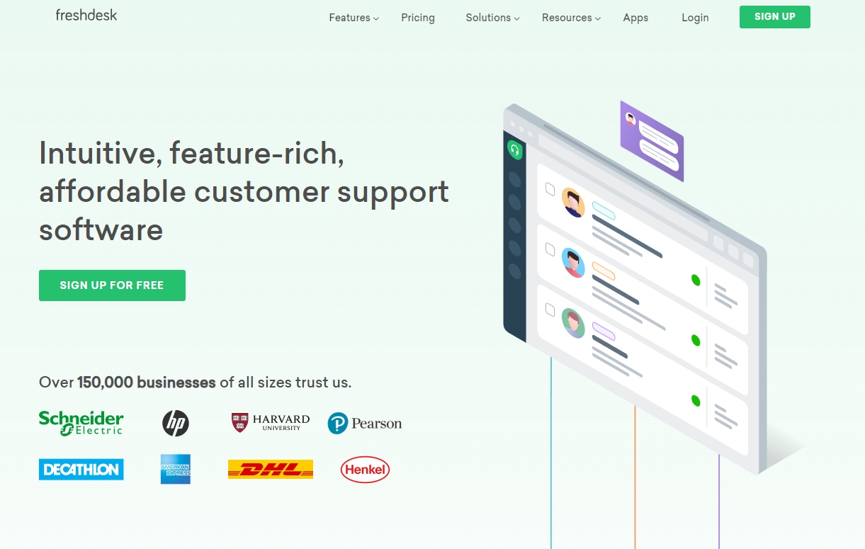
Freshdesk is a prime example of this. Here is what their desktop site looks like:
Now take a look at their mobile site:
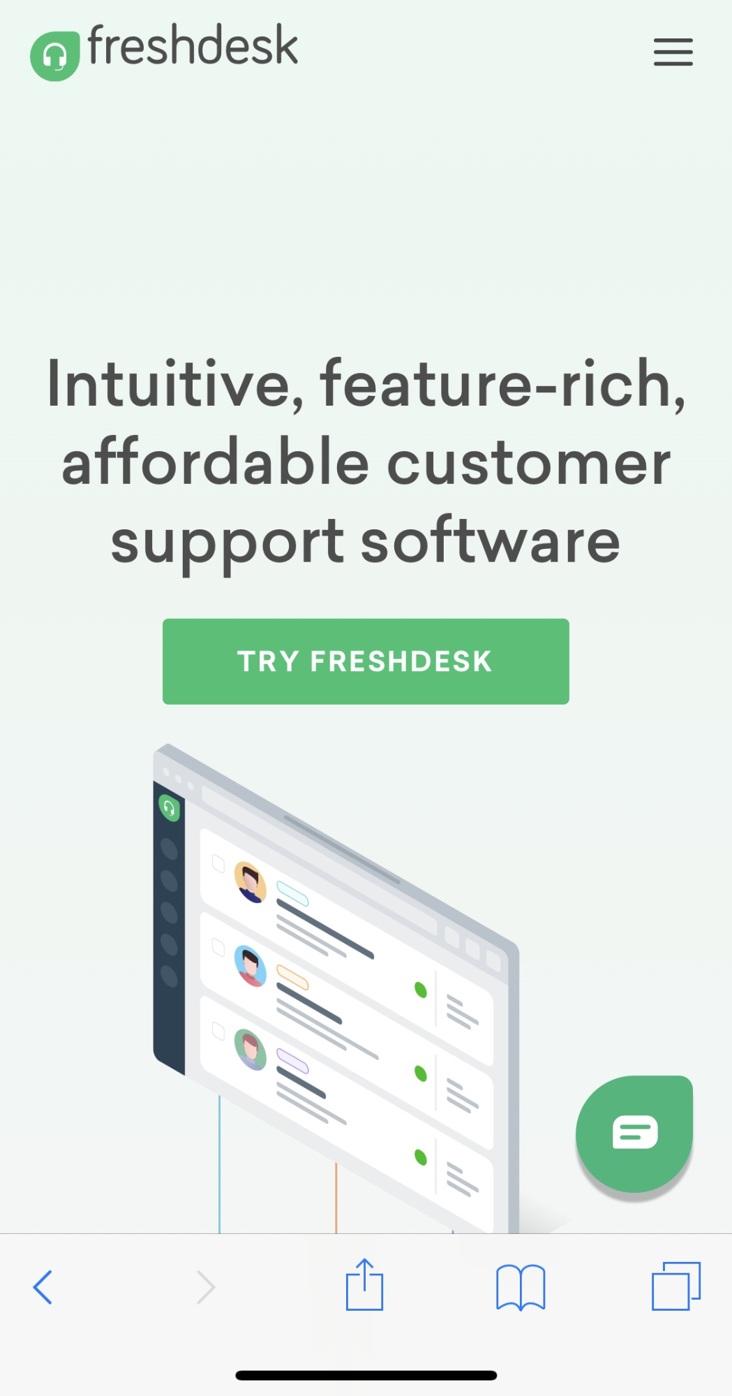
It perfectly adjusts to mobile screen dimensions, carrying over all of the necessary page elements like CTAs, menus, images, and even their live chat software.
The same can be said for Lyfe Marketing. Their mobile design of their branding services page maxes out at two columns and makes their work shine through with a clean, easy to digest layout.
Mobile responsive design isn’t just for looks, either. A ConversionXL case study found a 79.3% increase in conversions after transitioning a site to mobile responsive design.
In the study, mobile responsive design helped to improved speed, usability, conversions, and brand favorability.
Offspring found similar results in a Moz case study. Their mobile responsive design resulted in increased brand awareness, a 15.19% increase in mobile conversions, a 102.58% increase in mobile YOY revenue, a 100/100 mobile usability score, and a 25.59% increase in organic search traffic.
Mobile responsive design is more than just design. It’s usability, favorability and a conversion-producing powerhouse.
Phone calls are still alive and well in 2019.
According to eMarketer, phone calls are actually consumers’ number one preferred method of communication with a business.
Calling still beats (by far) live-chat, emails, texting, self-service, social media, mobile apps, and yes, pigeon post.
I know. It sounds crazy, right? You mean smartphones aren’t just for apps and posting your latest meal on social? (Do people still do that?)
But the data doesn’t lie:
Click-to-call buttons are a great way to capture mobile traffic that needs answers fast. So, what do they look like? Here’s an example:

Floating call buttons on your landing page can help users dial your company in seconds rather than scrolling down to the bottom to locate a tiny number in the footer.
It all sounds great in theory, but do they work?
Absolutely.
A Google study found that click-to-call buttons played a powerful role in purchase intent. Those who clicked the button to call a company were at the bottom of the funnel. They were a single positive phone call away from converting.
The simple addition of a click-to-call button on a mobile landing page for String Automotive resulted in a 200% increase in conversions.
Calls convert well and signal conversion intent in ways that forms simply can’t. So, why not make it easier for users to call you by adding a click-to-call button.
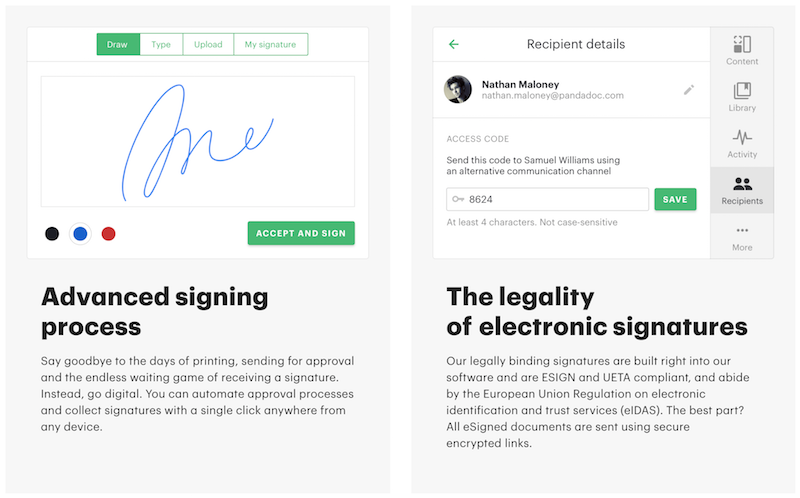
Bonus tip: If you want to take your mobile strategies even further, you can use other advanced mobile features like collecting signatures at checkout, which can increase sale prices by 18%.
With the mobile-first index rolling out as we speak, now is the time to get your mobile landing pages up to snuff.
When it comes to starting a blog, long-form content is king. But when it comes to mobile landing pages, concise marketing wins. Condense your content for on-the-go users.
Test your mobile site speed and take any necessary steps to improve it. Every second matters.
Implement mobile responsive design. Case studies show that it can help you increase conversions by almost 80%.
Provide click-to-call options to capitalize on the wave of mobile traffic coming your way.
The mobile-first index doesn’t have to be the next Y2K. If you invest in your mobile landing page development, you can experience smooth sailing through the storm.
Author Bio:
Levi Olmstead - Head of Community and SEO at G2, a B2B software and services review site with over 650,000 real-user reviews. Levi is an Indiana-native and IU alum who in his spare time enjoys solving paranormal mysteries with his dog Frodo. Connect with him on Twitter.