We’ve just spent a week investigating the device resolutions in use around the world between May-July 2015 for our device list in Fluid UI. We thought it would be handy to share this research on our blog for everyone to see.
The following graphics and tables detail all of the current common resolutions for devices, their point/density pixel resolution and various other details along with the market share for those devices. We hope it will be useful to use as a baseline for working on cross platform/device projects and will help to make sure your work is as accessible, usable and beautiful as possible.
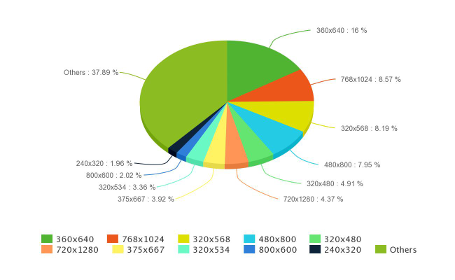
Source: statcounter.com - Download the full csv
North America is a little more predictable, but not by much, with three resolutions having a market share of above 15% and two others above 5%. The prevalence of iOS device resolutions is also far more noticeable in the North American market.
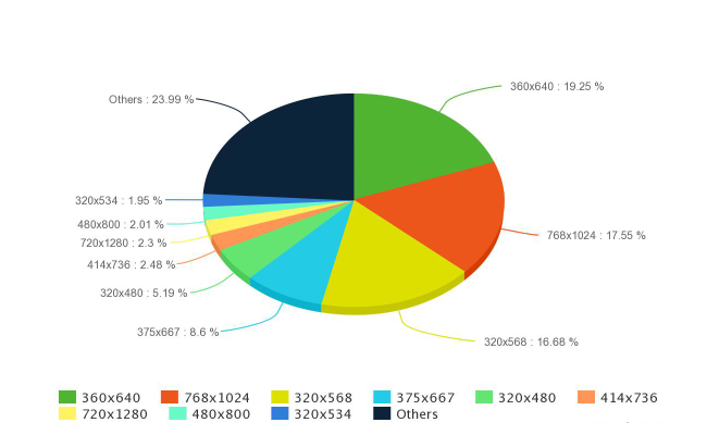
Source: statcounter.com - Download the full csv
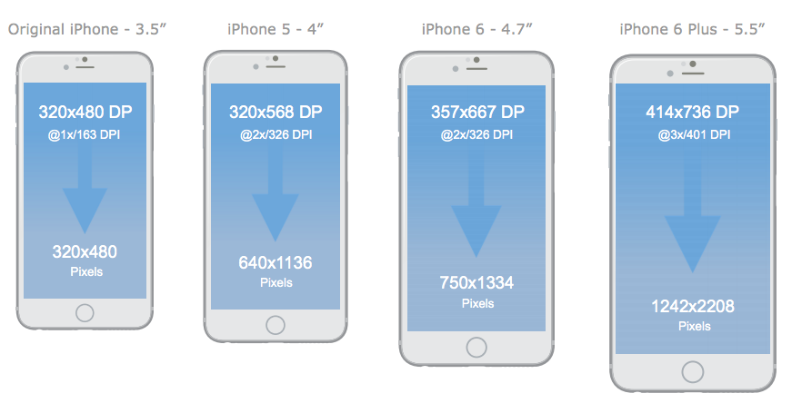
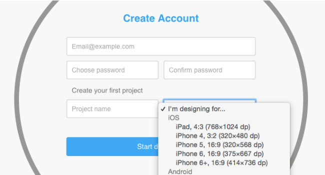
Apple are famous for putting a lot of effort into keeping their phones as simple as possible to design for. But with the iPhone 6 and 6+ they have finally given in to market pressures to launch a larger device, resulting in the first real fragmentation of screen sizes on the platform.
iPhone
| Model | DP | PPI | Ratio | Viewport |
| iPhone 2g, 3g | 320 x 480 | 163 PPI (@1x) | 3:2 | 320 x 480 |
| iPhone 4 | 320 x 480 | 326 PPI (@2x) | 3:2 | 640 x 960 |
| iPhone 5 | 320 x 568 | 326 PPI (@2x) | 16:9 | 640 x 1136 |
| iPhone 6 | 375 x 667 | 326 PPI (@2x) | 16:9 | 750 x 1334 |
| iPhone 6+ | 414 x 736 | 401 PPI (@3x) | 16:9 | 1080 x 1920 |
iPad
| Model | DP | PPI | Ratio | Viewport |
| iPad + Mini | 768 x 1024 | 132 PPI (@1x) | 4:3 | 768 x 1024 |
| iPad (Retina) | 768 x 1024 | 264 PPI (@2x) | 4:3 | 1536 x 2048 |
Full resolution assets for the iPhone 6+ are created at 1242x2208 and scaled down to 1080x1920 by the phone itself when displaying. For more information, see here.
Android screen density distribution is of course a bit more varied. The following table details the various Android models which hold relatively large market share along with their screen resolutions.
Top selling Android phones
| Model | DP | Density | PPI | Ratio | Viewport |
| Galaxy SIII | 360 x 640 | 200% (XHDPI) | 306 PPI | 16:9 | 720 x 1280 |
| Galaxy SII | 320 x 533 | 150% (HDPI) | 217 PPI | 5:3 | 480 x 800 |
| Google Nexus 4 | 384 x 640 | 200% (XHDPI) | 318 PPI | 5:3 | 768 x 1280 |
| Galaxy Nexus | 360 x 640 | 200% (XHDPI) | 316 PPI | 16:9 | 720 x 1280 |
| Galaxy SIV | 360 x 640 | 300% (XXHDPI) | 441 PPI | 16:9 | 1080 x 1920 |
| Galaxy Note II | 360 x 640 | 200% (XHDPI) | 267 PPI | 16:9 | 720 x 1280 |
| Galaxy S Plus | 320 x 533 | 150% (HDPI) | 233 PPI | 5:3 | 480 x 800 |
| Galaxy S | 320 x 533 | 150% (HDPI) | 233 PPI | 5:3 | 480 x 800 |
| Galaxy Note | 400 x 640 | 200% (XHDPI) | 285 PPI | 8:5 | 800 x 1280 |
| HTC One | 360 x 640 | 300% (XXHDPI) | 469 PPI | 16:9 | 1080 x 1920 |
| Droid Razr | 480 x 853 | 150% (HDPI) | 312 PPI | 16:9 | 720 x 1280 |
| Droid 3 & 4 | 640 x 360 | 150% (HDPI) | 274 PPI | 16:9 | 960 x 540 |
| Droid Raz Maxx | 640 x 360 | 150% (HDPI) | 256 ppi | 16:9 | 540 x 960 |
| HTC Desire | 240 x 400 | 200% (HDPI) | 252 ppi | 5:3 | 480 x 800 |
Source: screensiz.es
Late to the party and with a fairly small overall footprint, windows screens are mostly limited to the Microsoft/Nokia released devices, which come in two broad resolutions - 480x800 (5:3) and 480x854 (16:9). Tablet resolutions vary a good bit more and these often blur the lines between laptops running the same windows operating system.
Windows Phones
| Model | PPI | Ratio | Viewport | Market Share |
| Nokia Lumia 520 | 233 PPI | 5:3 | 480 x 800 | 23.2% |
| Nokia Lumia 630 | 221 PPI | 16:9 | 480 x 854 | 9.7% |
| Nokia Lumia 625 | 199 PPI | 5:3 | 480 x 800 | 7.1% |
| Nokia Lumia 530 | 245 PPI | 16:9 | 480 x 854 | 5.1% |
Windows tablets
Windows tablet resolutions are more varied, with the following all having some penetration:
| 1024 x 768 | 1280 x 800 | 1280 x 1024 | 1366 x 768 | 1920 x 1080 | 2560 x 1440 |
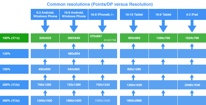
There is less fragmentation in the environment than originally anticipated and many of the device resolutions, while constantly increasing in terms of total pixels, are maintaining the same aspect ratios of their predecessors. Combined with a DP/Point based approach to designing, it should remain possible to deliver content, particularly on web without additional complications.
Below is our output graph of device resolutions along with their DP / point equivalent which we will be updating Fluid UI with. We look forward to seeing you there.
We don’t have much to add here and the sales and growth of this market is still to be deeply understood, but we include them as we’ve done the research for our Fluid UI device list as we have libraries for them.
Wearables
| Model | Viewport | PPI |
| Apple Watch 38mm | 272 x 340 | 326 PPI @2x |
| Apple Watch 42mm | 312 x 390 | 326 PPI @2x |
| Pebble Original and steel Monochrome | 144 x 168 | 176 PPI |
| Pebble Time Color display | 144 × 168 | 182 PPI |
| Galaxy Gear | 320 x 320 | 275 PPI |
| Android Wear | 320 x 320 | 348 PPI |