As we saw in UX for conversion: Understand your user, designers around the world have been using UX techniques to drive the user to a specific place on their website or app. But as UX specialist Jennifer Winter reminded us in her article for the UserTesting website:
“Conversion isn’t about making someone do something, it’s about providing an environment that makes doing that thing irresistible.”
Deeply understanding your target audience by using UX research methodologies is the first step for it. Now you already know enough about your user and all this information will help you make safer design decisions. It will contribute to the success of your site focusing on conversion and better experience. At this stage, it is important to consider a few points:
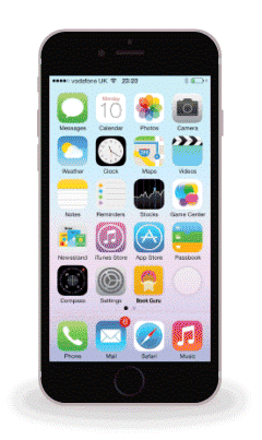
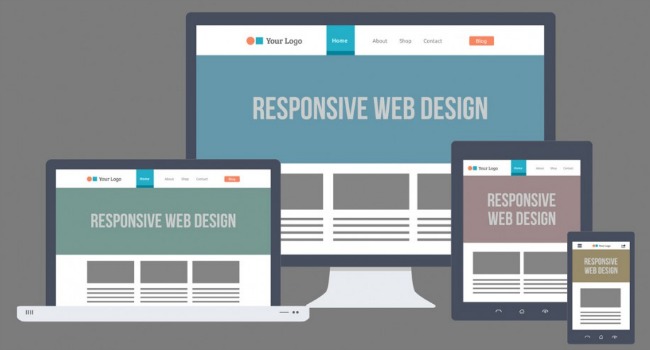
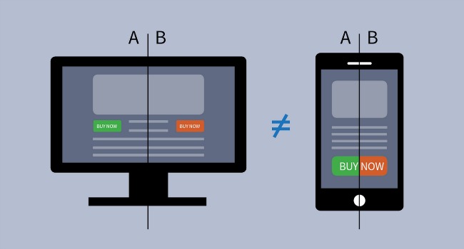
The use of mobile devices to access the Internet is skyrocketing worldwide. More and more people are consuming content and making transactions on their smartphones and tablets. Not to mention the penetration of “wearables” (such as Watches, Glasses etc). In this new context, planning your website to be responsive is mandatory.
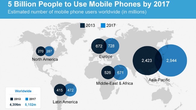
According to the report, Internet Trends by Mary Meeker, 45% of transactions on Groupon came from mobile devices from the start of 2013 (compared to less than 15% two years earlier). On Etsy, 50% of user traffic came from mobile devices from early 2014.
With responsive web design, website development for smartphones, m-commerce and mobile marketing intelligence, thinking about optimising your site for mobile is a must. It’s important to remember that people use their phone or tablet in different ways to their desktop or laptop. Take into account also the context of the use of the device: is it an executive in his office? A doctor with cases in a clinic? A teenager with her cell phone at the bus stop?
A study by Google (2012) found that people use smartphones in the following contexts:
Tablets are also used for entertainment and navigation. Desktops on the other hand, are used for more serious tasks or intensive investigation. According to the study, smartphones are the most common starting point for the following activities online:
When designing a website, also consider the users who rely on their phone only to access the web. They will have no choice but to use your phone for all kinds of tasks.
To help analyze whether your site is responsive or not, Google launched it’s resizer tool. There are other tools that can also be used such as DesignModo.com, Semalt and whatismyscreenresolution.net, to name just a few.
Another important point is to consider the accessibility to your site. Consider that among your audience, you can have users with low vision or hearing, blindness etc. Accessibility is no longer a “luxury”, every site should be accessible.
There are some experts in accessibility, as well as websites and online information and tools (such as Toomino, which adds voice navigation support to your site and the web accessibility checker) that will be useful. The important thing is not to ignore the issue of accessibility in your project design.
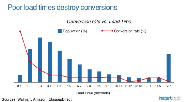
The days in which you had the patience to wait for the loading of a page online is in the past (those from the era of the dial-up connection know what I’m saying, hehe). A study by the University of Massachusetts showed that streaming video services (such as YouTube and Netflix) can get or lose users in seconds. “We found that people are patient within two seconds,” said NPR News science teacher at the University Ramesh Sitaraman.
Here are a few interesting interesting data on loading:
A front-end specialist can help you with improving load time. But as Lara Callender Hogan says in her the book Design For Performance you also should keep in mind that the use of different font types and sizes, image size and weight, element reusing and other design decisions impact on loading time. These decisions can (and should) be discussed with your developer.
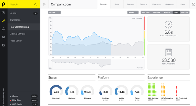
If you already have a website and want find out how fast it is, you can use Pingdom to check the load time of each page or element.
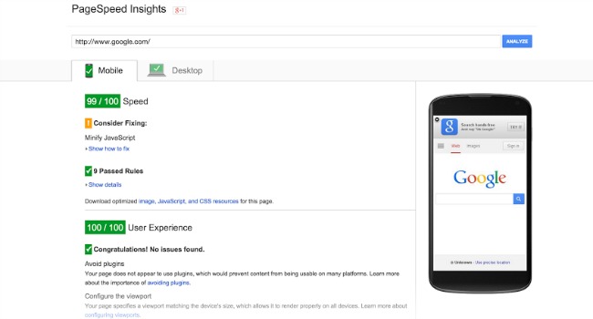
Another cool site that can help in this task is Google’s “Pagespeed Insights”.
In addition to checking a page’s load time, Pagespeed also gives tips on how to improve pages. Another great point: you can check the site’s optimization for mobile devices.
As we have seen, in a more and more fast-paced world, the user, has less time, and less patience to navigate on your site or application. There is no time to waste thinking about what should be done on your site, your design should be “simple and intuitive” (I strongly suggest reading the book Don’t make me think, by Steve Krug which outlines the importance of a great user experience).
Apart from loading time, for example, it is important to make navigation paths easier for the user to complete the required tasks (such as complete a purchase). It is important that the site’s information architecture is well defined (tools like “Card Sorting” and “Tree Testing” can help in this task). It should have appropriate prioritisation and hierarchies, with clear global navigation and navigation hints like “Breadcrumbs” that outline the user path.
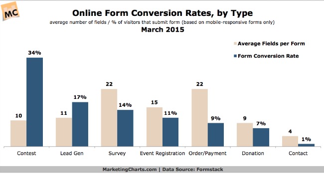
One way to help your users save time is to automate form fields. For example: the zip code field should come before completing the address. Thus, the others (city and state) can be filled automatically by the system. Another suggestion is that the cursor goes to the next field automatically, as soon as the previous was filled. The “auto-complete” can also help you save time in filling out form fields and searches. The information can also be saved to save the user time when returning to your site. Also, remember that shorter forms convert better than longer forms.
It is equally important to ensure easy access to support contact or chat. The user feels more comfortable knowing that he can ask for help if necessary.
Besides functional and easy to navigate, your site must also be pleasing to the eye. It is the role of designer to take care of the site art and UI. But UX can and should influence these decisions and the two always go together.
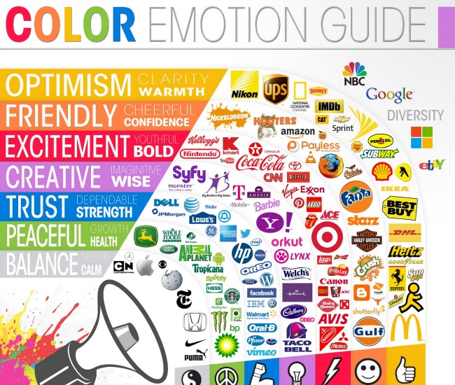
Make sure, for example, in choosing a suitable color palette to communicate your message so it is aligned with your brand. You can define your style together with the designer. To give you an idea of the colour scheme, you can use ColorHunt website. It is important to also think about the color for CTAs buttons because they can directly impact the conversion of your site.
It is also important to pay attention to the UI style and site structure (Flat? Card style? Vertical pattern with scroll? Add a hero video? Slides framework? Complex reduction for mobile design?): Regardless of whether you have a more modern or more traditional audience, you do not want your site to have a “dated style,” that looks like it was made during the Dinosaurs Age. :)
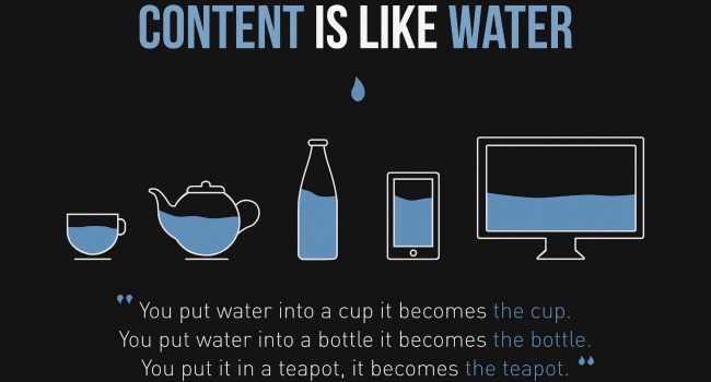
You might think that is more a Web-writer’s responsibility than UX designer’s, but having good content, makes all the difference in the user experience on your site or application. Images with high quality, well-written texts convey credibility, and engage and encourage your user to complete the task on your site.
In addition to written text, with a tone and appropriate voice (an editor or a journalist can help in this task), it is also important to note how it is organised on the page and throughout the site navigation. The text format and how it is organised, help the user with the navigation.
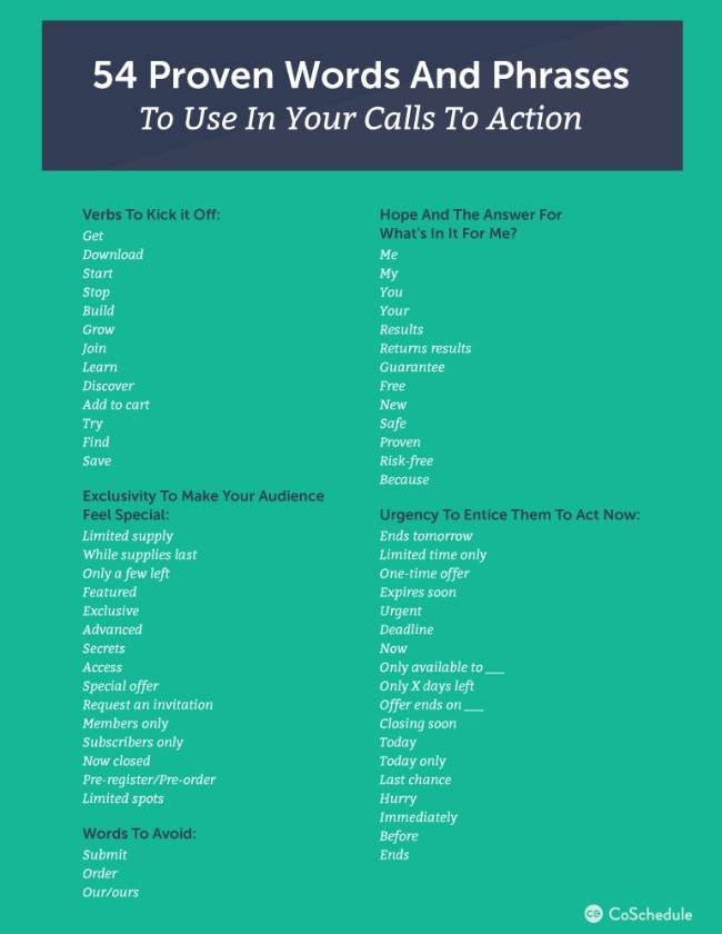
Another important aspect is your “call-to-action”. In addition to appropriate sizes and colours, it is also important to pay attention to the text: action verbs get more results. An article by Wishpond lists 25 great words to use for your CTA. Design your call-to-action so it is personal, communicates value and conveys urgency.
It is known that using verbs like “Subscribe to our Newsletter”. And please, don’t say “Click Here”, the CTA should in itself be understood as something clickable.
Remember the importance of feedback text, those when the user completes any successful action or when an error occurs, for example, missing a field in a form. It is essential that these hits are direct, objective and simple.
As I’ve mentioned before on “UX for conversion: Understand your user”, the choice of typefaces can impact on your site’s performance.
The correct choice of typeface is also crucial to the readability of your site, as well as the number of characters per line (it is suggested between 44 and 75, with 66 considered ideal) and the size of the lines and how the text is organised in pages (blocks, justified, left-aligned).
An important tip is not to use more than two typefaces, one for body text and one for the buttons. The font size will also help to determine hierarchies, in addition, to differentiating the body text from titles. Formatting such as bold or italic can be used to define subtitles and photo captions. The important thing is that there is a standard formatting and consistency.
Remember: both content (text, photos, elements) and typefaces must also be optimized for mobile devices.
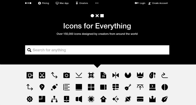
The iconography of your website is also key to good communication. It should facilitate simple navigation and promote rapid interpretation of the content and the possible actions (especially CTAs).
It is important that the iconography of your website be consistent and standardized so users know there meaning. Your users shouldn’t be spending time trying to interpret the icons.
A website that can help in this task is The Noun Project, where you can find thousands of great icons created by designers from around the world.
A good way to test your design before launch is by prototyping it. It can definitely save your company a fortune and help you to make sure you are making the best design decisions. You can do user testing and user interviews to validate your decisions and re-design it if needed.
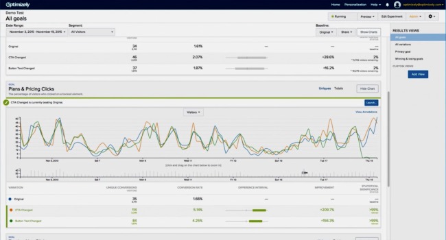
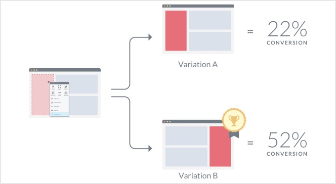
After you launch your design, if you still have doubts, besides using information generated by your analytics tools, it is always good to keep doing tests. A good way to do it is through A/B tests. The idea here is to test two different versions in real time with your current users. That means the two options will go live: a group of users will see option A and the other group of users will see option B. After a period with the two versions live, you can verify which one performed better and which you should use. A / B tests are one of the most efficient ways of validating hypotheses, especially when it comes to optimizing conversions.
Optimizely.com is one online tool that can help you in this task and can be used for both sites and for mobile application.
Visual website optimizer vwo.com allows A/B tests with different URLs and with more than one variable. You can also analyse landing Pages, heatmaps and targeted reports for each type and topic of research.
Thinking strategically about how to use UX for conversion is like thinking of a UX cycle: we’ve started talking about understanding your user, by applying UX research methodologies, to be able to design a great experience which will drive conversion. But the efforts don’t stop here. We should keep researching and understanding the user to keep improving their experiences.