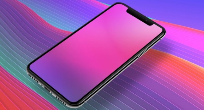
It was in September 2017 that Apple had unveiled its futuristic and cutting-edge iPhone X, which is already on the roll since November 3. And it was just a couple of days ago that Apple had informed the iOS app developers to develop new apps that will support iPhone X Super Retina Display.
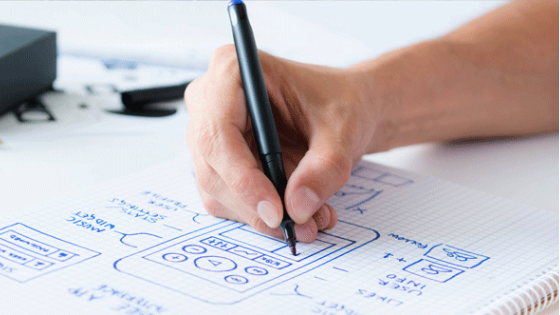
This means the app developers have to make major changes in their approach while designing the mobile applications. So, the job of the app developers is going to be challenging and exciting. The User Interface designers are also going to pass through the same channel.
The UI designers will not be working on the similar old-school conventional designs but on the comprehensively different pattern. However, this will also offer new opportunities to showcase their creativity and designing skills.
Now that the screen has become much wider with 5.8-inch display, rounded and fully covered glass screen. The iPhone X also enjoys the benefit of higher resolutions. It surely lights the eyes of the user.
There are a spectrum of highly advanced features with the iPhone X such as OLED Super Retina Display, the FaceID for the verification process, advanced and faster processor, wireless charging, the introduction of a black line used as the home indicator to name a few. It becomes the responsibility of the UI designers to make the most out of these new features. While you must have a look at the Human Interface Guidelines we have 9 tips to make your job a little easier.
One of the topmost factors that the UI designers will precisely have to deal with is playing with the extra-large sized screen of the phone. Usually, in the earlier models like iPhone 6, 7 and even 8, you do not find such a taller display. The display is 145 pt taller and the screen about 20% bigger in the iPhone X.
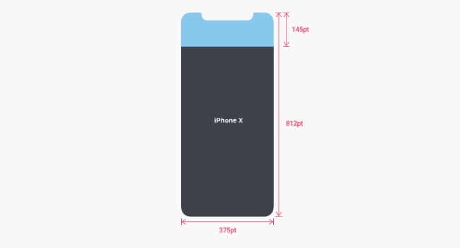
The Super Retina Display is yet another gem of a beauty that has been added to provide a power-pack resolution of about 1125x2436 pixels. This would literally mean that the user interface will be able to design the art-board quite comprehensibly using the 375 x 812 in Sketch or Photoshop. In addition, the graphical utilization will add another grace to the designing strata.
Designers also need to focus attention on the bottom of the screen. It is a place that has control elements on the app. But in the case of the iPhone X, since there is no home indicator, the designer’s skill will be put to test. They will not be as independent to place the control elements on the bottom of the screen.
However, the question is if the home key is gone then what has come in its place. Apple has replaced it with a black line, which needs to be swiped to open the home screen. If you are swiping it left or right, then you are opening other apps.
Nonetheless, there is an important advice from Apple to the designers. It has rather suggested the designers not to conceal the home key and says that must be visible all the time throughout. You can only use the hide option when you feel it’s very necessary.
If you are designing a gaming app, then the custom gesture control becomes a must-have element. There is an option of edge protect through which you can use app controls and device controls on a couple of swipes. But be careful while using or else it might create confusion.
Designers should also take a note to not place any button in close proximity with the home indicator to avoid confusion.
As a UI designer, you should have comprehensive information about the changes made by Apple in the status bar so that you can properly utilize its functionality. As the height of iPhone X has increased, so the height of status bar has gone to 44 pt, which is just double the size of iPhone 8 (about 22 pt). The status bar is divided into two parts, separated by a notch.
Again here Apple has urged not to hide the status bar as it will provide useful information on the battery percentage, network access and other info such as a message on Whatsapp etc. Apart from that, the video and images are something that users enjoy watching in full screen and so you don’t need to hide the status bar at all.
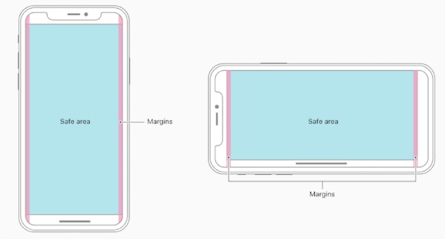
Besides, the UI designers also have to think of implementing the safe area on the screen. You can take the help of safe area guides offered by Apple in this regard. You do not have to place important elements there. The content should be placed symmetrically towards the center. The designers also need to focus on the interface that auto layout and system offers.
One of the striking features of iPhone X that distinguishes it from its contemporaries is the round edges and scallop shape to adjust the front camera and speaker. This has offered more space to the designers across the length and width of the phone to work on.
The designers also have the option of choosing the landscape mode offering to add maximum content in the form of text, video or images etc.
The aspect ratio becomes important if you are using full-screen images. This is because as the height of the phone has become taller, it will stretch the full-screen image, cut out the details or enclose it in a box, which in turn will spoil the beauty of the design.
So, the images that are specially designed for the iPhone X will not fit well into the other screen sizes and so the best idea is to mind the aspect ratio.
Well, you may know very well that iPhone X has introduced the new feature of Face ID for authentication. So, the UI designers will not find the Touch ID for home key anymore.
The users will unlock the phone through face detection. So, the designers will have to implement Face Id and not Touch ID.
With iPhone X the UI designers have the freedom to make use of new gestures instead of the buttons. They can also make use of custom keyboard and you do not need to add the emoji signs as it will be added automatically. In addition, the old perplexing gestures are gone and the new ones can be customized.
The usage of colors has always been one of the most important aspects of the User Interface designing and designers have taken note of it.
The use of rich and dynamic colors will add to the excelling visual appeal and so Apple has brought forth the concept of Display P3 Color Space, where you can use a vibrant and wide spectrum of colors to give your graphics that extra embellishment. In fact, the choice of colors in iPhone X is more than ones found in normal computers.
Just remember when you are doing this that accessibility is still an issue even with the iPhone X.
UI designers not only have to consider the Hamburger menu but also look at other possible options such as the tab bar. Yes, you can accommodate it as the size of the screen is large enough to provide such a space.
Just remember that just because you have extra space to play with, a great designer knows when to leave that space empty.
So, we had a discussion on what path does the UI designer have to follow while designing an app for the all exclusive iPhone X. The iPhone X is very different from the other iPhones and so you have to adopt a different approach.
However, this will be a new learning curve and experience because many of the tasks here will be undertaken for the first time. So, enjoy your designing period with this new model!
Mehul Rajput is a CEO of Mindinventory, a leading mobile app design and development company specialized in android and iOS app development. He does blogging as hobby and love to write on mobile technologies, app development and mobile app marketing.