After my recent article on integrating UX research into your product roadmap, I had a bit of feedback on Twitter that has left me thinking about a particular problem.
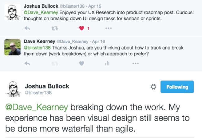
I’m not one to casually respond to a problem, even on Twitter. The question struck a chord. My initial thoughts were that there are a bevy of techniques for breaking down any type of work, such as work breakdown structure and user stories. Upon further reflection about creating design deliverables, the question is definitely more nuanced and subtle than that.
Something about it told me that design should be waterfall at times. Were the ghosts of processes past screaming in my ear for vengeance, or was there something less mystical going on? I decided to unpack it a little.
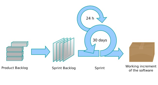
Before the internet and especially before the cloud, there was no iterative software development as we now know it. Continuous integration, app stores, web applications and distributed workflows simply didn’t exist. A software update was a thing to be feared - a massive roll-out across a network using a CD or floppy disk inserted manually into every computer. There are still many darkened rooms of computers that run windows NT or Windows 2000 around the world nearly two decades after they were released.
I’ll say it loud and I’ll say it once only:
There is no one size fits all best practice team approach to working.
Scrum and agile primarily evolved for software development projects and not design projects. I’ve never been a believer in a ‘one size fits all’ approach to creative processes - I believe each team should tune its own processes and consider them a continuous work in progress, constantly searching for the optimal workflow for that team based on their own abilities, strengths and levels of experience.
The problem is the perceived relationship between what everyone presumes is the best approach (agile) and what everyone thinks is the evil, legacy approach (waterfall) and what design needs (its own approach - like prototyping process or design sprints).
And now we get to the meat of the issue (sorry vegan designers).
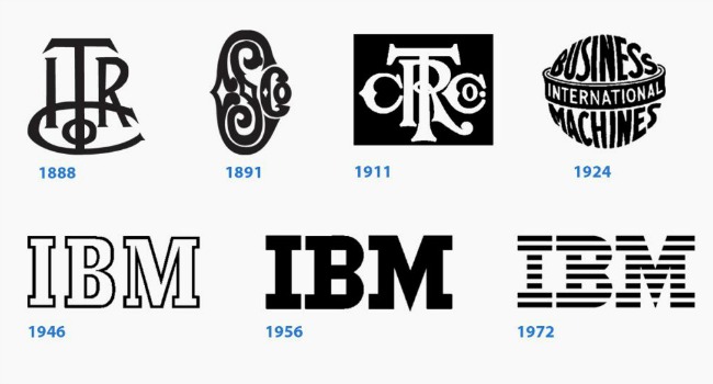
How often do you see a logo go through an iterative development cycle which includes an open call for customer feedback before it is launched? Google rolled out a new logo recently - combining it with a big PR and marketing campaign that reflected the company’s innermost self. The designers were rolled out to talk about the meaning of the logo, the font choices, how they impact the soul and the emotions, how the choices they made represent the aspirations of the brand and the era the company lives in.
Now think of your logo. It probably didn’t evolve in the public eye in the same way that a piece of software does. Logo development happens far away from user feedback and the capacity to iterate.
Designers can most definitely get it wrong:
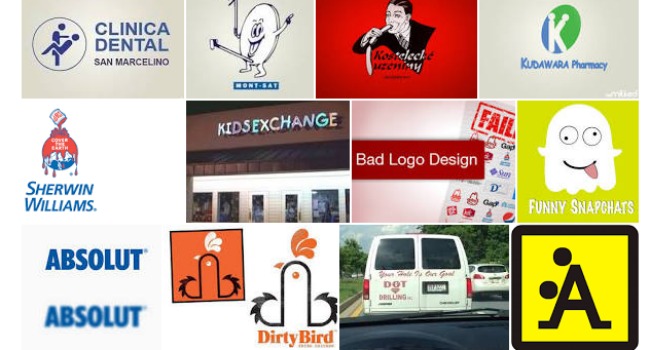
Is it better for the company to have the big pr/marketing release or to rethink their logo and cast it as a constantly evolving visual representation of who they are? Does iterating a logo once it has been released to the public cause consumers to lose confidence in that brand? If so - how many other aspects of design are like this - and therefore - how many aspects of design SHOULD be considered as waterfall (or at least not agile) in their delivery?
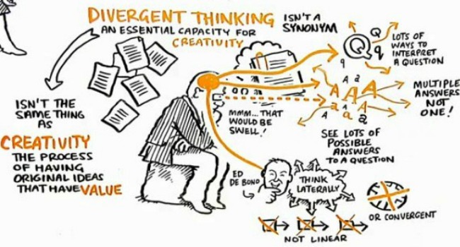
So let’s move on. Investing in consistency and bringing convergence to your design work is a hugely important factor in letting the development team build a product that eliminates technical debt, speeds up UI development and builds a consistency into the UI that users will be able to learn and appreciate. The importance of this convergence is often overlooked by the less experienced and non-technical members of a design team.
When Google rolled out their new logo as described above, there was a collective gasp across the internet about how well they handled it. Everywhere you turned, from google.com to your Android phone, the logo was refreshed - all within hours of the unveil. The ability to do that all at once was an incredible achievement, and one which no doubt took a huge amount of planning. Updating your look and feel for a global enterprise can be extremely costly and time consuming.
Design visuals are still seen as final when presented, especially by management (who would argue their time is too valuable to review low fidelity prototypes).
Product management and roadmaps mostly place the focus on new features, not visual iterations for existing ones. Designers need to fight to ensure the quality of the user experience happens from day 1, not “in a future iteration”.
The tools for iterating designs are still really poor - especially when delivering interactive rather than static deliverables (that’s a problem we are working to fix with Fluid UI).
A lack of business metrics supporting the value of iterating designs is currently leading to a poor understanding of the value of assigning time to design rather than new feature development.
Design fundamentally needs to be timeless not iterative.
Good design is holistic and takes everything into account when it is created.
Customers of mature companies with mature products expect the quality of design to be higher than the average startup, but will accept a lack of features.
Design project management is less mature than development project management.
Design lives on two tracks - roadmap and iteration and must contribute to both in different ways.
Overall visual identity is part of the brand and must not change frequently.
Let me put on my manager and CEO hat for a few minutes. My sales and marketing team are telling me that the investment in incremental design changes is less than the value of adding the new features that are on the roadmap. They can project sales won and lost based on the current feature set and where we will be next week or next month.
It’s your job as a designer to tell the other side of the story. Telling me we need to do better design without being able to back it up isn’t going to work. I don’t ever need to do a body of work that will provide an unquantifiable return on the investment of resources it would take. So get your act together, get your UX research hat on and give me an alternative viewpoint.
If we have data, let’s look at data. If all we have are opinions, let’s go with mine – Jim Barksdale, former Netscape CEO.
Thankfully I can take my hat off again now and be more sympathetic to the cause and talk a bit about another preconceived notion that people often express to me. It’s this:
Executing by the book, agile workflow should be a mark of honour for your team.
I disagree. Your process should be a reflection of a considered understanding of the needs of your team that have been weighed up against the alternative approaches available and executed in a way that everyone buys into.
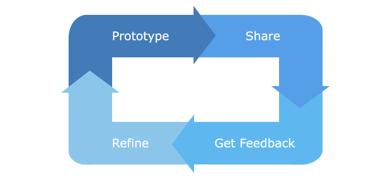
There are other workflows or ways to approach design that use part of the agile approach. I previously wrote about one approach I consider valid - the prototyping workflow.
Do the agile bits in an agile way, use waterfall when you need to use it and find the right process to maximise efficiencies in your team. Make sure it is shared with the team and the team all understand it and live by it. If you need to be waterfall for a while, be waterfall. If you need to be agile, be agile. Pick the solution that works for your team and make it repeatable.