The success of Pokemon Go in the last couple of weeks may make much of this post seem irrelevant. However, it is one thing to design and launch an app which you are planning to give away for free. If you plan to turn a profit at some point then you may need a slightly different strategy. The failure of Pokemon Go to impact the sales at Nintendo may change in the long term but in the short term it has not arrested the decline in revenue of the slumbering giant of the games industry.
Unlike Nintendo we do not all have the time and money to pump into the development of a new product so how can you increase your chance of being successful?
This may be a bit obvious. But, just because you have a great idea for an app is not a reason to spend time and money developing the app. If users are not completely clear as to why they should download and use the app then chances are they will do neither. For some great insights into this, Tomer Sharon has included some excellent pointers in Validating Product Ideas. You need to start by asking the right questions. We have also looked at this issue in a recent post and it is worth having a look at them if you are particularly interested in product/ idea validation.
In this post I want to look at the area of product development from a slightly different perspective. I am going to look at 2 areas:
These are two specific areas which will make or break a new product or service.
Open your twitter feed on any given day and there is a good chance you will be hit with an article setting out the trends for the last year, this year or even more bizarrely for the coming year.

How often do you read these articles, if you do and I am sure we all look occasionally, and wonder how these trends have sort of passed you by.
The rationale behind these posts is that the top trends are working because so many people have started adopting them. But, just stop and think for a moment. Trends start somewhere and they usually start when someone looks at a current process or design feature and decides to make a radical shift.
Let us look at the US Presidential election as an example. Hillary Clinton launched a new app ealier in the week in an attempt to gamify the battle with Trump.
So if you’re a candidate, particularly one who isn’t a bile-spuming human sweet potato, how do you keep voters engaged long enough to absorb your talking points? If you’re Hillary Clinton, you borrow a few pages from Farmville’s playbook, and task them with running their own virtual campaign office to get out the vote.

As someone who is passionate about creating the best customer experience possible this is not easy to say, but, you need to be able to distinguish between what the user wants and what the user needs and you need to be able to communicate this to the user as effectively and as quickly as possible.
However, we have all signed up for an app or web application and then been annoyed by the multiple onboarding techniques that we are subjected to. Email, push messages, notifications, pop-ups. The best type of onboarding is the one that is least visible and least intrusive.
The whole point of designing something new, is that it is new. You examine a problem and you offer an innovative, and hopefully positive, solution. This is why it is important to be aware of trends without sheepishly following them.
So, while it is good to be aware of what others in your space are doing, you do not just want to replicate a slightly different version of existing apps. Often those who follow trends to not think enough about the user and the particular problem that your app will solve for that particular user or group of users. So, the best innovation needs as much divergent thinking as possible. So, remember: Don’t follow trends, make them.
Yes, we have trends and the things that will define our future economy, but almost always, without fail, people define the trends. And the trends define the future. You, as an entrepreneur, are the future. The two are inextricably connected. Trends without the intellect are just numbers.
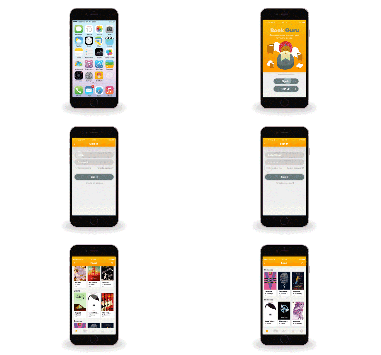
At Fluid UI we make it easy to work your way through several iterations of your idea very quickly. Once you have designed the basic concept you can share the prototype with potential users and see what they think. Find out what they like and what they don’t like. There are some caveats here. Nevertheless, it is important to make sure that your sign up page is as simple and as effective as possible. This is probably one area where following trends (or conventions may be a better term) is the right thing to do. You do not want to shock people at the very start so having a rather innovative sign up page may be a great idea but it might be best to wait till you are at a different stage in your product cycle before implementing something like that.

It is important you do not get too caught up in the design stage. The purpose of the design phase is to get your concept out of your head and into a clear prototype. It is not important that you get everything right first time round but it is important that you get a clear version of your app for users to try out.