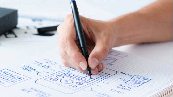
We have a design philosophy at Fluid UI. We want to make sure that when you are designing a user interface that we stay out of the way as much as possible in order to maximise your productivity. We’ve made every effort in the tool to provide only the options you need when you need them - and nothing more. We believe this keeps the design process simple and fast - by understanding your needs and goals at each moment, we can provide a tool that matches the way you design and ensures you get the most productive return on your time.
Of course, we don’t always get it right. Sometimes we are forced to make decisions based on constraints in terms of time, resources, technical restrictions and other limitations. Sometimes our assumptions are simply wrong and we make design decisions that are suboptimal or even (in retrospect) completely daft. Many of these are caught when testing. Some aren’t and they slip through. That won’t ever stop us trying to make the best decisions we can and continuing to improve Fluid UI to make it the best, most productive and most fun tool to use on the market.
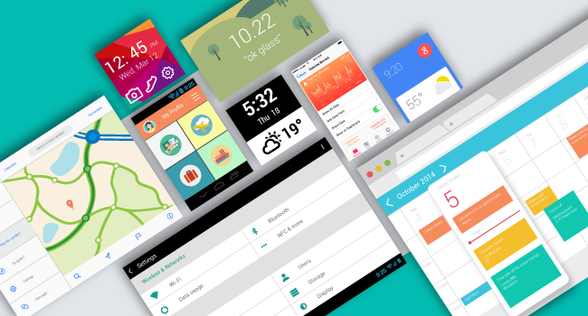
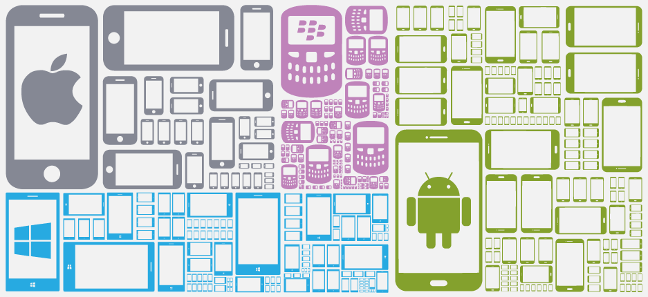
One of the recent changes that we have encountered in designing apps is the increased resolutions of mobile devices while desktop resolutions remain relatively similar. Apart from the mac retina screen, most PC laptop screens remain around the 1366x768 mark, while mobile device resolutions have shot up to the point that they are normally the same or higher than the resolution of the screens that the app is being designed on.
Delivering the level of performance expected of modern software is an issue in any app and has historically been the bane of many design tools in particular. We built Fluid UI in the browser as a way to enable our users to share mockups and preview them on device in a simple and effective manner. This means we are limited by the performance of the browser, and this will always be slower than the performance of a native desktop app. We accept that and work with it - the benefits of an online cloud solution more than make up for it. But add to this an ambitious camera/zooming mechanic while trying to display every facet of a project on screen at the same time and we’ve ended up spending a lot of development time optimising and improving the speed of the experience. Again, we feel the effort is worth it, but it is definitely a debate we have often - performance vs features vs usability and how best to invest our available time to fulfil the needs of our users.
Often we’ve had to face a speed versus graphical quality trade-off. One example in Fluid is the graphical artefacts that show on inactive pages, particularly small pages at large zooms.
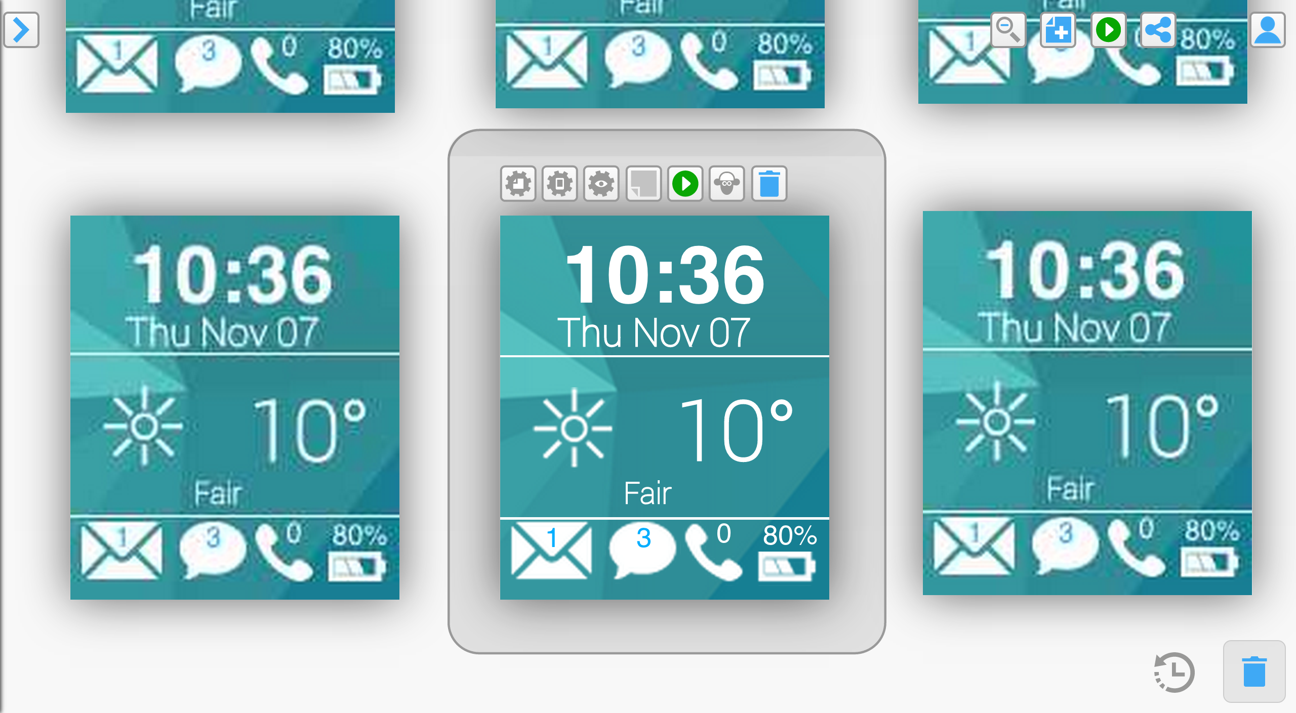
In order to be able to display all of the screens of a project in zoomed out mode, we need to store multiple versions of each screen at different resolutions. Otherwise, the browser would run out of memory and grind to a halt. There is a visible “popping” of screens when transitioning (particularly between active zoomed in screens) that is caused as a result. It’s not optimal, slightly ugly and detracts from the design experience, but a trade off we had to make to ensure the app runs efficiently and in a pleasing manner.
There are some speed issues we haven’t resolved yet. More and more people want to upload high quality images for retina or other high resolution devices. But the pixel perfect approach comes with a high cost, particularly on mobile - previewing those images can cause seriously slow load times and can even (in the case of a browser web view) run the browser out of memory and cause an app to crash. We will add some automated image resizing/optimisation for these previews, though obviously, this too comes with a speed vs quality cost.
The web is meant to be fast and beautiful, but these rarely make easy bedfellows. We’ll be following up our camera release with implementing the emerging @1x design standard for designing apps that appears to be taking hold as a happy medium between performance and quality. We are really looking forward to getting this implemented and out as a clear and sensible design solution for an ever more problematic app design issue.
In design there is no right and no wrong, just different shades of user opinion. The last version of the Fluid UI camera caused love and hate in equal measure. We’ve had plenty of feedback saying it moved too much, and plenty of feedback saying it was perfect for our user’s needs. What we always knew is that it was incomplete and that we could make it better. Mostly, our users suggested it was great for small projects, but got progressively more frustrating for bigger projects and longer periods of use. People wanted more control and less unnecessary movement and our latest camera release puts that control in our user’s hands without sacrificing many of the things that people already loved about it. We’ve made the options all available under the hood and picked the most intelligent defaults for most app designs.
We hope the newest version is a massive improvement, and our user tests point in that direction so far. There is no validation quite like the validation of real user feedback though. We encourage you to try it out and look forward to your feedback. We’ll continue to listen to our users and improve the experience until we redefine how apps are designed.
We love making Fluid UI and seeing some of the world’s greatest apps being designed in it, funding being raised from it and the use we get from colleges, universities and coding clubs. We’re going to continue to improve it and learn from our users, incorporating more user testing than ever before and watching, learning and compiling our user feedback into clear projects that help us make the best design tool on the market. We hope you will continue with us on that journey.