Recently we had a customer who wanted to restore a previous iteration of a project he was working on, but the version he restored didn’t reflect the work he was looking for. He contacted support looking to see if there was a mistake in his saved versions. We found that the time which was displayed when each project save happened was our server time - not his local time. He was restoring files from the wrong time zone.
Use local time zones when displaying dates for users, particularly for online services.
Along with the time, the subject of the date came up. This is another area we’ve encountered where there is plenty of scope for user error and frustration.
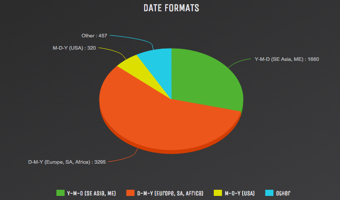
Put simply, the US date format (Month-Day-Year) is different to the format used by the vast majority of people elsewhere in the world.
 *
*
A designer in the US might recommend writing the date something like 01/06/2020 for January 6th, 2020. But European users would interpret this as June 1st, 2020.
Developers also frequently use the date format YYY-MM-DD. From a development point of view, this is the simplest way to do it. Going from larger units (years, months) to smaller ones (months, days) makes implementing searching and indexing far faster. Unlike other dates, this format also forms the basis of an ISO standard - the ISO date standard 8601. As a result, this is a format used in many “developer designed” user interfaces.
Designers need to decide the date format most suited to their users.

The biggest impediment to designing a good UI is using a bad design tool. This is why we work very hard to keep Fluid UI as easy as possible to use. We consider every element in the user interface in Fluid UI to be like a TAX - a tax we are constantly working to reduce. It’s our way of saying:
Whenever we add a feature, we should always look at every possible way to enable that feature without adding additional clutter to the UI.
In order to make Fluid UI the best design tool we can, we gather data from a number of different sources:
We gather user feedback from Intercom and Zendesk, categorising it by features, bugs, onboarding queries and account queries. We then compare that with whatever stage the user is at in their life cycle (first session, free user, paying user, churning user etc).
We monitor overall editor stability with Muscula. Often we are able to react to new bugs quickly, long before a user or our own QA team might find them (apparently, only 4% of people who encounter an issue actually report it).
We gather aggregate usage metrics (via our own system) that let us know which features users use, in what order, and how often.
Finally, we sit down with users when the opportunity arises to watch them use the editor.
All of this data is fed back into our roadmap to prioritise each step of the journey. No single part is enough to show a complete picture of what our users need next.
Understand the different stages of your user’s lifecycle and find out what’s important to them at each stage before prioritising design work.
The start screen for Fluid UI is as simple as we can make it. You can start a new project immediately, access older projects, or chat with us. This is as close as we have gotten to fullest expression of our button tax - starting with a completely blank screen.