Designs are a reflection of the times. Designs are also the outcomes of needs that emerge during a particular period. These cardinal rules of design apply to app development and sites. Over the years, websites have undergone a radical shift in design, with emphasis on two distinct aspects. One has been the need for enhancing the user experience, while the second has been the need to get the message across in the shortest possible time.
Achieving this a decade back may have appeared as a bit of a challenge when design trends were only loaded towards presenting a visually enriching/stunning experience. However, minimalism rescued designers from design demands that could be best described as oxymoronic.
It is now time for design to move into a different trend and with millennials dominating most areas of work and business, trends will be decided by this cohort. Here, we look at ten design trends that millennials will adopt in 2019.
It is true that there are no laid down rules in the world of design. However, unwritten rules of design exist and this used to be incorporated more as a subconscious decision. The design used to typically conform to these unwritten standards that were basically a tendency to follow or adopt something that worked for others. This will no longer be the same.
The single biggest change that can be expected from millennial entrepreneurs is the fact that design will not conform to a particular trend. There really will not be any clear cut definition of what constitutes an acceptable design and this will get more interesting as individuals of diverse backgrounds without any formal training in web designing get to unleash their creativity in web design.
Website designs were undoubtedly a visualization that permitted the use of functions and features. However, this veered more on the creative side, though the primary objective was functionality. This has changed and will continue to change even more when millennials stamp their preferences in design history. This has mainly got to do with the need for high-speed interactions and lesser time towards checking out the visually stunning features or renditions. All design features will revolve around functionality and will be used effectively to highlight the important aspects that will draw attention quickly.

Source: Dribble
Data being the new oil, this will not come as a surprise to anyone. With the deluge of data, there is clearly a need for most businesses to leverage the power of data analytics. This will be necessary for shaping decisions and there will be a need to bring out the visual context of data in a crystal clear manner.
Interpreting texts and numbers take time and in a world where time is the biggest differentiator, it will be necessary for sharper and swift decisions. Data visualization of analytics and the need for interactive dashboards will be a strong trend in the future and will continue to remain that way for long.
Data Visualization helps users to understand not just the data that is being represented, but also the underlying patterns beneath the data sets.
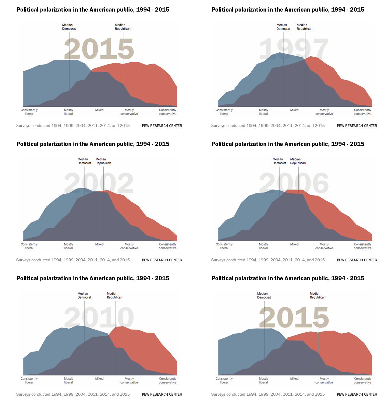
Source: Flowingdata
The desire for greater functional use will find more and more ways of expression. In addition to the features and options taking centre stage in design, there will be a stronger inclination towards dynamic designs. The use of intelligent sensors to adjust the brightness of the display in phones will serve as a cue for website designs which will automatically choose different templates depending on the location and the known ambient light conditions.
More advanced designs will incorporate designs that use automatic and updated inputs of weather and offer a suitable display that will offer a user better visibility. Display will be intelligent in the future and this will be a fusion of hardware, automated inputs and optimized themes.
Due to current popularity, this may not appear as a new trend at first glance. However, all the above trends are a clear indicator that progressive web apps will be a strong area of focus for millennials. The ability to have access to app like functions from browsers continue to find greater acceptance among users. The distinct characteristics of progressive web apps make it appealing and attractive, and this will dominate the design trends in the future. This will only get better with support from modern browsers.
Progressive web apps load 2 times faster, improve ad revenue by 44%, and actually get users to spend 40% more time on their sites. Also, sites reported a 17% increase in conversions.
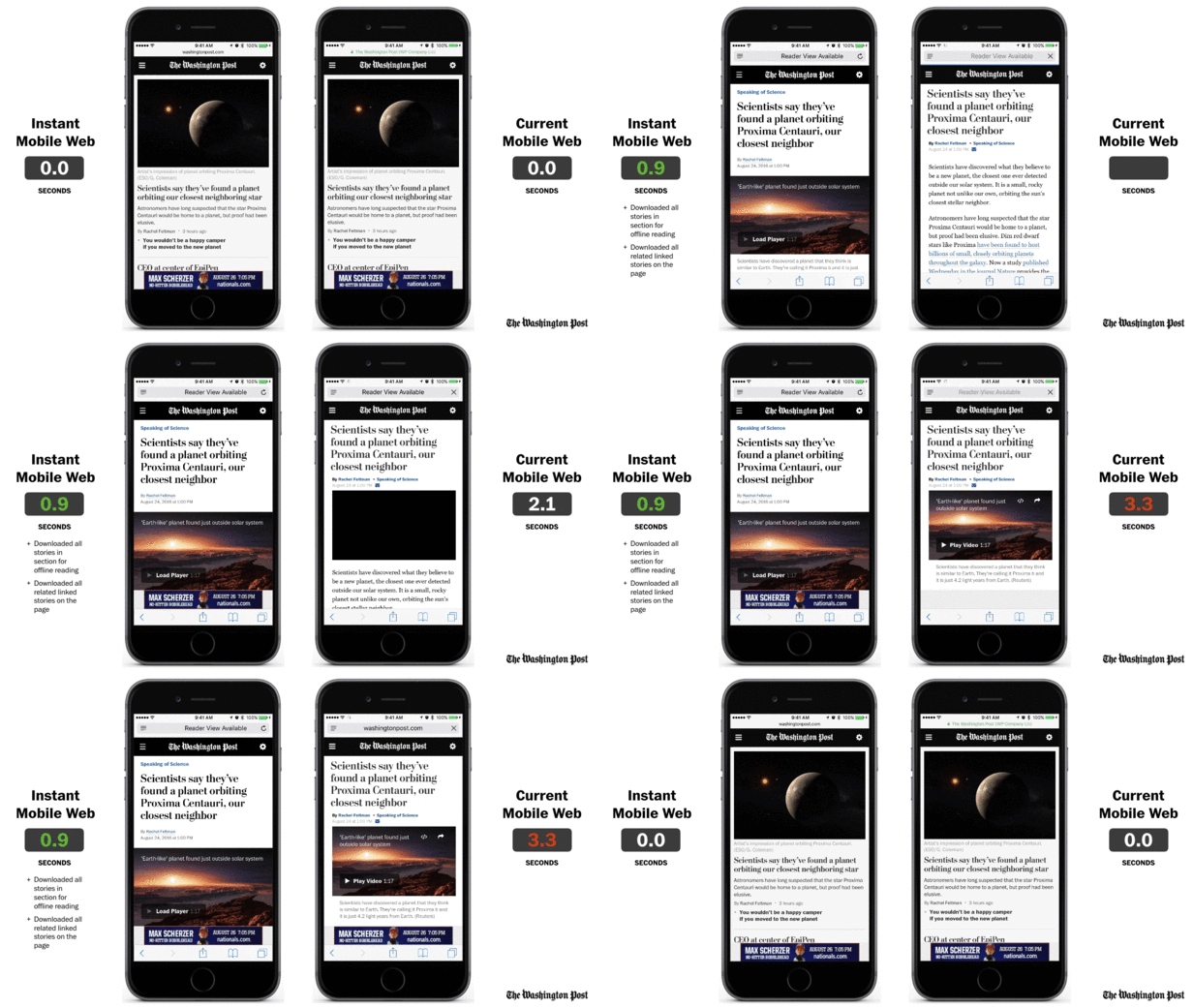
Source: The Washington Post
General voice search statistics of WordStream predicts that by 2020, 50% of searches will be routed through voice-based systems. Voice User Interfaces have finally moved out of design labs and onto devices. The advances in AI and the overarching nature of technological advances have made it possible for voice user interfaces to achieve more than ever before. These developments have unfolded at just the right time when there was a need to come up with more innovative ways and faster options of getting devices to work on oral instructions.
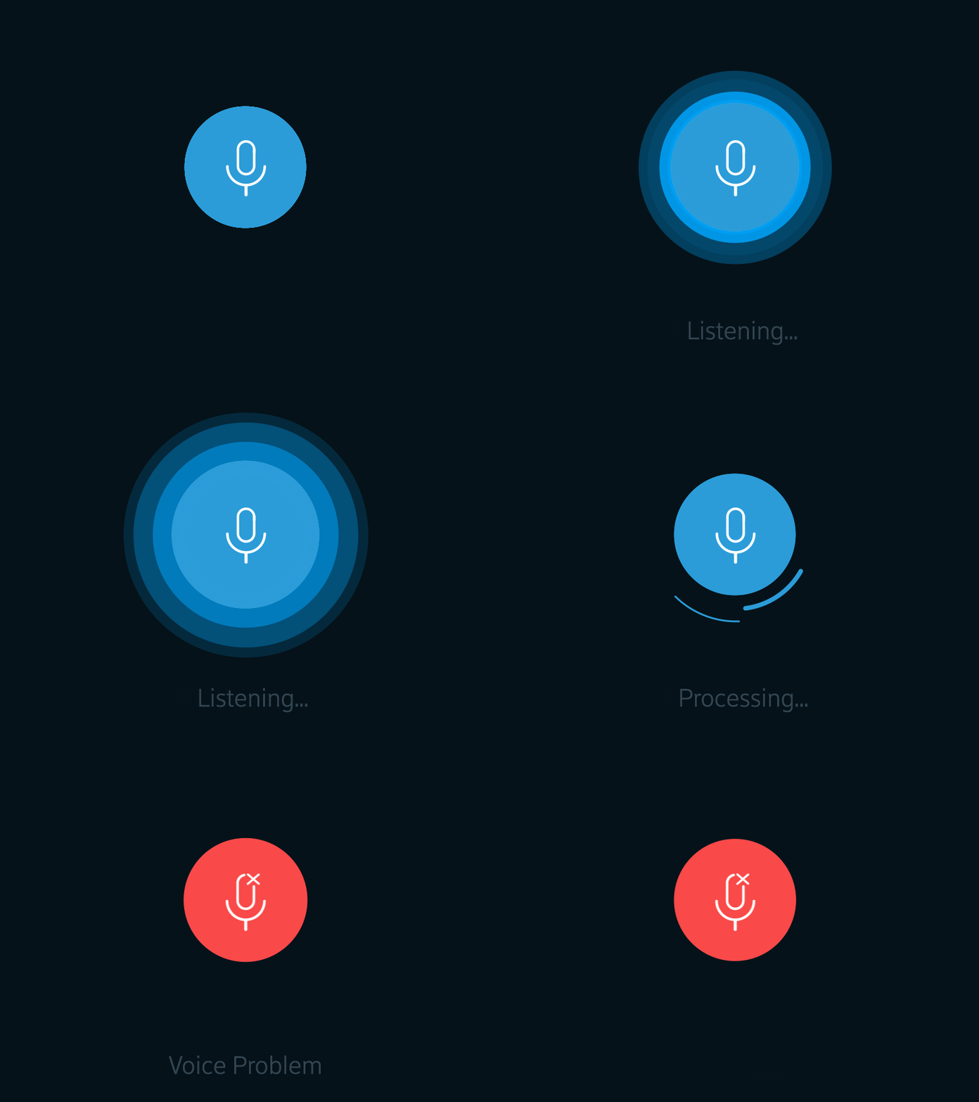
Source: Dribble
The careful application of 30-degree angles to the sides of drawings to create the three-dimensional effect has caught the fancy of designers and offers depth to creations. This trend will continue to hold the fort as users have traditionally desired depth in artistic renditions. While flat representations have trended for some time, the use of Isometric/3D designs is suitable for designs in app development.
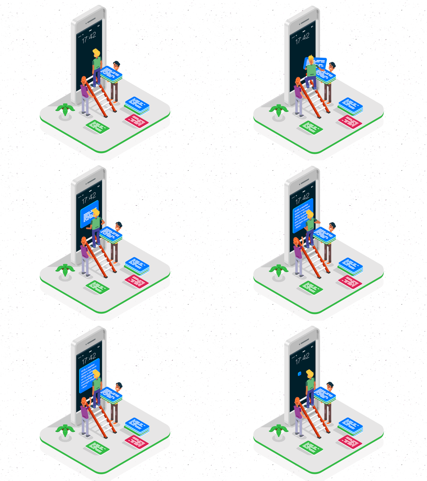
Source: Dribble
Among the hot trends, Google’s Material Design is making a splash. It permits users to interact better with apps. The search is for a better experiential feel and interaction of users and the best way to go forward is material design. The use of elevation to depict shadows and the use of depths in design has found traction and developers are unanimous in declaring this to be one of the hottest trends.
Contrary to the anticipation that overlapping effects are bound to take away the focus from design elements, the overlapping actually brings elements into sharper focus. This is exactly why overlapping is emerging as an out of the grid design feature. In combination with other features including shadows, it is possible to create an incredibly simple and effective magnetic effect.
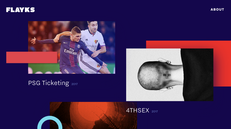
Source: Flayks
The need to present text in a manner that helps users clearly understand the content is of primary importance. It underscores the importance of a website. It is hard to imagine a website without any text content. It is therefore essential to get the basics right, and this effectively means that designers need to be on top of their game when it comes to using the right fonts/typography in creatives.
Businesses that are digitally born will find it easier to adopt these design trends and others will have to catch up with these trends to be able to compete on an even platform. To tower high among the competition with visibility it is necessary to use these trends effectively and reposition businesses with the edge of differentiators.
Author Bio:
Dhaval Sarvaiya, one of the founders of Intelivita, a customer-centric mobile app development company, helps enterprises and startups overcome their digital transformation and mobility challenges with the might of on-demand solutions powered by cutting-edge technology. Connect with him on LinkedIn.