Even though designing digital user interfaces is an exercise in two dimensions, nearly every UI out there has depth and perception, properties native to the 3D world. Even ‘flat design’, the dominant industry trend these past few years, relies heavily on arranging objects on a z-axis (or at least making it seem like they are).
Designers that can expertly bake depth into their interfaces create UIs that are realistic, familiar, and ultimately more user-centric. Achieving that requires a firm understanding of how light and shadow interact with each other, a subject that photographers and artists spend years mastering.
We don’t have years—we have a blog post—so instead we’ll hone in on one of the most popular design techniques for depicting depth: the drop shadow.
Don’t let its abundance fool you—just because you can’t go three pages on the Internet without seeing one, doesn’t mean it’s easy to pull off. In fact, you’d be surprised how many UI designers manage to botch them, whether that’s by flagrant overuse or simply not knowing how they operate. This blog post aims to fix that, whether you’re a seasoned design veteran or currently enrolled in UI 101.
Drop shadows are a specific type of cast shadow, or a shadow formed by an object blocking a source of light (your silhouette stretched across the pavement on a late summer day is a cast shadow). But unlike seeing your own shadow, where the sun is behind you, in drop shadows the source of light is positioned somewhere above the object.
Orienting the light source this way causes a halo-like shadow to appear around the edges of the object, and results in the object appearing to levitate above the underlying surface, towards the user.
All graphic design programs will have some sort of drop shadow function built-in, though most of their default settings for drop shadows aren’t ideal for real use cases. It’s up to the user to make their drop shadows more realistic, and I’ll offer a few tips on how to that here. But first…
It’s easy to come up with reasons not to use a drop shadow — they’re overused, they act as a crutch for designers—but when wielded properly, drop shadows serve as powerful visual cues that are unmistakable to all users.
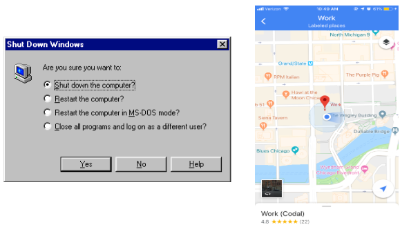
We intuitively understand that when components appear raised in an interface, especially beveled ones, they’re clickable. This relationship is so ingrained into modern web design that you can see it both in the Google Maps iOS app and the ancient dialog boxes of Windows 95.
And despite its age, the drop shadow has never really gone out of style—it has a timeless staying power, even in the current age of flat design (which sometimes swaps drop shadows for other ways to exhibit depth).
Finally, drop shadows can act as a quick and dirty way to add contrast. Have a softer, lighter design element, like a pale card against a white background? Add a drop shadow, and watch it pop.
But the drop shadow’s utility belies its problems—because it’s essentially a design Swiss army knife, designers often toss it in without giving it a second thought, and the results can be shoddy, distracting, and just plain weird shadows detracting from the UI.
Here’s a few tips for ensuring your drop shadow works perfectly, every time.
Subtlety is the name of the game when it comes to any design technique that employs light and shadow, and drop shadows are no exception. An inky smog smeared around the edges of whatever you’re shadowing won’t only offend the sensibilities of your fellow designers, but likely distract the user as well.
Why? Because the purpose of baking shadow into your user interface is to inject tactile realism into the design, thus better simulating the real world. And in the real world, shadows are almost never conspicuous, and rarely even noticeable. They’re subtle, and your drop shadow needs to mimic that.
That means designing the shadow so that it closely hugs the element its supporting, without veering too far from the boundary. You should also crank down the opacity as well—shadows darken, but don’t blot out the background completely.
Like their subtle transparency, natural shadows don’t have clear, crisp boundaries, but rather blurred edges that melt into their surroundings. Designers employing a drop shadow in their interface need to remember to soften the shadow’s edges to avoid an unnatural and unattractive look. This example from Reuters, cited in WDD’s excellent article on drop shadows, demonstrates this undesirable result perfectly (note the right sidebar).
We’ve already mentioned that a drop shadow’s light source is located above the object, but its exact position matters as well. If your design features multiple drop shadows, all with light sources oriented differently, the overall effect will feel incongruous and unsettling.
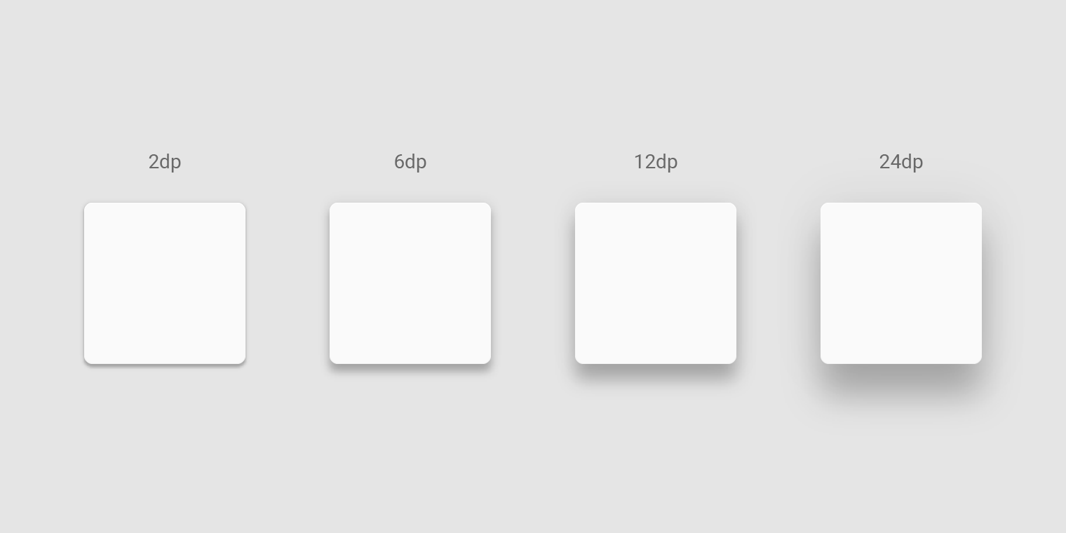
Finally, remember that anytime you’re elevating objects on the z-axis—whether that’s with a drop shadow or not—you need to account for the visual hierarchy inherent to three dimensions. Objects closer to the user will be prioritized first, while ones farther away will be deemed less relevant.
For drop shadows, this translates to more important elements (at higher elevations) needing larger shadows, while those at lower elevations require smaller ones.
There’s no end to the ways UI designers can harness the complicated interplay of light and shadow to invigorate their interfaces, but the drop shadow serves as a fundamental building block for these more advanced techniques. Master the drop shadow, and you’re well on your way to making realistic, practical, and ultimately beautiful user interfaces.
Author Bio:
Sean McGowan is a content writer at Codal, authoring blog posts on topics ranging from UX design to the Internet of Things. Working alongside developers, designers, and marketers, Sean leads the writing team to ensure Codal produces engaging web content of the highest quality.