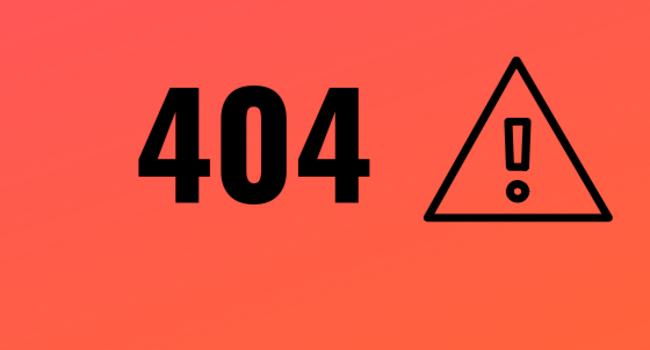
The 404 page of every website - a page which many companies spend a great amount of time working on, while hoping that no customer will ever see it.
Why?
Because when a customer sees your 404 page, it means something has gone wrong. Your customer has typed the wrong address, or they’ve visited a page that no longer exists, or someone, somewhere has made a mistake and there is a link to your site that leads to a dead end.
Every good UX designer and product manager recognises that while you focus on solving the biggest problems a user has first, you need to accommodate when they go off script too. That’s why the humble 404 page has become such an important part of every website - even when the goal is never to have a customer see it.
Here, we look at how 20 large companies handle their 404 pages - how they use them to recover the poor experience of arriving at a dead link, and how they take responsibility for the failure while redirecting their users towards greener pastures, often throwing in a little brand development and humour at the same time.
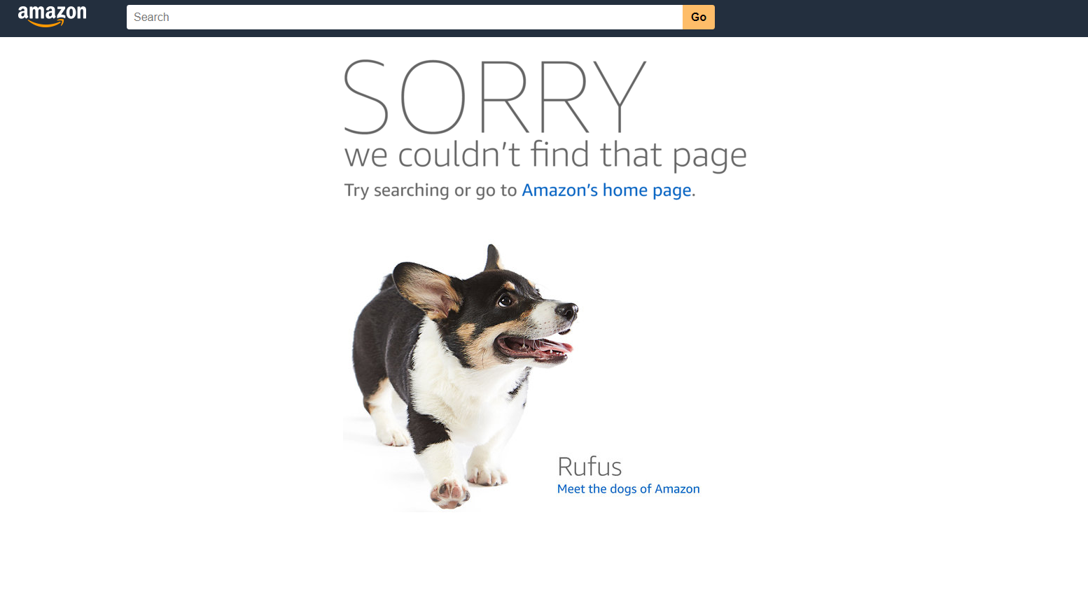
Say hi to the dogs! Amazon uses the 404 page to give you some insight into their company culture (including obligatory cute puppy pictures). Amazon also immediately takes responsibility for the error (even if it is not their fault) - with ‘SORRY’ in large capitals notifying the user that this is not the right page.
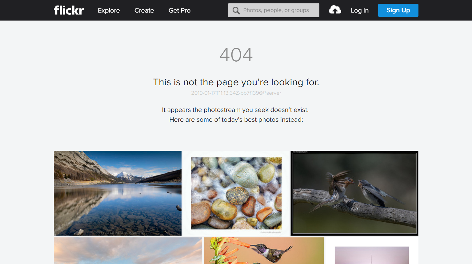
An oblique movie reference, a little explanation and a chance to look at a curated photo list means even users who arrived there by accident are likely to hang around for a little longer.
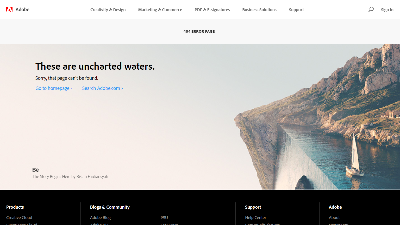
A mind bending photo and a matching idiom combine as a subtle testament to the power of Adobe’s photo editing suite. Search and back to the homepage are the two standard actions a user might want to take from that point.
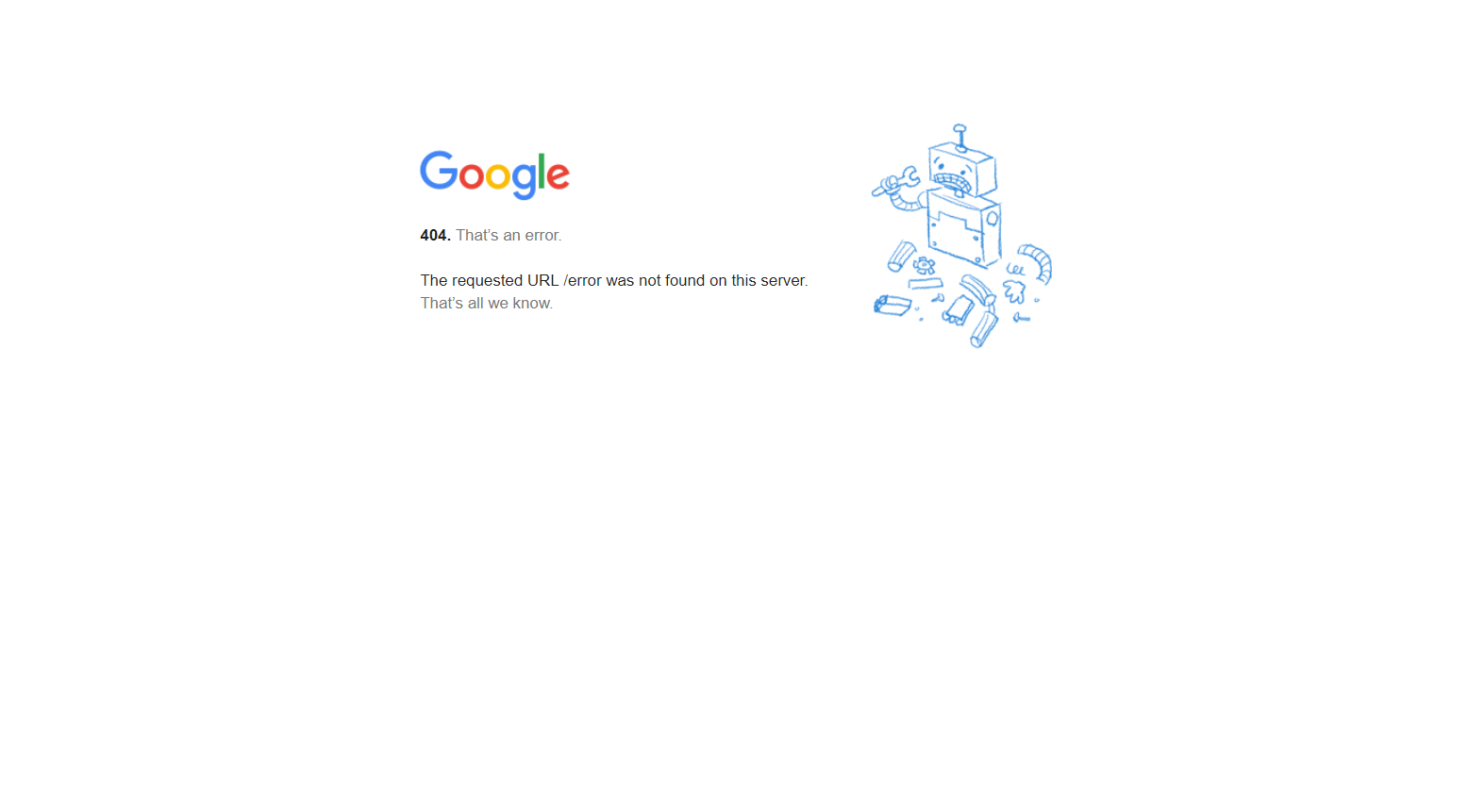
Google keeps it simple. Just an image of a broken robot and a simple almost technical error message. Probably a testament to their engineering roots and focus on finding just the right answer every time.
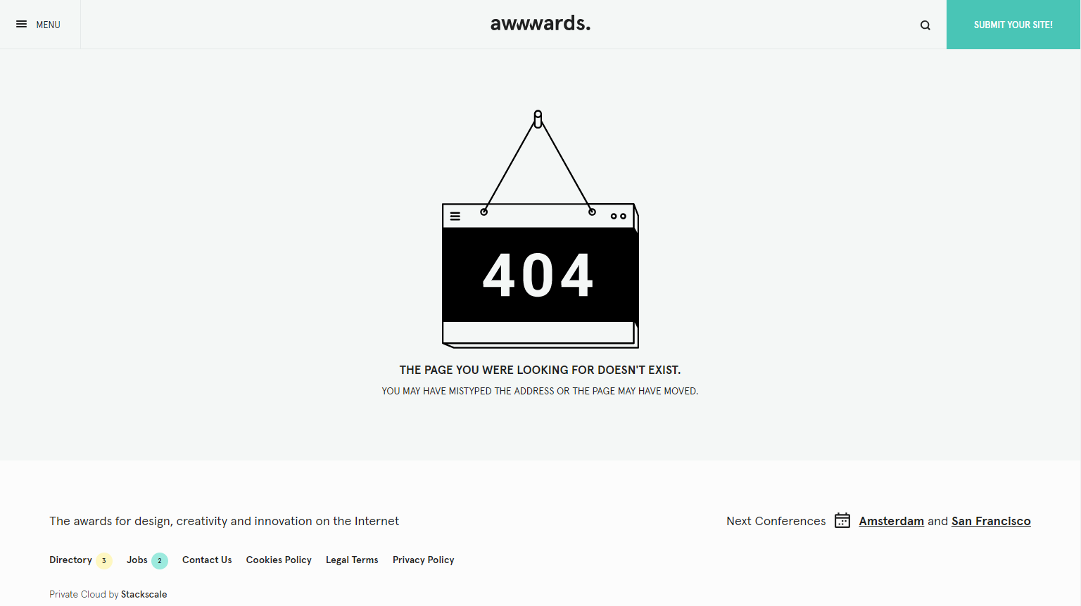
Not everyone gets it right, and Awwward’s 404 page uses all caps and stark imagery to communicate to the visitor that they haven’t arrived where they were expecting to. The capitalised text in particular makes it harder to read, causing the user to tarry longer on their journey than they might otherwise prefer.
A fun little game is a great way to entertain your lost visitors if you have the time to put one together. It definitely helped it make this list!
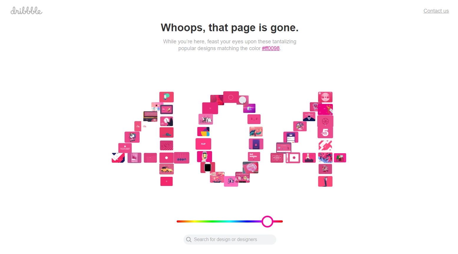
Dribbble is a website for designers looking for inspiration, so what better way to help a lost visitor than letting them pick a colour and giving them links to designs of that colour. Another example of a website 404 page that deeply understands why their customers are there, and then works hard to give those customers that content wherever they go.
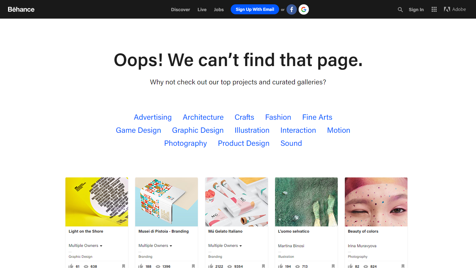
Behance, a similar site to Dribbble that offers visual inspiration for designers is a little more sterile by comparison. Like a 00’s search engine, they show delinquent visitors a list of all the projects, categories and showcases some popular design projects in an effort to help them get back on track.
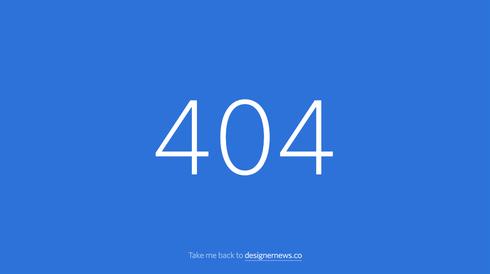
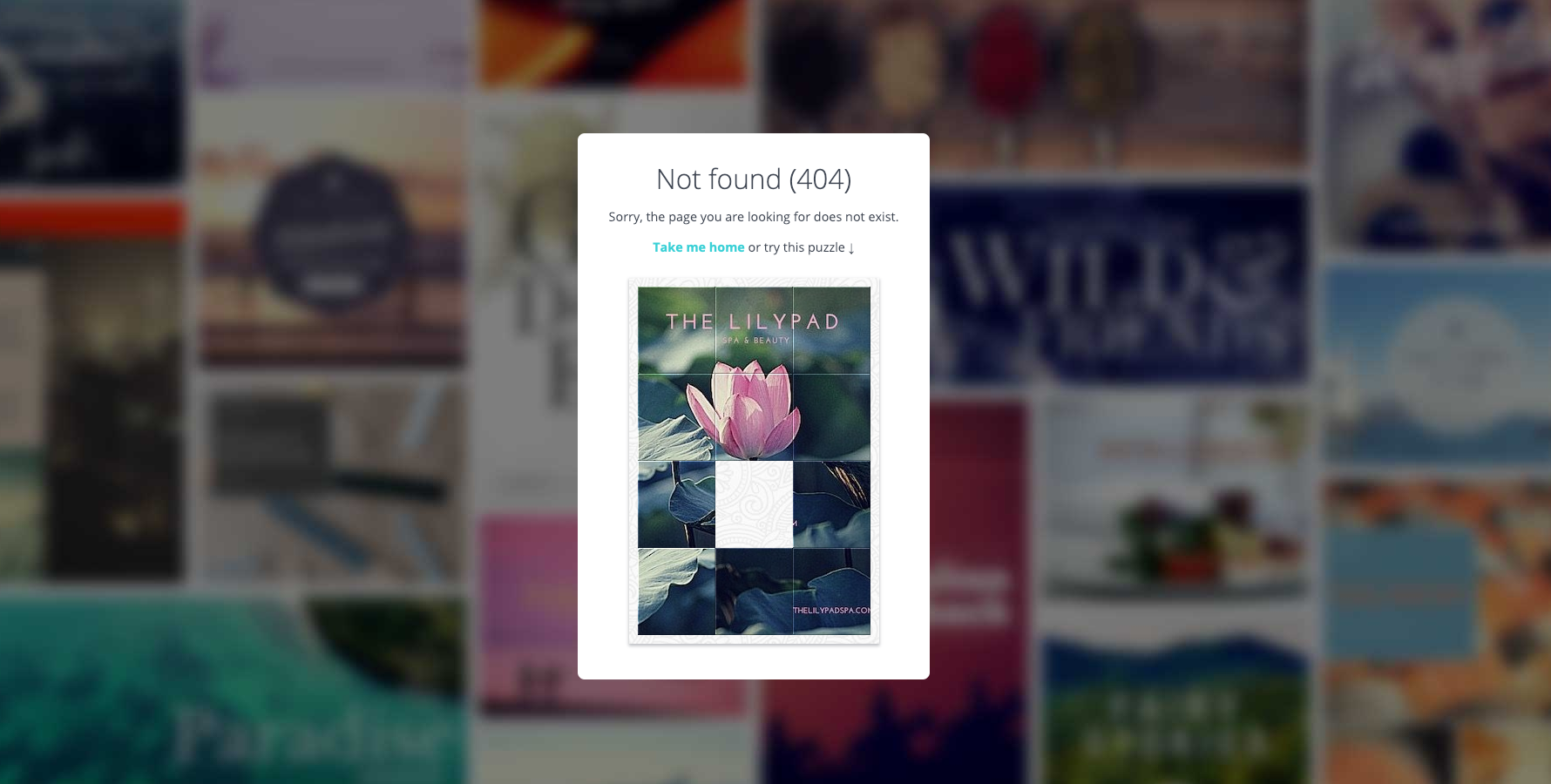
Simplicity often comes with its own power. Designer News’ 404 page gets the message across - bonus points for it not taking a month of a developer’s time to implement.
A simple page with copywriting that borders on blaming the user for the error (unlike Adobe, who immediately take responsibility for the error and work to help the user). A headline that if you didn’t read deeper, could be interpreted as “this page exists, but you can’t access it”. This visitors day just got a little less happy seeing this.
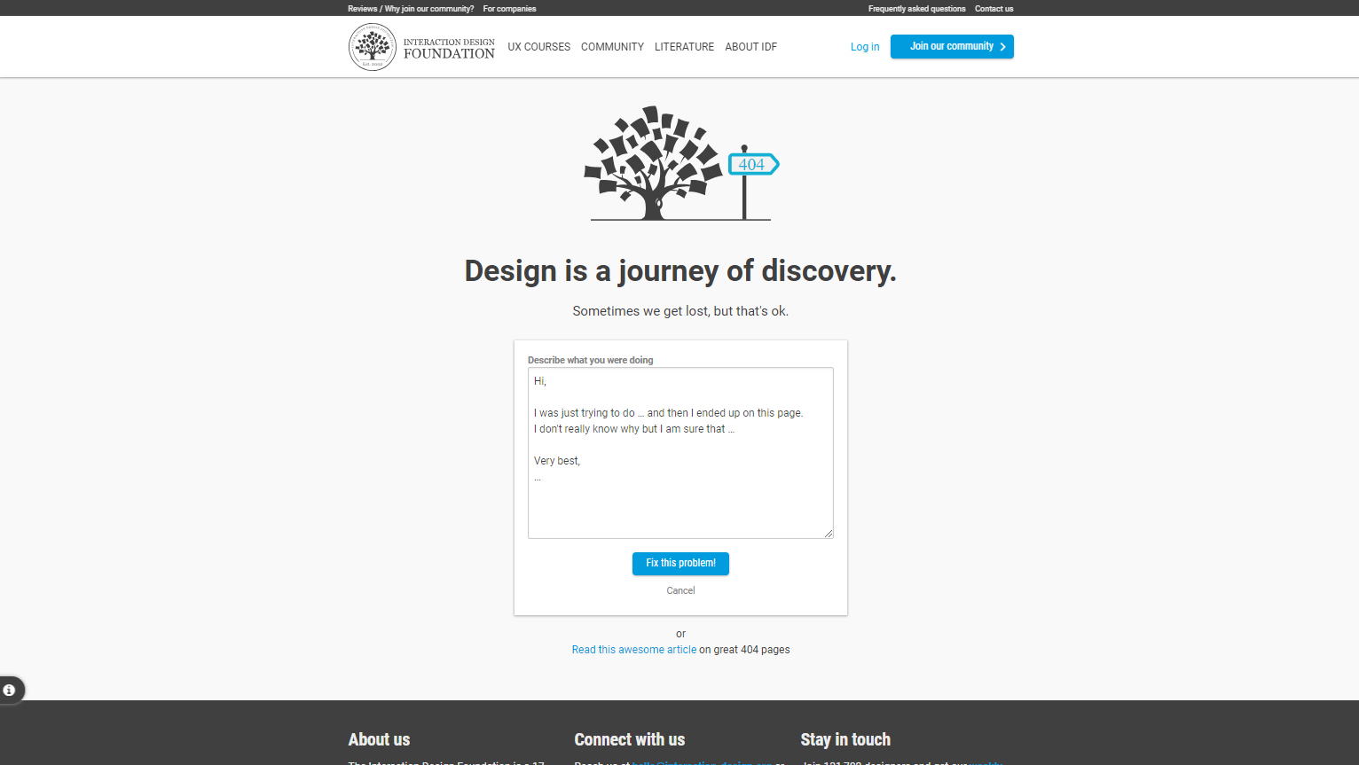
The Interaction Design Foundation gives the visitor a chance to send an email message saying what they were doing when they got lost and asking what they were expecting to see instead. There is noble if misguided intent in this approach - what they really should be doing if they care enough about their 404 visitors is reviewing their website error logs (or using simple online website spidering tools) and identifying common reasons that people are failing to get to their intended destinations.
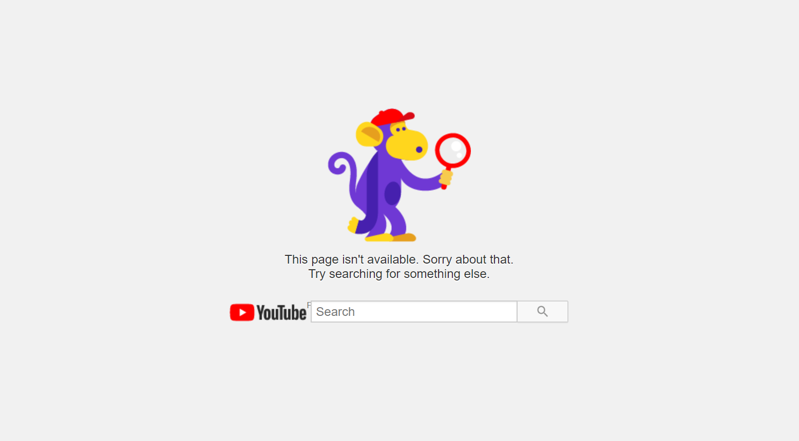
Communicate clearly what’s just happened, have a cute monkey picture, let the user search for another video instead. Good, simple work by the world’s second largest search engine.
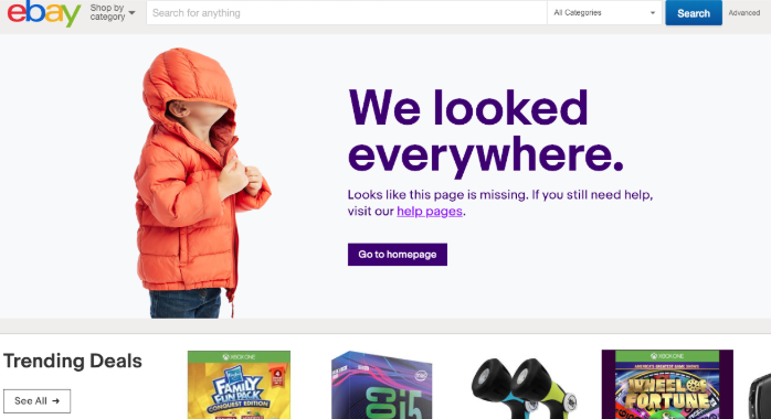
A simple and relatively fun image of a kid is an unusual departure from our pages to date, but it works well as it combines with a clear message and links back to their homepage, help pages and trending deals.
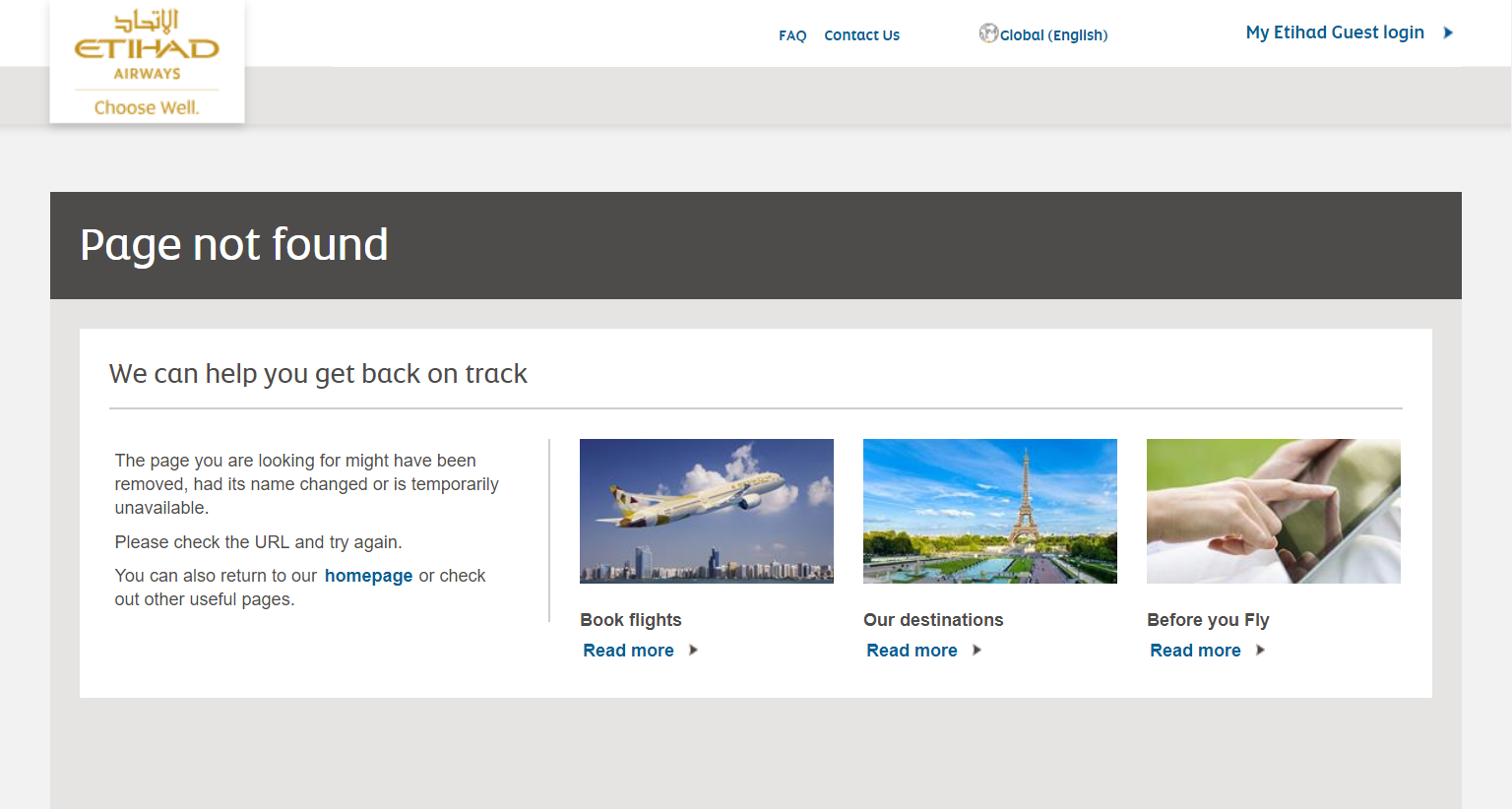
The Etihad 404 copywriters missed the memo on brevity, taking 3 lines to communicate what one line would normally achieve while giving the user some bad advice at the same time (Check the URL and try again. Really? How many average web users properly understand how a URL is formatted? Plus, if you are on a 404 page, trying again won’t magically make it suddenly work).
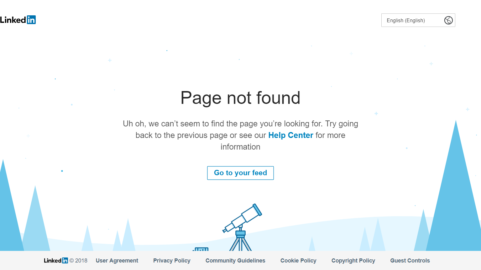
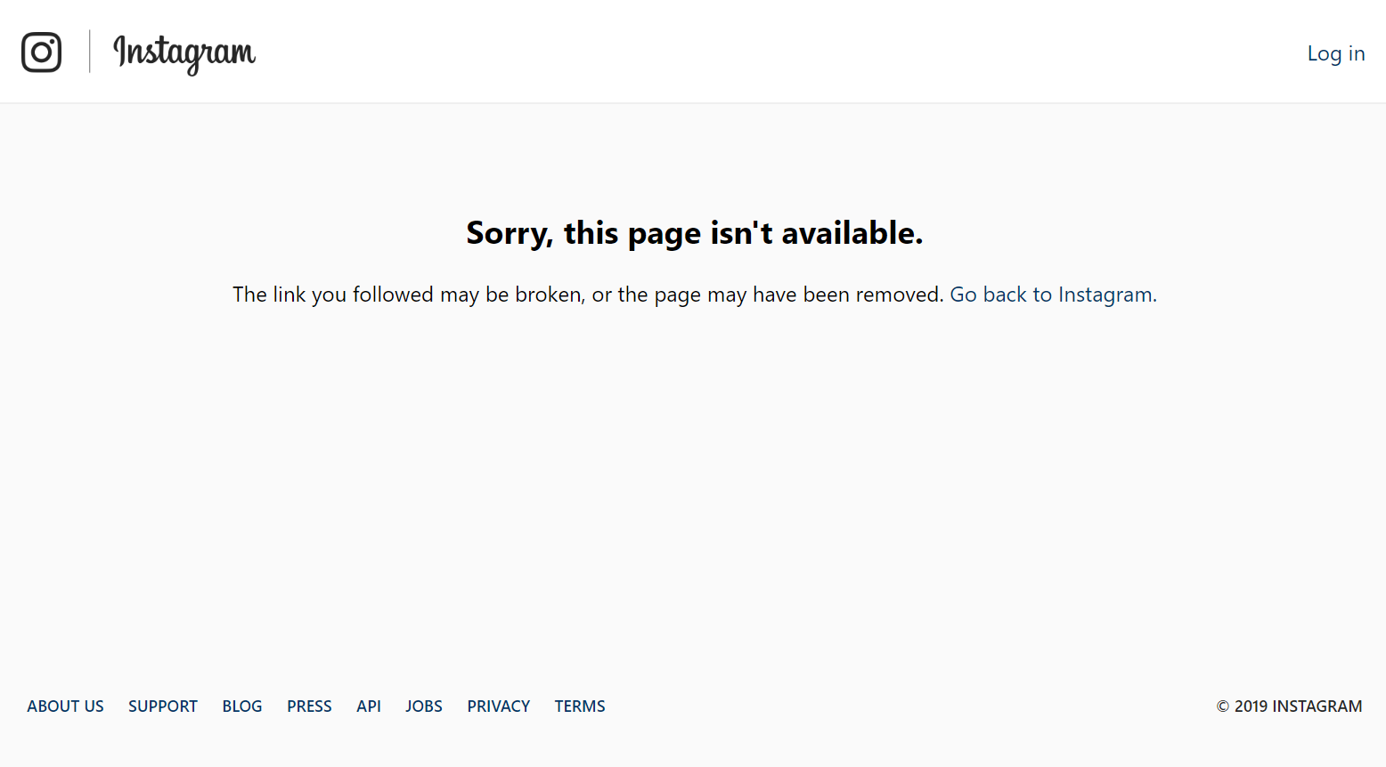
A bog standard 404 page that ticks all the boxes without truly offering anything inspirational. A vaguely relevant telescope image, decent copy and links back to the user’s feed and to the help center.
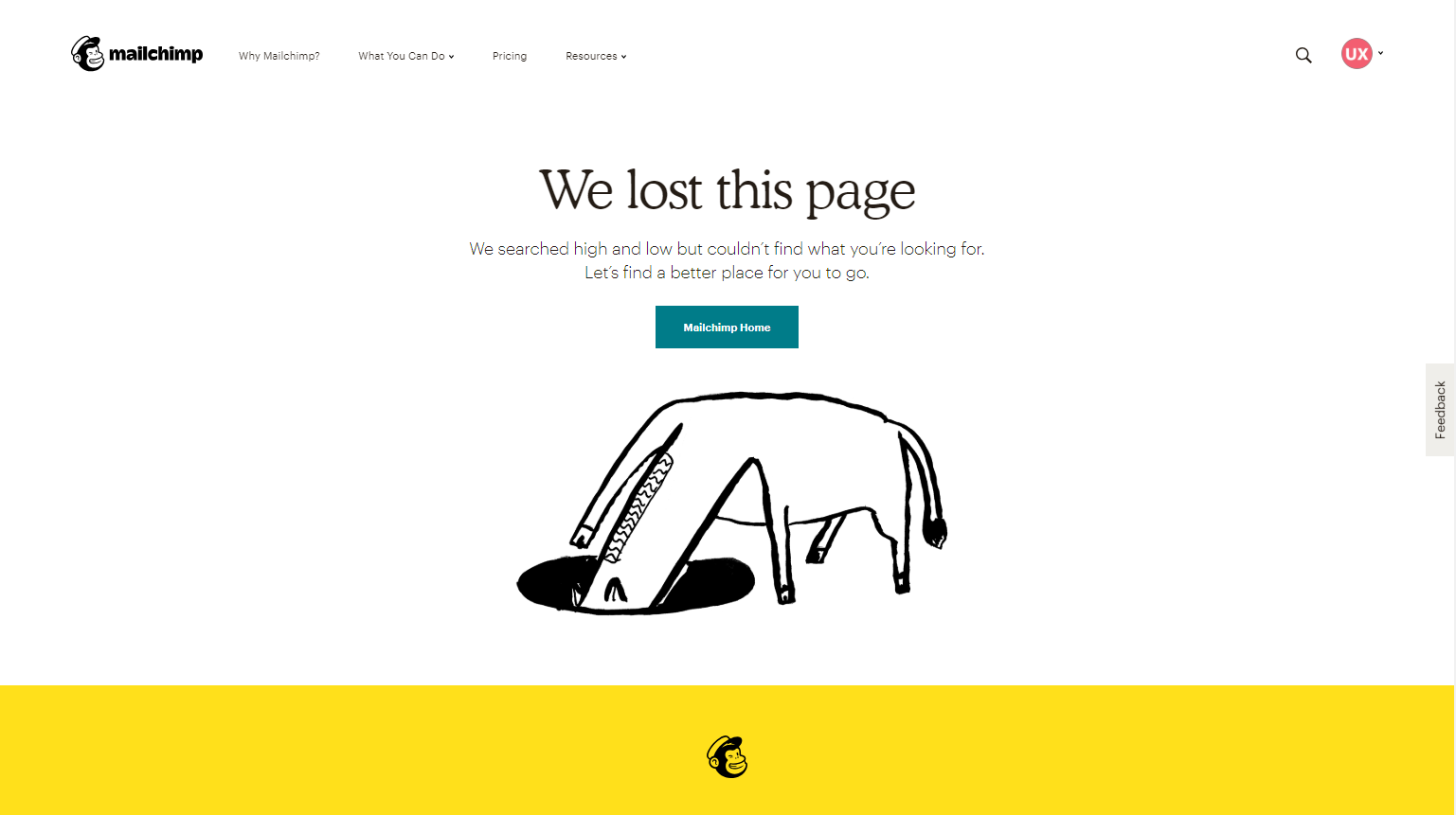
Arriving at a 404 page rarely means life or death, so Mailchimp does it right here by taking responsiblity for the error while giving the visitor options to proceed. Ticks all the boxes, and helps reinforce their brand.
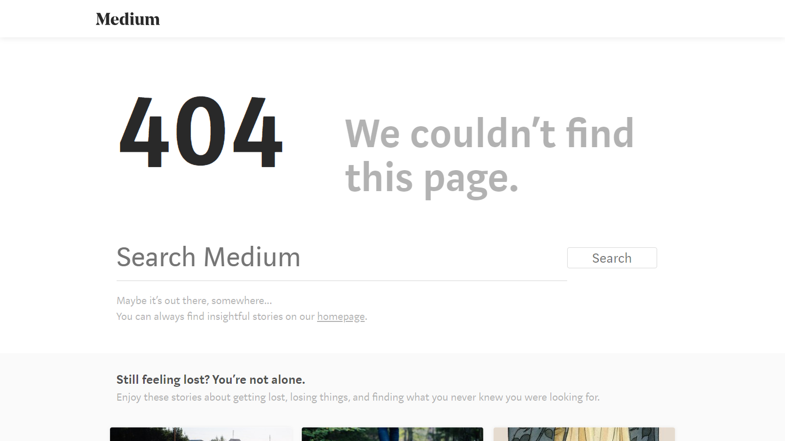
The 404 error message is loud and clear. The page cleverly gives the option to the user to navigate to popular articles about ‘getting lost’.
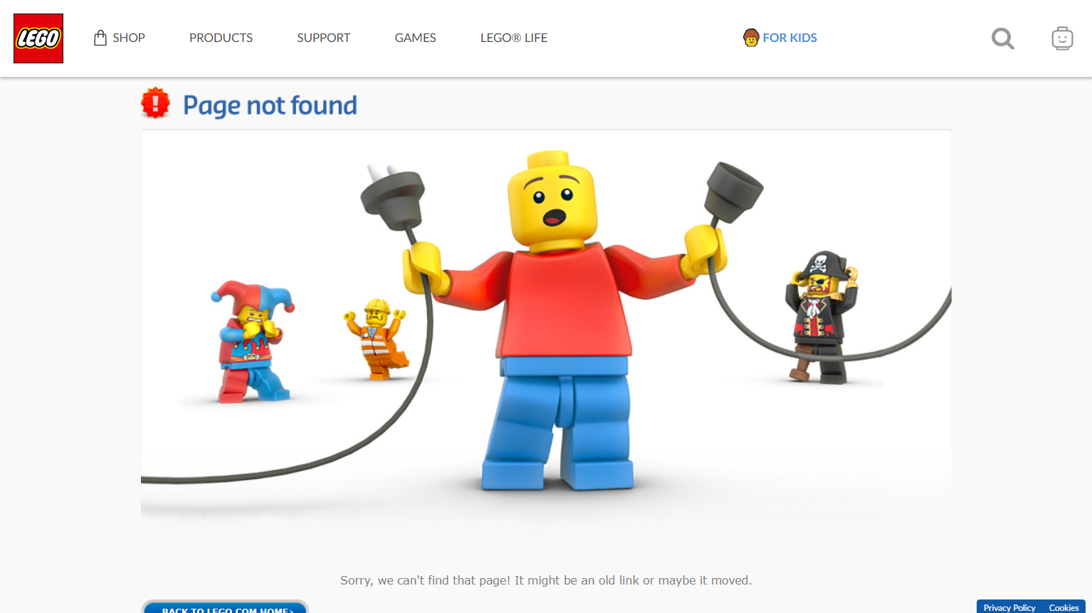
A little emotion can rescue a bad situation - even if it’s just the face of a virtual plastic toy. Lego does a great job here.
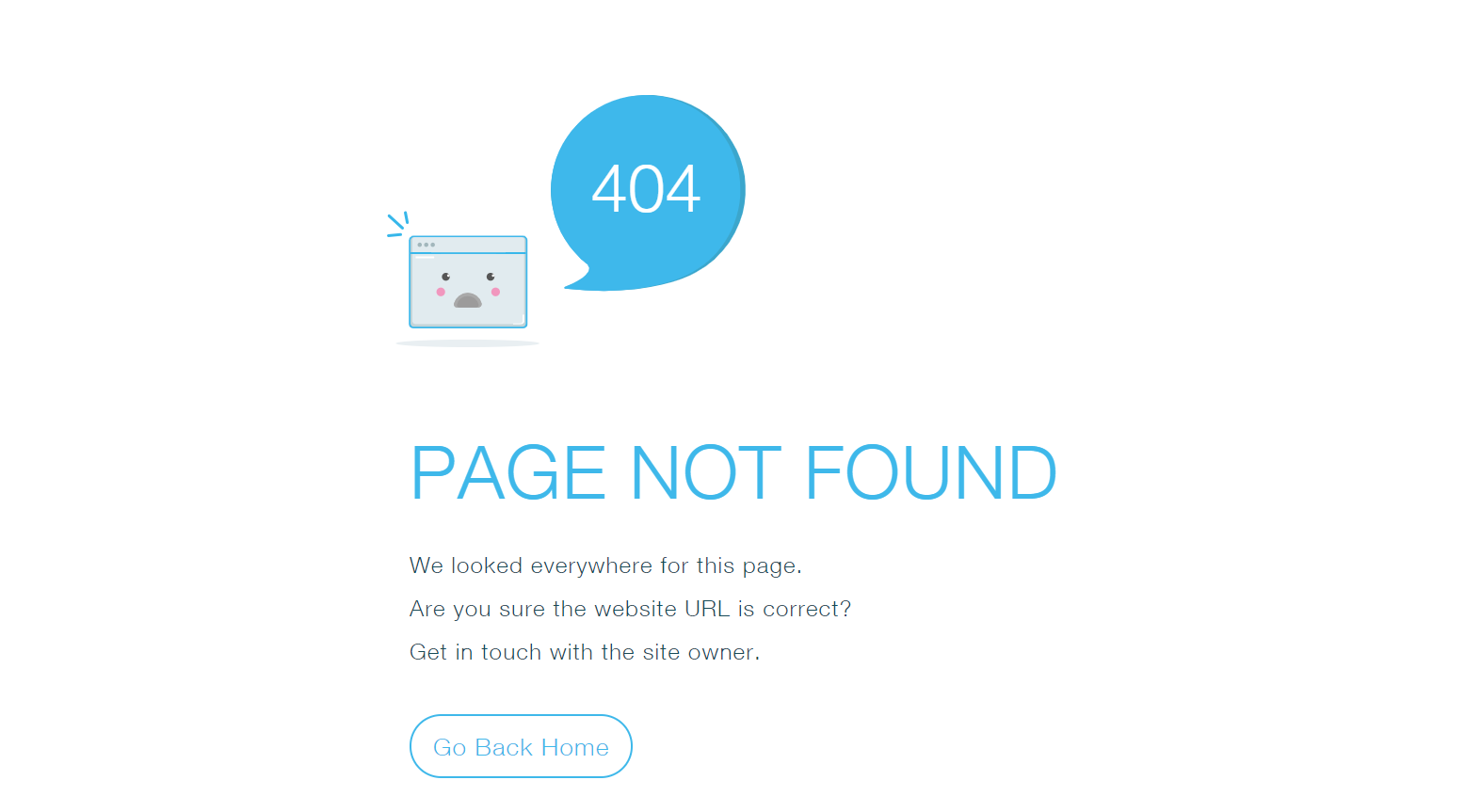
A simple monochromatic 404 offering. One slight criticism is the main action button (Go Back Home) is hard to immediately identify.
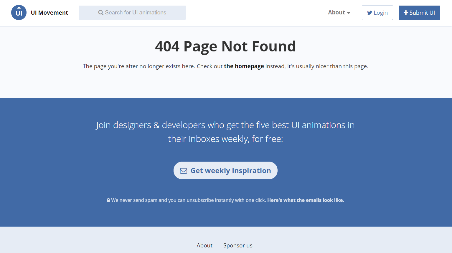
UI Movement use their error page to promote the weekly subscribtion of their newsletter, smart!
Author Bio:
Saadia Minhas is a UX Design Passionate with extensive experience of leading and developing amazing user experience by delivering high quality design for products and projects all over the world. To read more of her articles, visit Medium, UXDesignWorld