Trust is crucial to your brand’s success. After all, if your customers don’t trust you, they won’t spend money on you.
But it’s not obvious how your brand can convey its trustworthiness, especially when you’re an up-coming brand or when entering a completely new market. There are tons of marketing strategies that you can use to inspire trust and reassure your audience, of course.
But it can start with something far simpler and smaller.
Your logo!
Let me tell you why.
If you’re an online business, you need to win people over without any face-to-face interaction. Even if you have a physical space, you’re very likely to be discovered online first, and everything about your brand and that online experience needs to inspire trust.
That’s why a brand’s logo design matters so much. It has the power to impact how someone feels about your brand, before they know anything else about it and when you can pair your brand’s symbol to the positive experiences your brand provides, your audience begins to implicitly trust you.
So a logo design that accurately reflects a brand, its values and culture, effectively inspires trust. To help you get there, I’m going to share with you the five factors behind a trustworthy logo.
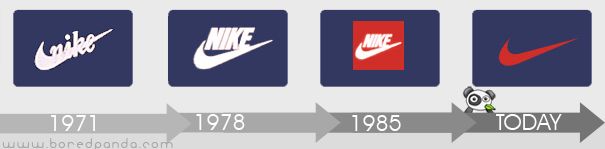
The Nike swoosh is one of the most easily recognized logos in the world. While it has consistently evolved over the decades, it has also gotten much simpler.
A logo design’s simplicity means that your audience can instantly recognize it anywhere. The reason simplicity is so important in logo design is that it helps you recreate your logo across platforms with ease. This way, no matter how your audience interacts with your brand (on a mobile device, in a store, at an event, etc.), they see a single, consistent logo at all times. This demonstrates to your audience that your brand is established, organized and unified.
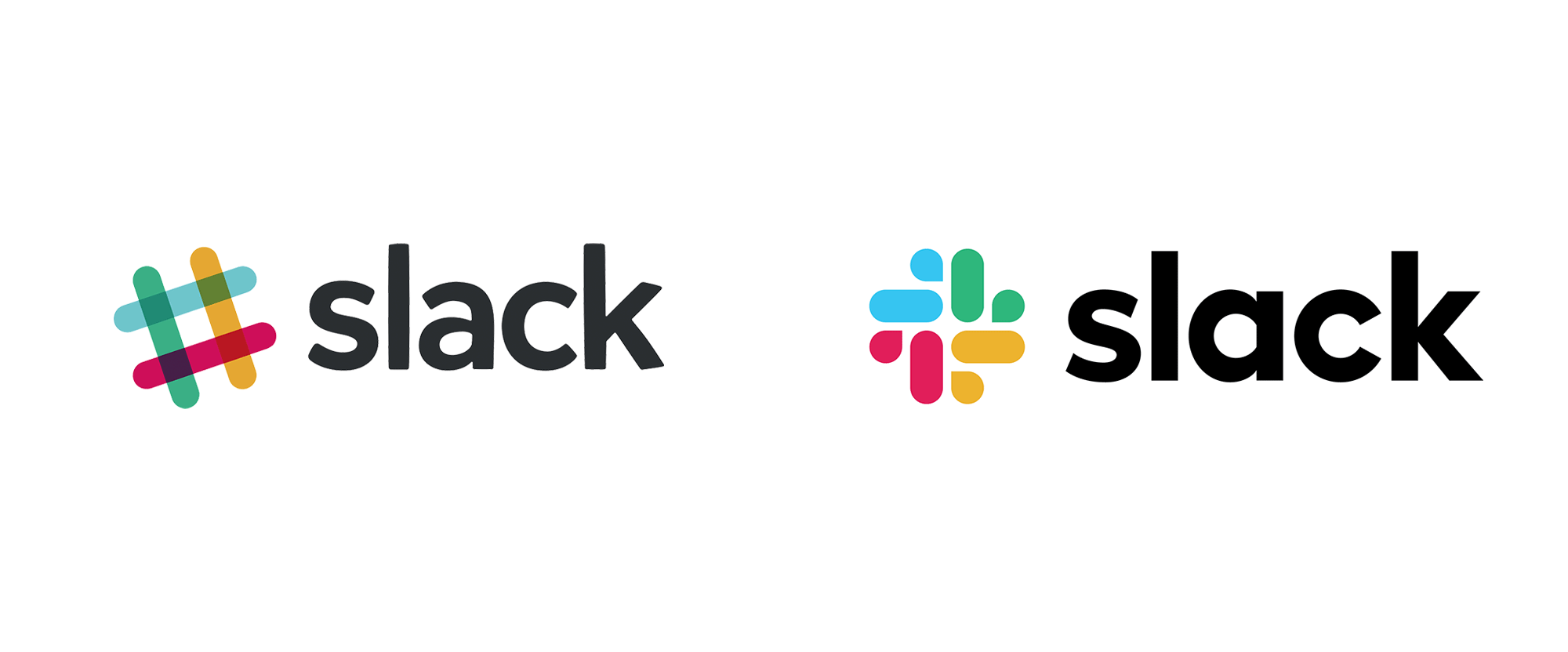
Recently, Slack, the popular workflow app, redesigned its iconic logo. A major reason for this was that the original logo was complicated and difficult to recreate consistently across mediums. As a result, the logo often appeared differently in different settings, and multiple logo designs were used to compensate which broke any sense of cohesivity and consistency for the brand.
The new logo is straightforward and structured, making it easy to recreate across channels.
The change itself might seem minor, but the impact has been huge for Slack.
A unique and intricate logo might look great but if you can’t accurately recreate it for different settings and channels, it can become disruptive to your brand.
An important factor to consider is the industry that your logo is meant to reflect. How people feel about an industry determines what they expect to see from trustworthy logo designs. The closer you can design a logo that adheres to people’s expectations of that industry’s aesthetics, the more trustworthy it appears.
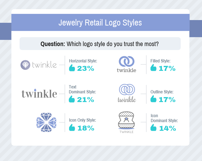
Recently, Venngage (the online logo-maker) and SurveyMonkey paired up to conduct a survey on logo design and trust. Over 1000 adults, aged 18 and over living in the US were surveyed using SurveyMonkey’s online survey panel. Responses were balanced on age and gender to ensure fairly representative responses.
The survey showed the respondents a series of logos for imaginary companies in six different industries: jewelry retail, education, financial services, law firms, news/media and tech. They were asked to rank six variations of the same logo from the most trustworthy to the least trustworthy.
Here are the types of logos respondents were shown for one industry, jewelry:
There’s a big difference in trustworthiness between the top left corner logo and the bottom right.
It was found that for each industry, a different logo design style was seen as the most trustworthy. So its important to consider specific design aesthetics depending on your industry for your logo to maximize its trustworthiness.
To learn more about the logo design study and the different types of logos used, check out the complete logo design study.
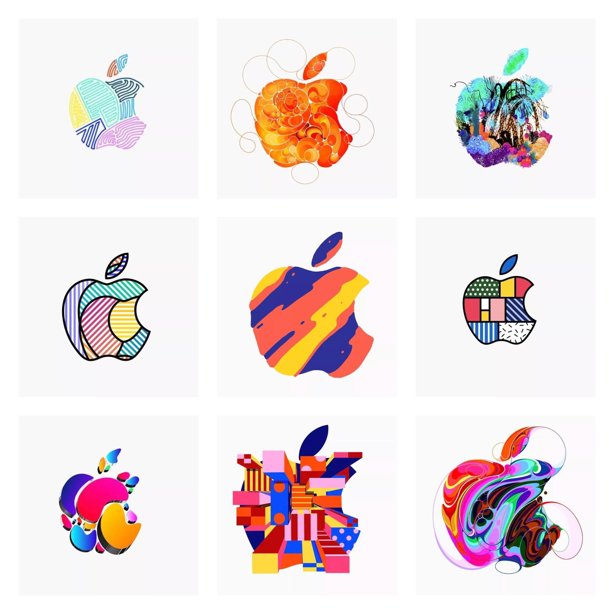
In 2018, Apple reimagined its logos with vibrant colors and abstract patterns. The same design approach was used for its Ipad Pro advertisements and the result was vivid artwork which was absolutely stunning.
As a consistently trendsetting tech giant, Apple rarely makes a marketing misstep so if there’s one clear takeaway from Apple’s colorful marketing campaign, it’s that really color works. The use of vibrant colors in design increases engagement and interest.
But why does color have such an impact?
The study of color psychology looks at the influence that colors have on us. There are so many emotions and ideas implicit in colors, that the use of colors alone evokes so many responses in people. In fact, marketing studies on color have shown that 90% of instant judgements about a brand are made based on the use of colors.
While color doesn’t directly affect your brand’s trustworthiness, the right color choices help your overall design align with your brand and industry and that, in turn, is what contributes to your logo’s trustworthiness.
Taking a page out of Apple’s marketing book is not a bad idea but that doesn’t mean you should treat all trends equally. Some trends are timeless while many others aren’t. When it comes designing your logo, be wary of falling into design trend traps.
If something about your design choices suggests ‘copycat’, it hurts your credibility as a brand instantly. I can think of at least three major problems of following the wrong trend.Some design trends aren’t necessarily suitable for your brand, incorporating the wrong one can confuse your target audience.
There’s the simple fact that a design trend works today, but tomorrow looks outdated and unappealing. You want a logo that’s ‘unique’ or ‘different’ and timeless or as close to it as possible. If your logo appears unoriginal and like a lot of other logos, it harms the trustworthiness of your brand.
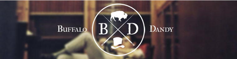
For example, the X-style logo is pretty popular and many brands have used it and has become synonymous with ‘hipster’ culture and high-quality. Just take a look at the logo below for Buffalo Dandy - looks familiar, right?
Now this isn’t a criticism of Buffalo Dandy, it’s a great looking logo but you have to ask whether or not a trend works for you and your brand. Are you an early adopter of this trend, at a time that it’s still fresh or is it on its way out?
Originality can be a little risky, but at least it suggests individuality. If you appear like other brands doing similar things, you might appear like a cheap imitation.
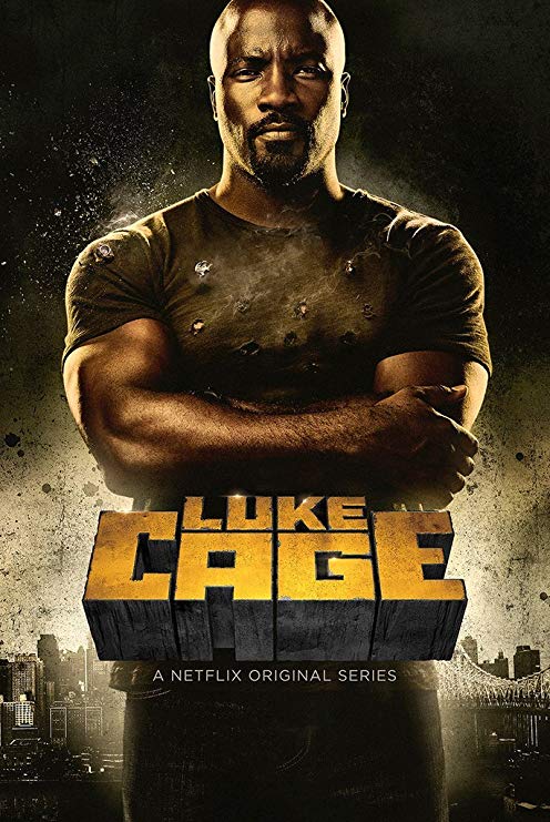
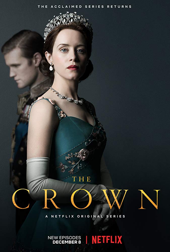
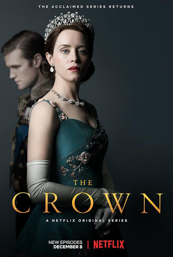
In just the same way colors influence people’s emotions and ideas about a brand, so can font styles. A 2018 study on font psychology that used the font styles of Netflix shows as a way to understand the attitudes and ideas fonts inspire about a series, and the impact of font choices on branding.
After looking at over 30 shows, the study identifies four distinct groups of font styles - decorative, headline, modern, and handwritten. When we look at the shows in each category, we get a sense of how the fonts reflect the themes and atmosphere of the series.
Take a look at the two posters below:
Source
Now try picturing the delicate, yet rigid font for The Crown getting replaced by the blocky, imposing font of Luke Cage. That’s the impact font psychology has on logo design and branding.
You want your logo to truthfully reflect your brand and to do that you need to understand how people perceive colors, font styles, and design trends. Your design also needs to be simple, recognizable, and relevant to your particular industry. Of course, there are no hard and fast rules - just some approaches that are more effective than others but a great logo design is rarely a stroke of completely inspired luck, it’s usually a combination of research and reflection.
Have you recently designed a logo? Or really happy with a logo that was designed months or years ago? Tell me about your process and what worked for you!
Author Bio:
Jeilan Devanesan is a copywriter at Venngage, the online graphic-design tool. He researches and writes on how to design creative content, engaging your audience with visuals, and design trends. He has written for CMI, Outbrain, Clutch, Classy and other publications. You can connect with him on Linkedin.


