When ESPN.com decided to listen to their community and incorporate feedback they had into their homepage design, they saw a 35% jump in their revenues in just one year. That’s the power of UX design.
If you truly want your mobile experience to draw your audience in, you need to design an experience that’ll appeal to them. There’s no magic formula to the perfect UX design. The only way to end up with a product that your users will love is to get your prototypes out there as soon as possible and perform a thorough usability testing.
However, the amount of focus we place on ‘time to market’ leads too many companies to hasten through the development phase. As a result, prototyping and usability don’t often get the measure of importance they deserve. Learning how to integrate the UX research into their design is a big step forward.
Rushing through prototyping phase leads to a sub-par user experience and clearly, you don’t want that. One of the best ways to solve this is to adopt rapid prototyping. There are ways you can optimize your prototyping process in such a way that your design itself allows for faster prototyping. This way, you can produce the most insightful mockups without spending too much time on them.
When ESPN.com decided to listen to their community and incorporate feedback they had into their homepage design, they saw a 35% jump in their revenues in just one year.

When designing variants to split test design elements, make sure you vary only the specific element you want to test, keeping the rest same. For instance, if you are split testing the logo of your app, keep everything else – like the color palette and the size proportions – identical. If you change a few elements per prototype, gaining any clear indication would become difficult.
Tweaking only one variable at a time will let you see clearly how your user group interacts with that one element. When the rest of the elements are identical, you have a lot more control. A variable like a button placement, field labels, copy and interstitial designs should all remain constant except for the one variable being tested.
Do not test two entirely different designs. It’s okay to test if a histogram works better than a pie graph, as long as both are representing the same data. But one prototype representing a histogram for download rate over the last 6 months cannot be tested against another representing a pie graph of the number of users in each age group.
The copy, content, field labels, and other text elements are one of the most influential factors when users form an impression. Unless you are specifically testing the copy, make sure it remains unchanged across your prototypes. Keeping the copy same across all variants ensures that the users can form an unadulterated perception of the variable you are testing. So keep the names, numbers and other personal information consistent. Any unnecessary distractions are best avoided.
Of course, you will be presenting your designs to the stakeholders first and seeking approval from them. But, it is important that you design for the end user and not the stakeholders. The stakeholders will be sold anyway if the user feedback is positive.
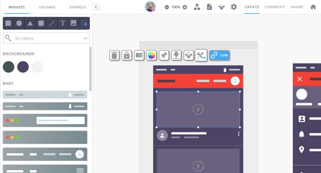
It is crucial to understand one thing – Rapid prototyping is a process for understanding your users. Your early prototypes aren’t meant to look polished and responsive. Low-fidelity prototypes made with a simple pen and paper or a basic prototyping tool don’t necessarily have to be jazzed up to appeal to the stakeholders at this stage. When testing in your internal user team, make sure you test core features (using such dashboards) that matter to the users. Then use the insights gathered at this stage to polish up the more advanced formal design.
This is also a great opportunity to mitigate differences of opinions when your design concept is deviating from the stakeholder’s brief. You can use both your design and the stakeholders’ design as variants to see which one impresses the users better.

A rapid prototyping cycle does not have to prototype the entire product. Whether you are testing on a beta community or launching your product to the public, the fact remains that users have distinctly low attention spans and little to no tolerance for complexity. Even at the testing stage, beta users won’t even complete the test if they feel put off by a longish process. Your internal team may be kinder to you, but that’s hardly the point.
Keep your prototypes short and specific. A 3 to 5-page prototype is long enough in most cases. Don’t include pages in the prototype that aren’t being tested. Strictly eliminate anything that will distract users from the outcome you are looking for. At the advanced stage prototyping, of course, you will have to test the entire flow, but that can wait at the low and medium fidelity prototype stage. Only include screens that are critical to the current round of usability testing. And that brings us to our next point –
At first, this may sound contradictory to our goal of prototyping quickly. However, planning multiple rounds of prototyping, as often as every day and every week will help you keep a close tab on changes in user behavior dynamically. It will also let you adapt quickly and evade major changes in the development stage. In the long run, short bursts of rapid prototyping will help you save time and stay flexible.
User insights are the lifeblood of your prototyping process. Rapid prototyping helps you gain insights into user behavior and perceptions early on; allowing you to adapt the design elements while there’s still plenty of time. Dynamic user insights throughout the process are a great tool for designers as opposed to advanced prototypes that are more suited to engineers. Sprinting head-on into designing and unleashing all your best creative work all at once might sound like a good idea, but may lead to trouble if your one high-fidelity prototype doesn’t do as well as intended and you need to strip away a ton of elements to redesign. Use rapid prototyping to avert such outcomes and also save time on the overall design process.
Author Bio:
Jaykishan Panchal is a content marketing strategist at MoveoApps, a Mobile app development company.He enjoys writing about Technology, marketing and industry trends. He is a tech enthusiast and loves to explore new stuff.