Software development is fundamentally about creating connections between entities. Sometimes we specify one or more relationship between the connected entities. Creating content for the web is no different and also involves making connections between entities; a hyper-link is basically a connection between two or more web pages - Tim Berners Lee explains the underlying connectivity of a hypertext web much better here.
However, as users create this common connection type the “link” is usually unseen - the actual connections are not displayed visually - instead, we hold this map of connections in our mind’s eye. Displaying and manipulating connections is central when creating sitemaps and flow diagrams but it is rarely used as the actual means of creation for prototypes of websites or apps. However, designers tend to think in visual terms so shouldn’t the web of connections that we create be visual?
David McCandless with his talk “The beauty of data visualization”
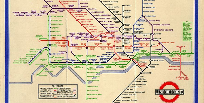
Another relevant example: https://en.wikipedia.org/wiki/Tube_map the original London Tube Map. Designed back in 1931 by an electrical engineering draftsman Harry Beck (in his spare time while he was laid off due to staff cuts) the London Tube Map presents a set of complex connections possessing many relationships between many different entities in a simple abstract manner. Also take a peek at this great overview of metro maps around the world.

Original London Underground Map designed by Harry Beck in 1931
A common visual language is established to indicate tube stations, interchanges and the various rail lines are differentiated through a combination of colour and line style (the latter not introduced until some years later). Harmony is achieved through limited use of vertical and horizontal lines with 45 degree diagonals and roughly equidistant spacing between the stops. The majority of less relevant real-world geographical information is removed to reduce noise and the complex winding tracks are straightened out in an electrical schematic / topological style. Overall this is a sublime example of how to display complex connections between many entities with clarity and therefore rightly takes its place as a true design classic, has been adopted around the world as the standard for presenting transit information and quietly enriched the lives of millions since its introduction. But what does this tell us about prototyping you might well ask?

This map of Facebook connections is revealing
The principle of uniform connectedness is the strongest of the Gestalt Principles concerned with relatedness. It refers to the fact that:
Elements that are connected by uniform visual properties are perceived as being more related than elements that are not connected. As with the principle of proximity, uniform connectedness causes us to perceive groups or chunks rather than unrelated, individual things.
More specifically in this case…
In practice, uniform connectedness is quite simple: draw a box around a group of elements and you’ve indicated that they’re related. Alternately, you can draw connecting lines (or arrows or some other tangible connecting reference) from one element to the next for the same effect.
Some specific examples are discussed in detail here
Human perception is governed by relationships; how things are similar or dissimilar, how they contrast or blend with one another, and how arrangements of things suggest hierarchies and are affected by context.
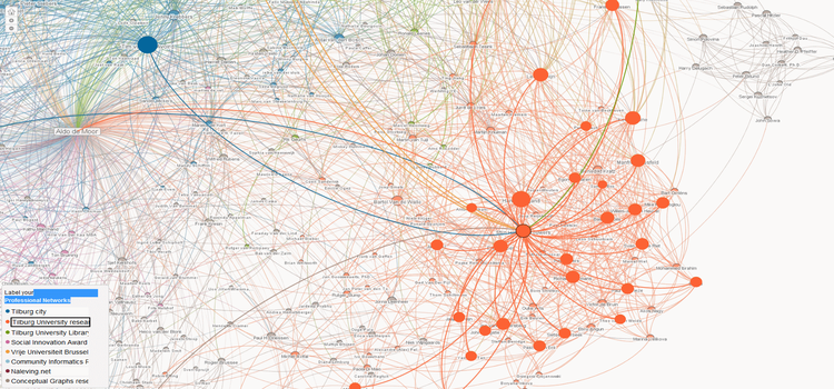
An important reason to display connections is that there is significant new information within the patterns that connections make. Take the example social graph from Linked In below, new patterns emerge within the connections - groups, relationships, information not otherwise clear is revealed.

Would this social graph make sense without the connections?
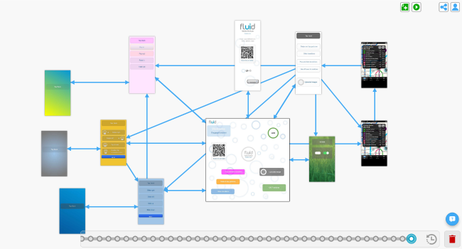
In a much simpler way, we have introduced these ideas into Fluid UI - a visual connection can represent a hyperlink between two pages, a parent to child relationship between a template and a page or an instructional relationship between two elements on the same page. The point is that as far as the user is concerned, all are connections of a kind and the method for creating them is roughly the same.
Displaying connections, allowing users to easily create and manipulate those connections, we believe, will result in a more intuitive and faster overall workflow and lead to better design decisions. By seeing these connections we can better understand the flow between pages and how each page relates to the others - seeing the entire prototype as a whole. When making connections is as simple as joining the dots… everyone can play.We look forward to handing Fluid UI over to you soon so you can see these ideas in action for yourself. We have a lot more to say about this idea so expect new related posts in the months ahead. If you have not done so - access Fluid UI here.

Timeline Review in Fluid UI