I met Andrei Gomes when I worked for one of the biggest school chains in Brazil, in 2011, coordinating a post-graduate course about digital media. Besides being a designer he was also my manager. One day I sent him a document with text in green (which I had added) and in red (my suggested edits). He got back to me asking to make sure to highlight my changes and my suggestions. I thought it was a joke and told him he should see the red and green parts. That was when he surprised me with his answer: “the problem is that I am color blind for red and green colors”. I was totally shocked! How could a color blind guy be such a great designer?
At the time he convinced me (and changed my prejudiced point of view) that he could be a perfectly good designer, and actually a great one. Many years later, this week in fact, I decided to write about accessibility for the Fluid UI blog, I thought it would be a great time to talk more about the subject with him:
Andrei: Design is a way to follow a work methodology focused on results from the conception to the final product. It’s about solving problems in creative ways with research proposals, assumptions, creation, testing, validation and user participation.
Andrei: Well, I guess like most people: I decided to be a designer during my childhood. Every child is creative by nature and has a huge learning ability. And like all other children I liked to draw. It was an interest that I carried over into my teenage years. playing video games and watching cartoons is natural for any kid. I grew up in the 90s and technology fascinated me. The first computer I used was a PC 386 which belong to a neighbour. We played Carmen Sandiego and Doom. So I got it into my head that I wanted to work with computers (not even knowing what design was yet). Later on, during my first computer course I had access to Corel Draw. It was version 4. That drawing vector thing was fantastic to me. Then I took a Photoshop class, using the 5.5 version that had ImageReady which let you create gifs. At this time I had no doubts: I had to work with this “thing”. From there it was a natural path. I started working in graphics bureaus and small stamping stores. Then a friend told me about the degree course which I signed up for. I identified a lot with the Web Design and Project Methodology classes. I discovered that there was a position called “Art Director” in design agencies and that became my focus. I wanted to learn more about the job and the skills I would need to learn.
I started by learning about illustration, photography, print production, web and animation, besides studying general knowledge and fundamental understanding of people and their needs. Something that deals with all these topics very well today is Design Thinking.

Andrei: Always focus on the user. Imagine how your product or service will be used and turn this into a value proposition. Then validate this hypothesis by testing. Often, our busy lives in an office will not make it easy to do usability tests and formal recruiting of participants for the test. But we should keep in mind that that’s part of the process. We need to observe and experience the results and learn from them. We should include the importance of the user in the company’s values, this helps to have accessibility and other inclusive concepts included in any kind of project.
I remember when the smartphone started to become popular, I read an article about how people who live in very cold places could use the device with gloves. That’s the kind of thing I could never imagine could be a problem without imagining the situation from the user’s perspective. Knowledge and awareness are some ways to get there. I had the opportunity to create a post-graduate course in Interaction Design and made sure to include a Digital Accessibility discipline to address this exact issue. Simply put, always think of inclusion during the design process, keep things centred on the user from the beginning.

Andrei: Accessibility is a key factor in the digital design process, it’s so important that it’s included in the W3C standards. It has a whole section devoted to this subject, which is the WCAG. This is often overlooked by developers. Many professionals believe that accessibility standards should be directed only at people with severe disabilities. These designers forget that disability has various degrees and types of limitations, they may think impaired is just someone who uses a wheelchair or those who are completely blind, excluding for example those with limited movement and people with low vision or myopia.
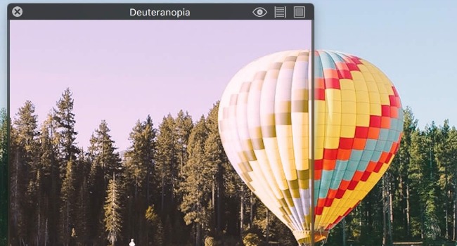
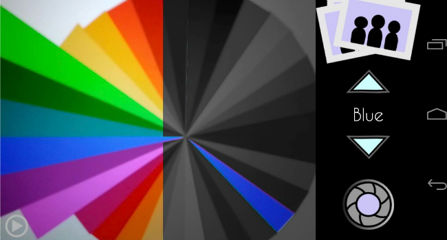
Andrei: Do not consider accessibility in user experience design as developing something contrary to all the principles, methods and rules involving the experience and the design concept. In my case, I have a small visual impairment (myopia and astigmatism) and I don’t consider myself disabled because I have only one of the most common types of color blindness, deuteranomaly. It interferes with green colors. That does not mean I can not see green. But when it’s next to red, which has a frequency of light very close, the information is confused. It is difficult to distinguish between them.
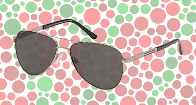
For example, the final of the men’s soccer game in the Olympics in 2016 between Brazil and Germany was decided on penalties. The match marked the count of goals with green and red polka dots. Just looking at the scoreboard I wouldn’t be able to say which team was winning. This was a visual design error/mistake for sure. It may seem an exaggeration, but it is the same when the theatres do not offer subtitles for movies, thus excluding the hearing impaired.
I believe the reason we don’t develop accessible projects is ignorance, prejudice, or believing it will be too expensive, hard to implement or time consuming. The idea is to apply accessibility concepts throughout the whole project and in all stages of planning, design, development and testing. Just as we wouldn’t think of a web project without it being responsive, you can not think usability without accessibility.

Andrei: Well, I never had serious problems because of it. But I almost failed in design college on the Color Theory discipline. The teacher asked for a cutout panel on papers with similar colors and mine, obviously, was a mess. Then I explained that I was color blind and got extra work to make up for the grade. After this case, which was very early in the course, I noticed that most of my work was done with primary colors. Yellow and blue, they were in most cases, the most predominant colors. But we are adaptive beings. I learned to work around this by using the available resources. I studied the CMYK and RGB channels to make the compositions for print and digital materials. Photoshop tools were essential to me. The dispenser has become an essential tool. I was expert in hue, saturation and brightness as well as working with selective color, levels and curves adjustments. When I migrated to the web, it was the turn of Hex. I’d just read the code and already knew the color. I can say that being color blind helped me understand more about the application of color in design projects.
While still in college, I made an artistic design extension course. The techniques I liked most were graphite and ink, for only having to use black and shades. Then I learned to use crayons (for grownups)and enjoyed it. Relearning was fun.

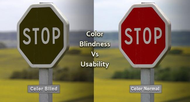
One thing that people always ask me when I say that I am color blind is how I handle the traffic signals. In my city, Rio de Janeiro, the traffic lights are usually vertical, then I know that the bottom color is green, yellow in the middle and red on top. But once I travelled to the interior of another estate in Brazil and there was a light horizontally. Then I didn’t know if the sign on the left was green or red. I just slowed down and went with the flow. Result: the signal was green. I’ve adapted.
Andrei: In fact, color blindness does not interfere with anything in the professional practice of a designer. Anyone can be a designer if they study it. Oh, and do not forget to study the theory of colors really well and use the color Photoshop tools. They help a lot. :)
About the Author:
Andrei studied Graphic design and Ergodesign interfaces. He has worked as a Specialist in Digital Communication Educational Products at Senac School chain where he created the postgraduate degree in Interaction Design. Currently working as an IT Technical Coordinator at SENAI Graphic Arts School in Brazil and UX Designer at Digital Perceptual Agency. You can find Andrei on Linkedin.