Homepage-only syndrome and IA design are fundamentally about solving complex information design problems. Solving any problem requires us to first understand the problem. The key to understanding any problem is to see and understand it in its entirety - to get a high level overview of the major components - free from distracting details - or in other words, to see the “big picture”.
Information design problems tend to centre on filtering and making sense of complex information and then formulating new ways to organise and present that information to the end user so that it can be easily understood and used. This can be a daunting challenge for the designer, with a high risk of information overload unless the right approach is employed - the devil is lurking in the detail.
Take a common example such as web design, often inexperienced designers will tend to jump straight into creating pages and graphics as half-baked solutions to half-understood problems. This most commonly results in problems such as; overly-designed homepage with lots of very dull sub pages sites that lack an overall theme and/or consistency, navigation menus that contain serious structural issues rendering them confusing for end users.
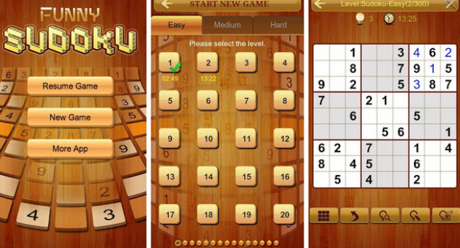
In any case this stuff is bad news, this is only an example, it could just as easily apply to a designer doing android prototyping or working on a iPad app. Instead, think of this phase as a rough sketch - stay out of the detail abyss in the early stages and it will serve you well! So, this idea of seeing the big picture works a little bit like Sudoko.
There are no big problems, there are just a lot of little problems.

In a typical Sudoko puzzle, every row, column and cell is continuously cross-referenced against each other - the available information is used to reach small solutions as more and more is progressively revealed - building to an overall puzzle solution. Or to put it another way, the key to the solution to any individual part of the puzzle comes from the information present (or missing) in the other parts. Dividing a larger problem into smaller, more manageable chunks is a sensible general problem solving technique - not restricted to design but applicable.
Only after first achieving a clear overview should we begin to propose potential solutions to each sub-problem and importantly, always with a constant reference to the overall problem / solution relationship. When solving UI and IA design problems a similar approach is useful - as with the novice designer example, just filling in all the numbers in the first cell of a Sudoku puzzle will not get you very far. Each individual element must be solved by itself (or in small logical groups) but continuously cross-checked with everything else to see how it all fits together within the overall design. The key takeaway is that good solutions emerge progressively and the larger solution is actually a collection of small solutions.
So why does this sort of thing happen so frequently and what role do design tools play? The vast majority of design tools on the market today still tend to focus on individual page design.
Take Dreamweaver as a common example - the user works exclusively on single page designs with the other pages in a given project shown only as a small list of page names on the right upper corner of the interface and available only through menus when linking - to it’s credit Dreamweaver does feature a visual linking tool although it is certainly not the primary method and infrequently used. Also it offers a sitemap feature but again this is not overly useful from the perspective we are talking about here. Basically each page is viewed and edited in isolation from the rest - in an indirect way this leads to the tunnel vision problem mentioned above or at the very least these tools create the conditions that make tunnel vision more likely to occur - the tools do influence the output.
So to recap, it is beneficial to keep a broader perspective on the overall project, “working-up” individual areas in logical groups but constantly in reference to each other and of course, the “big picture”. This problem overview concept is central to working up various aspects of a given design solution in a holistic way. Designing all screens in an app or site prototype with a balanced emphasis, while considering the flow between the screens, has three key advantages:
Below are some screenshots from the Fluid UI Editor and we hope you can see how we are trying to integrate these ideas about “big picture” thinking into our own UI design. Our goal is that it will allow designers to more easily produce better mobile app prototypes and better overall designs. Importantly we are tying to do this in a very visual way - designers are visual creatures, so this approach feels right.
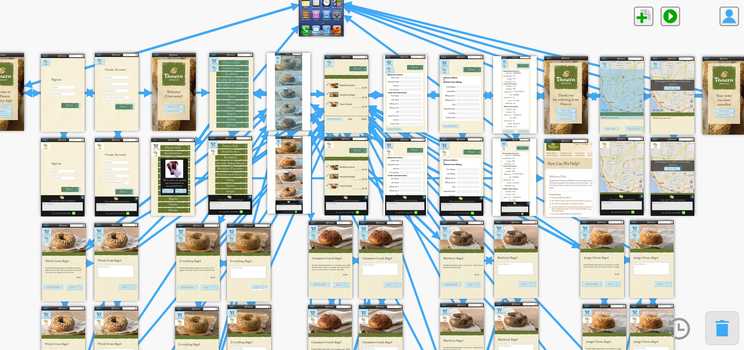
You can view many more UI mockups and screenshots taken from the Fluid UI Editor on flicker. Also, Dave recently stumbled upon this excellent article from HBR - it touches of some similar issues (in a somewhat tangential way) but you may find this interesting if you have gotten this far. So, as always we love to read you comments.