I watched the latest Apple launch presentation yesterday, eager to see what updates they’ve been brewing up and whether these updates will have much impact in terms of how we think about designing on the iOS platform.
With the recent release of the iPhone 6 and 6+, iOS designers are still getting used to dealing with a broader range of screen sizes and updating their workflows to deal with these effectively. Thankfully, the amount of designer affecting changes in iOS9 are relatively few, with added functionality available to be used in the operating system but not necessarily any new looks, feels, resolutions or design standards to integrate this time around.
That said, their new updates were quite extensive and give a lot of new flexibility and power to people designing and developing for the Apple platform, particularly when thinking about cross platform functionality (as long as it remains within the Apple ecosystem of course). Below are the key highlights I felt came from the presentation and any initial thoughts I have on how designers can start to integrate them with their thinking.
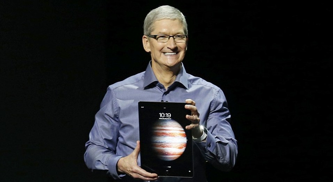
iPad Pro

- A new, larger screen iPad - coming in at 12.9” and 2732x2049 pixels resolution (meaning 264 DPI resolution, just like the iPad Air).
- The same 4:3 screen ratio as previous ipads, presumably meaning older apps should be backwards compatible.
- The iPad comes with 2 new accessories - a separate keyboard that combines as a cover (similar to many Windows 8/10 tablets) and a stylus (the Apple “pencil”) that comes with a lot of built in features that can measure position, force and tilt and should allow users to interact with their touch screens in a far more accurate way for apps that support it).
- It is also possible to use the stylus along with other fingers to create multi-touch gestures.
- Split screen functionality: The new iPad/iOS9 can split the sceen and show two apps on screen at the same time. With a demonstration from Microsoft (including a much more receptive reaction from the crowd than once, long ago), efficient workflows can even be created by copying and pasting between the different apps in a beautifully seamless manner.
Overall, looking at the iPad Pro, my sense is that the line between the iPad and laptops in general is smaller than ever before and that Apple is really targeting a more professional audience with this release. The 3 demo presentations, from Microsoft, Adobe and 3D4Medical (all providers of productivity software) would support this.
Apple TV

There were big announcements for Apple TV this time around, with significant new functionality added to both Apple TV and especially the remote control, now dubbed the “touch remote”.
- The remote adds Siri voice recognition, an accelerometer, a gyroscope and a touchpad that allows fast forward and rewind type functionality within menus. It also reminded me strongly of the Wii controller in terms of other exciting applications it could be used for.
- The Apple TV dongle itself is vastly more powerful, and can run high performance games as well as many other types of apps.
- Integration with other Apple devices is now much stronger too, with the ability to share work between different devices coming to the fore and multiplayer gaming being possible with people connecting iPhones to their TV as well as the remote control in order to use them as controllers.
- Apple TV will have its own app store and will run on a new operating system called tvOS - designers and developers can create apps for this new platform right now (and no doubt start integrating their existing apps to the new platform too) - the development needed as always for Apple products are in the latest xCode release.
Overall, I expect to see far more cross platform apps that work and share data between the different parts of the Apple ecosystem, from starting a game or piece of work on an iPhone, to continuing it on iPad and finishing it on you Apple TV, all these things are now possible.
iPhone

- The new iPhone adds “3d touch” - a new force sensitivity input mechanism and can recognise lighter and heavier force as well as normal taps. Light taps give previews of linked content, while holding for longer or pressing more will launch into a link. For example, a link to a website in your email could be light tapped to get a preview without leaving your mail, and properly tapped to launch the link.
- Using the new input, app icons on your homescreen can now offer functionality shortcuts without needing to fully open the app. For example, if you wanted to send an email, you could open the shortcut menu on the homescreen of your mail app and select “send email” - making your email workflow a small bit more efficient.
- Most of the rest of the functionality improvements relate to Apple specific software as well as improving durability and speed of the hardware. Great for making things run fast and look good, but nothing major in the area of rethinking the UI or design of apps or any other design workflows.
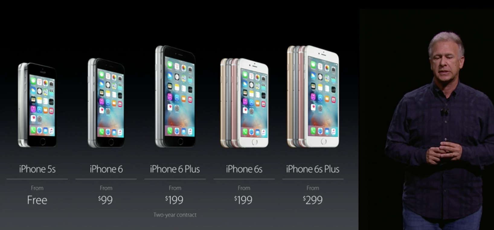
- Finally, Apple also launched what can only be described as a “hardware as a service” type approach to buying their phones - now you can pay a monthly fee and get an annual iPhone upgrade to the latest models.
Overall, nothing too significant here, a couple of nice touches, but the improvements this time around were more around hardware and speed rather than anything else. Apps will still need to be backwards compatible, so while the new functionality might be nice, they aren’t going to replace any existing UI approaches that people are familiar - rather they exist to add an additional layer of flexibility to those who have the latest model of iPhone.
Apple Watch

- Apple watch is still a relative newcomer in the Apple pantheon of products there were relatively few big announcements here, though they have progressed with a number of integration and functionality with other devices and software.
- Apple WatchOS 2 will be released on the 16th September.
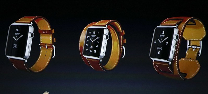
Other than that, there were some new strap colours (including a partnership with Hermes), but I think it is safe to say Apple are watching an learning before taking the next major steps here.
Conclusions
Overall, the new TV controllers and Apple’s vision of being able to share content between different parts of the mobile, tablet and TV ecosystem is really starting to become a reality with these recent releases. I’m definitely excited to see new areas of development (like apps for TV, easily designed in Fluid UI already) and I’m especially looking forward to seeing how the new input types such as force touch and the TV controller allow new and interesting interactions with the software we design.
