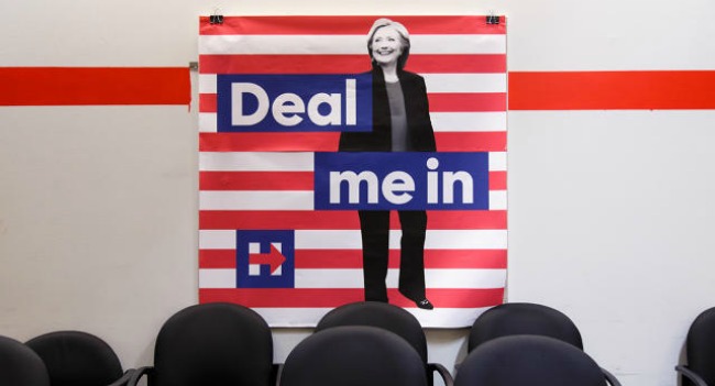
#UX in a nutshell: making things for people. Those people aren’t you.
— Visual Logic (@VisualLogicUX) August 19, 2016
In an earlier post I spoke a little bit about the websites of the candidates for the US primaries. User experience is as much about what you expect to happen as how it happens and in this respect UX is a fundamental part of the current US election campaign.
The candidates have taken it a step further in the last month with the release of two apps that they hope will engage their base. In this post I want to take a look at those apps and at some of the other apps in this space but I want to begin by looking back to where it all started.
In 2012 Obama launched one of the most sophisticated social media campaigns which integrated his app with Facebook. Among other features it made sure that those who signed up for the app got personal emails from President Obama:
@TimWilsonBarrio after using that app I now get emails from Obama. Makes me feel important, crucial to his reelection even.
— Lily Richards (@semanticsxyz) November 6, 2012
Two years later with the President happily back in the Whitehouse the app was shut down as concerns over it’s privacy grew.
Facebook integration was a hugely important part of the reelection campaign for President Obama. But, it was only one part. What was even more impressive from the point of view of a UX designer/ researcher was the level of detail that went into the design of the app. Tate Strickland is a designer and educator who is based in Seattle and he was tasked with the design of the Obama reelection app.
This was a sophisticated and more importantly user friendly app which reflected the type of President that Obama is. It was so good that it won an award from the Interaction Design Association
Usually the product UX moves forward, becomes more evolved and responds more and more to what the users want. If we look at Obama for America app we see a stylish app that has been fully thought out and gone through numerous iterations.
The app provided a smooth UX with features that made people feel important and engaged.
It was an app which was thoroughly designed from start to finish. This was not an app that was put together at the last minute:
Jump forward 4 years to the 2016 campaign and you would have to wonder if we have been in some sort of time warp or sucked into a wormhole.
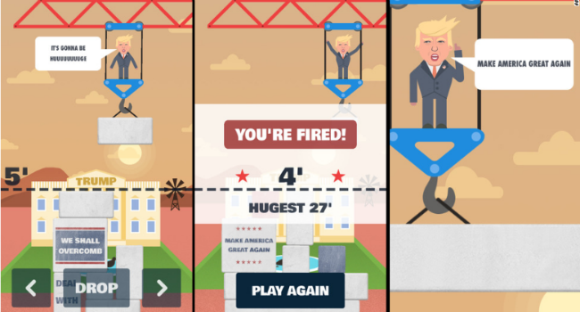
Ok, that’s not really Trump’s election app. But it is one of the many games/ apps that have sprung up over the last year.
The really shocking thing is that Trump did not have an app to start with and it was only when Hillary launched her app that his team seemed to realise the importance of having such a weapon in the election toolkit.
And even more shocking, though maybe I am just too easily shocked, it appears to be more focussed on promoting the Trump brand and in particular the TV show which Trump has more plans for the next four years than just running the country.
It’s surely a coincidence that that also happens to be the title of the show that brought Trump back to national prominence, as is the fact that Trump reportedly asked NBCUniversal for permission to continue hosting The Apprentice if he won in November — because he has priorities, and as this app makes clear, marketing The Apprentice ranks highly among them.
What is equally shocking to an innocent like myself is that the amount of time people put into designing apps and games with the number one objective of aiming ridicule at the candidates.

“Note that this is a parody and should not be taken seriously. All characters, names, and events in this game are fictional and do not represent personal views”.
You have to love the disclaimer at the start of the game. It was a disclaimer right. Cause Hillary and Trump are not parodies at all?

Back to the serious stuff, are the apps any good? How do they rate in terms of user experience for example?
Donald Trump released his app a few days ago and it seems to have received a mixed reaction.
FastCoDesign provided a pretty scathing review of the app:
The kindest thing that can be said about the America First app is it’s at least doing better in the App Store rankings than Trump himself is doing in the polls. (“What polls? All of them.”)
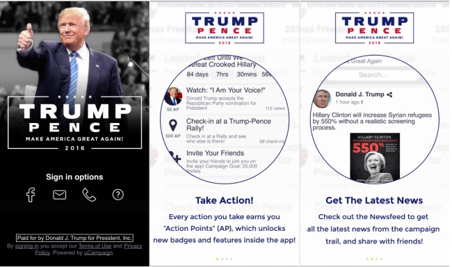
The most obvious difference for me between America First and Obama for America is that one is a polished and well designed app and the other is just a bit rough around the edges. The company that created America First — uCampaign — came to prominence when they were part of the Ted Cruz campaign in Iowa.
One big difference is the style. Look at thirteen23 who were the design team led by Strickland in the design and development of the Obama for America app. Compare it with uCampaign. It really does look like you are comparing a very refined and thoughtful idea with a rough and rugged piece of technology. Maybe that’s what Trump was going for, but from the point of view of UX it falls down massively.
It falls down for one simple reason: Obama for America made people feel part of something that was bigger than themselves and which promised a better future. The design of the app, the UX, the features all pointed in that direction. The problem with America First is that it seems like a game. There is a sense of the gameshow about the app and this is clearly part of the design. But, from the point of view of the user, can you really buy into someone who is more interested in gameshows than in building a better America. To quote another great President (Zaphod Beeblebrox):
If there’s anything more important than my ego around, I want it caught and shot now.
That is one reason why some serious design flaws may just push Hillary over the line.
I’m not sure how much better designed Hillary for America is but my first impression is that it provides a better UX and this derives in a large part from a better design. But, it is also less confused. While Trump uses design to hedge his bets:
Build me an app that will get me elected Presidents of the United States of America while at the same time promoting my TV show.
We seem to be veering into an alternative universe where reality shows have taken over and real life is something that we used to live.
In contrast Clinton turns to Facebook to help her win her campaign. She does not really run as sophisticated and as well designed a campaign as Obama (maybe such is not possible) but she did borrow from FarmVille.
However, it is the more thoughtful and inclusive design features which stand out in the Hillary campaign. They are there in the app and they are meant to make people feel part of something.
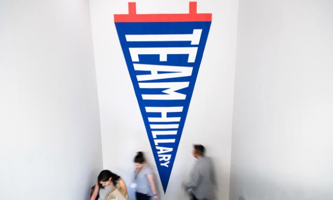
Design can be a powerful tool when put to the right problem. Making Hillary Clinton appear likeable is a tough design task and they have succeeded. The power of design was never more apparent to me than when looking over the apps and games related to the US election.
