With the hype around the Apple Watch reaching a crescendo this week, we’ve been thinking deeply at Fluid UI about how the latest product from Apple will affect interaction design, and how (once again) we’ve a whole new category of interface design challenges to encounter, learn and solve.
Apple have recently confessed that their beloved iPhone is “ruining your life” - but luckily they’ve managed to come out with a magical solution to the problem - the Watch. Whether moving some of the 150 interactions we have with our phones each day out of our pockets and on to our wrists will help us rebuild our lives is still up for debate, but there is no doubt that Apple wants us to build our UIs around short, quick interactions with the bulk of the more engaging and time consuming interactions still intended for when you take out your phone.
The design paradigm of the Apple Watch is therefore that we shouldn’t expect users to use it for long periods at a time and that all of our interactions and designs need to be time and content limited.
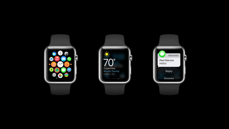
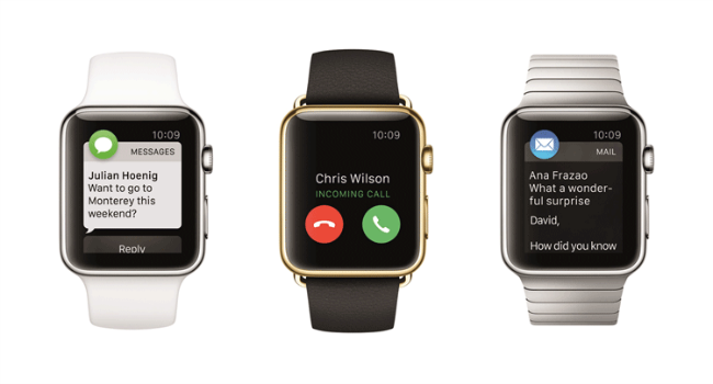
One of the key features of the Watch is the ability to manage notifications without having to dive into our pockets every time we feel the slightest (sometimes imaginary) vibrations. These notifications will come in all forms - mails, alarms and meeting requests and from all manner of apps. While being able to react to notifications without taking out our phones might seem like an advantage - being able to manage what notifications you get will become incredibly important. For example, I might want Twitter to tell me someone has replied to a direct message, but I sure as hell don’t want to be interrupted by a tap on the wrist telling me that one of my followers has decided to follow someone else. Currently, my phone does both on a regular basis.
Lesson: Giving fine tuned control over notifications from your apps will be important.

Interacting with the Watch must be in the form of short interactions (ideally 5 seconds or less) to be enjoyable. Any longer can become uncomfortable quite quickly - just try holding your arm up for 30 seconds as if you were looking at your watch. It can get painful.
Lesson: Don’t cause your users discomfort by putting the right interaction on the wrong device.
Mobile First was a design approach that helped to improve the quality of UI design for a new category of users who were increasingly working with smaller screens and touch screen interactions. The benefits of this approach were simplified, more targeted UIs that better solved the needs of mobile consumers. By adopting this approach, we learned that the level of complexity in a given UI had to drop a level to be maximally usable by mobile enabled users.
Given the level of UI sophistication had to drop when going from desktop to mobile, there is another order of magnitude jump needed when designing for the relatively miniscule Watch screen. Now interactions are even more limited - to the point of quick Yes/No interactions with a drastically simplified presentation of relevant decision making information. If we had to make cuts before, we need to make giant slices now.
Lesson: Vastly simplified yes/no interactions, swipes and far more limited space to present information relevant to the user’s decisions means even more simplified interactions.
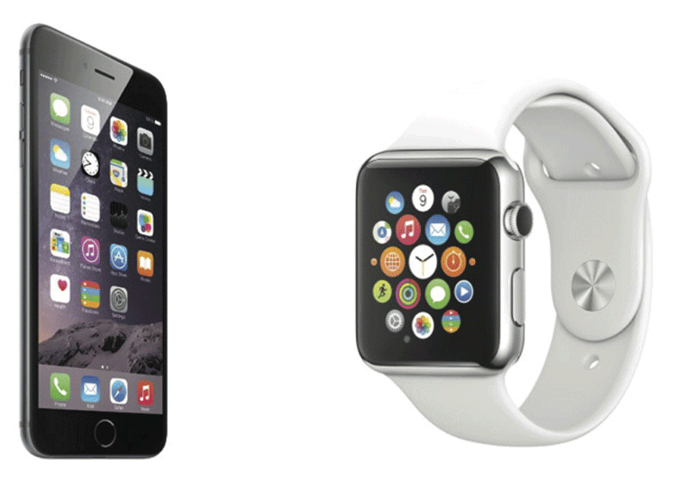
The Watch needs a connected iPhone and should be viewed more as an extension of the iPhone UI and not a device that functions in its own right. Interactions can happen on one or both devices, and choosing the right interaction on the right device at the right time is key in creating incredible Watch experiences. Many of the basic watch interactions - including installing apps from the App Store - are done through the iPhone. Take a leaf from Apple’s book here and make sure the right tools are being used to deliver the best user experiences using the right medium.
Lesson: Design in tandem with the iPhone, not alone.
Many of the interaction paradigms that Apple have brought us over the years do not apply to the Watch. “Pinch to zoom is impractical” (say Apple in their own design guidelines) - and it is sensible to conclude that all multi-finger swipes, taps and gestures are undesirable and result in a poor user experience.
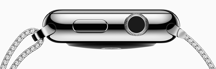
At a short count - there are 15 or more ways to interact with the Watch. From touches, force touches, swipes, looks, Siri, and the digital crown, there are plenty of ways to make our apps work.
Force touch can replace the double click and tap-hold type interactions in providing secondary options for many user actions. Scrolling and zooming are now handled by the digital crown, ensuring your fingers are not covering the screen as it moves.
Lesson: Some interactions are new, but most are similar to and are likely to replace older, similar interactions