Modern mobile and desktop users expect their sites to load and run like lightning. Therefore, a good UI or UX designer needs to have a complete understanding of the range of options available to improve the speed of your site and consequently the enjoyment your users get out of using it.
Any user who has access to high speed internet connections on either desktop or mobile will expect their actions on your website to be completed within milliseconds.
Milliseconds matter:
So there is no question - improvements in speed not only have a significant effect on the level of your user’s engagement, but any slowdown has a direct and measurable impact on your company’s bottom line.
Understanding a user’s expectations is also a hugely important part of delivering a service they deem to be fast.
While speed is hugely important, your users aren’t only concerned with speed in and of itself. Their expectations and prior experiences also play a huge role. Put simply, if a user expects something to take a longer period of time, they will be more patient about waiting for it. We can use a number of approaches to manage user expectations and hide latency issues while making them believe that the experience is moving faster than it actually is.
Using actual speed improvements and immediately communicating with a user about their actions has the best result when looking to improve a customer’s perception of whether your site is fast or slow.
There are 6 areas you need to have a basic understanding of to improve the likelihood your users will deem your app or website to be ‘fast’. The first parts are technical - to make your web app faster by knowing what your server does and how websites load. The second part consists of cosmetic and UI tricks - making it appear faster than it actually is.
Let’s start with making your site faster.
Use tools like website speed test to give yourself an initial overview of how fast your website is performing.

Make sure your site does not have any unnecessary redirects, as this can cause a delay of 200-300ms or more.
Make sure cache headers are set properly to ensure files are not re-downloaded when your user returns to your site.

Make sure every file that your website needs is well optimised and that no unnecessary files are downloaded.
A webpage typically consists of one HTML file, one or more JS and CSS files, a number of images and possibly some custom fonts (which are often quite large).
Optimise images using Photoshop’s save for web or pngcrush.
Ensure redundant CSS, javascript and HTML is removed and minify all code.
Reduce the number of files downloaded. The dev team should be using tools like browserify to eliminate additional javascript and CSS files. The front end team should be using spriting to reduce the number of images and find out what formats images are best saved as.
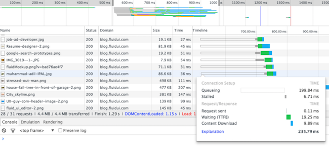
Stop your files being delayed by queuing them up before downloading. Most modern browsers allow 6-8 concurrent file downloads. If you want to download more than a certain number of files from a given website domain (e.g. www.fluidui.com), some will be queued until others complete. The exact number of parallel downloads you can make of this type depends on the browser:
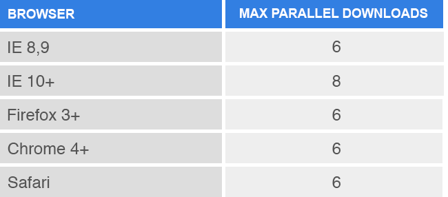
Use multiple domains if necessary, to increase the amount of parallel downloads you can make (this can have other speed benefits too).
Your webpage loads as follows:
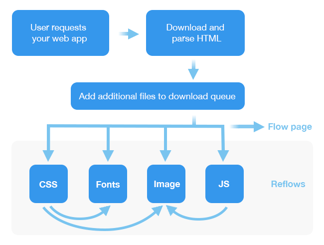
Your website will begin to draw itself as soon as it has enough content downloaded to flow out the page. Files that arrive later (such as additional CSS files or images) may cause the browser to do a reflow, updating part or all of the screen and often causing an undesirable jump (particularly if your user has scrolled down the page a bit).
Get the HTML and the CSS files to the user as a first priority as these define the look and the feel of the site and let it draw.
Load javascript last and don’t rely on it to show or hide parts of your page. To test this, disable javascript in your browser and see if your page loads with the same look/feel is it would normally do.
It may be worth having some inline JS or CSS to start files downloading in the HTML. That way they can load concurrently with the CSS file and don’t need to wait until the CSS file is downloaded and parsed before being added to the queue.
Tell the browser how big an image is going to be on screen to eliminate the visible ‘popping’ reflow when an image of an unknown size finishes loading.
At this stage, your site is downloading as fast as it can and Google should be giving you a really good PageSpeed score. Getting your web app to your user is only a small part of the overall problem however.
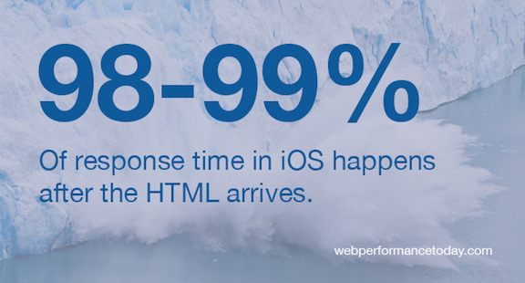
It’s time to focus on making sure the quality of the in-app experience is deemed super fast and won’t frustrate your users.
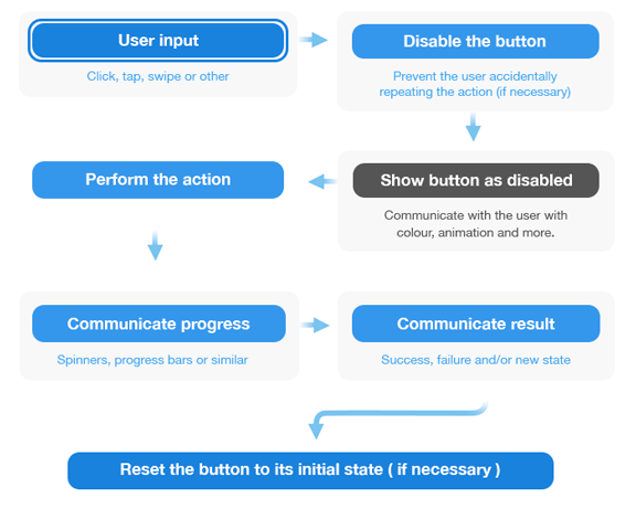
The first priority when responding to a user’s action is to communicate with the user that their action has been triggered. The second priority is to actually perform the user’s requested activity.
There are 7 stages to handling a user’s input:
Optimistic actions occur when the UI acts as if the action has succeeded, even if it is yet to be confirmed by the server.
Performing actions optimistically allows your user to continue working in your web app without being interrupted by latency and is hugely useful when delivering real time and low risk of failure actions.
For example, neither Instagram nor Facebook wait for the server to confirm a ‘Like’ action before updating your UI. Instead they assume it will be successful and immediately apply it on your device. Separately, they attempt to communicate with the server to confirm the action, after which time it is finalised and distributed to other users. This allows you to continue liking and scrolling, without interrupting your flow by forcing you to wait till the action you have performed has been confirmed by the server.
Sometimes, information needs to be sent to the server and a response dealt with before the user can continue on. This is common in forms, or when loading new pages or content that has not yet been stored locally. There are a number of tricks available here, to both set the user’s expectations and make the UI look like it’s busy making things happen. How we handle this can dramatically impact a user’s perception of speed, regardless of how long it takes.
Prompting the user to wait for their action to complete while giving a constant visual sense of progress will improve the perception of speed in your product.
These techniques will improve how responsive the user reports your website to be.
Use loading animation bars and spinners to inform the user that processing is happening.

Under-promise and over-deliver on loading times. Make the loading bar load slower at the start and faster at the end. Under no circumstances allow it to stop or delay, particularly towards the last 10%.
Backward moving progress bars and pulsing bars are shown to give a user a faster sense of progress.
If loading happens in a short period of time (under 300ms), consider just relying on animations and no progress indicator. Showing a loading screen for a brief period, followed by the content, can actually result in users thinking the loading process is slower than they would have thought without the loading animation.
Dummy placeholder content can be used to give a sense of progress while the real content is loading that mimics the look, feel and shape of the content that will be loaded into the area.

Finally, start showing page transitions immediately after the user action has commenced. There is no need for content to be returned to the server before starting to show a page. A slide in followed by a content fade in for example can create up to 200-300ms of an animation, giving you plenty of time to process a user’s request and display it.
Just because a user is now enjoying your content doesn’t mean you need to be idle. You can be busy loading the next screen while your user is browsing the content they have just loaded.
In most cases, when a user is on a page, we know what they are going to do next to a very strong degree of certainty.
For example, when a user visits FluidUI.com, we know that roughly 55% of people click on the ‘try now’ button, 15% of people go to demos and 10% of people go to the features page as their next action. We can start preloading the contents of the most likely next pages while the user is still exploring the current page. For 80% of users, this would mean that the next page they visit will already be loaded before they click on the link. From the user’s perspective, the page loads instantly.
You can use the Google Analytics behaviour flow to show where your users enter your site, and what their likely next steps are on each part of your site.
Improving performance on a site can take a lot of time and effort and it is critical to focus your efforts on the right problems first.
Your users could be complaining about load time, about in-app responsiveness or because the site is displaying a huge amount of data or has some extremely complicated rendering. They lump all these performance issues into one single user complaint - “your web app is too slow”.
In order to fix the right problem, you must first identify which area of performance is the one users are most unhappy with. That means getting out and hearing from those users, then feeding that information back into your development pipeline and resolving those issues for your users. That’s the fastest and most important tip to make your web app faster.