Sometimes bad UX gets in the way of design thinking. As a result design thinking is replaced by firefighting and dealing with angry customers. This is a wicked circle from which many companies never escape unless of course the company goes bust.
Design thinking is an essential tool for simplifying and humanising. It can’t be extra; it needs to be a core competence. - Jon Kolko
I was on the way to London for a week long course in ‘Design Thinking and Innovation’ with the Future London Academy. The aim of the week was to get a greater insight into how design thinking can be incorporated into a variety of diverse projects. For example, we went to the University of the Arts to hear about a project being run there:Design Against Crime. Before, spending the week with the Future London Academy, I would not have thought that design thinking could have such an impact our daily lives. After the week there, I could not imagine any project that would not benefit from some design thinking.
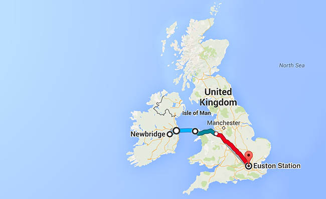
In keeping with the theme of the week I decided to begin by challenging myself to a bit more time with my thoughts. So rather than taking the short flight from Dublin to any one of the London airports, I took the ferry from Dublin to Holyhead, followed by a train from Holyhead to London Euston.

For one thing this was a trip which I had never made before. I had been to London once but that was years ago when I was a student and I had taken a flight from Dublin to London. This was going to be a very different experience including about three hours on a ferry and followed by a four hour train ride. So, I would have lots of time to think and prepare for the week in London.
We’re addicted to distraction, and it’s holding us back. To find genius in the 21st century, we must build a discipline of unplugging and deep thinking. - Scott Belsky
Taking the Ferry and train has some immediate advantages when it comes to thinking. Both are a little more laid back than travelling by air. Not only is it a more relaxed mode of travel, the very way in which train creeps through North Wales seems to signal at a more divergent way of thinking. In addition, the train journey from North Wales to the South of England is very pretty as it hugs the coastline passing through picturesque towns such as Colwyn Bay.

But, it also has the advantage of affording you time to stare out the window. In other words, it gives you the opportunity to unplug yourself from all of the distractions that have become part of our daily lives. Usually, there are emails and messages and even the odd phone call getting in the way. So, to be able to sit back and go off-line was going to make a nice change. The last time I had taken the train from Holyhead I was going to Sheffield. The train, on that occasion, did not have any internet access at all. This was a bit difficult to deal with at first. But once I got used to being off-line it became an enjoyable experience.
‘Virgin’, he told me ‘have some nerve charging for wifi’.
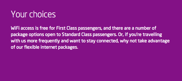
On this occasion, however, my attempt to unplug was rather short-lived because of a conversation which I had with a fellow traveller: ‘Virgin’, he told me ‘have some nerve charging for wifi’. With all of the naiveté of an Irishman abroad, I asked him what he meant. Apparently, first class customers had complimentary wifi but everyone else had to pay for it. Suddenly, and without any conscious decision, my whole attitude changed. Up to that moment, I was more than happy with my experience on Virgin Trains.
So, it was a bit odd to find that there was wifi on Virgin trains but that this was an add-on for which you had to pay. There is one exception which may reinforce a major difference, on the surface at least, between the UK and Ireland. If you are travelling first class then you receive complimentary access to the wifi. It is at times like this that I put on my UX hat and think about the user experience on Virgin trains. There are some positives. You can for example log on to their website, without having to pay extra and find out some details about the train which you are travelling on. I am, however, neither an engineer nor a train enthusiast so this aspect of the website did exactly enthral me.

What does the design of this particular UI tell us about Virgin trains and their customers. Well, in the first place, it would appear that Virgin train customers are prepared to pay for wifi access onboard.or, at the very least, they are prepared to do without it. I am not sure which.
Second, it would seem that Virgin trains have embraced the same model which has become the norm in airports and other transport companies which is that the main function of the company is to get someone on board (the ferry, train, plane) and then charge them exorbitant rates for everything.

Some of you may not have heard of POLA before you started reading this blog post. It is a general design principle which basically states that:
People are part of the system. The design should match the user’s experience, expectations, and mental models.
I had come across the POLA principle while reading another article on expectation and user experience. The article like the POLA principle was simple but very convincing. In essence honesty in marketing will lead to a more seamless user experience.
We know WiFi is high on our customers’ priorities and we’re delighted that we’re going to be able to offer them free and super-fast WiFi. (Patrick McCall, Virgin Trains Executive Co-Chairman)
I found these articles because I was researching user expectations and how it impacts on UX. As it turns out, it seems to have a rather large impact.

There are actually a lot of posts about the UX of travel. Everyone of them relates to the design of various websites and none relate to experience in the real world.
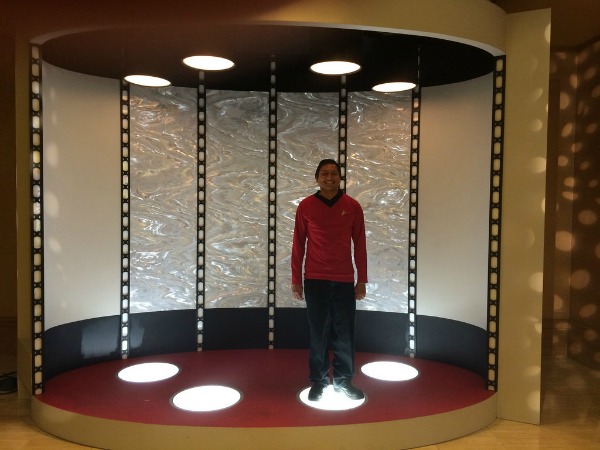
We must, at least until the invention of the transporter, continue to travel in the physical world. Oddly enough there are no posts about the CX of travel . The train from Holyhead to London costs about £95; the cost of wifi is about £4.95 per hour. So without doing any complicated maths it is easy to see that the cost of the wifi represents a pretty small portion of the cost of the trip. To the extent that I can guarantee that I would not have thought any worse of Virgin trains if I had to pay £99.95 for the trip with free wifi included. For a pretty small ROI Virgin really irritates a lot of customers. Why exactly would they design a customer experience in this way? The simple answer is that they did not design a customer experience, they designed a means to get an audience onto their train in order to sell them things.
This lack of CX was highlighted by an error in the reservations system. All of those paying customers who had booked a seat in one particular coach now discovered that they no longer had a seat. They eventually found some seats elsewhere but no thanks to the Virgin staff. Systems error seems to be a wonderful way for any organisation to absolve itself of any responsibility for mistakes which it makes. Like elephants, customers tend to have a long memory and ought to be treated with a little more care and even humanity.

 |
Brian is part of the communications team at Fluid UI, a design tool used for early stage product validation, UI design and user experience testing.