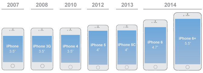
With the advent of the iPhone 6 and 6+, we have now passed the point where taking a PPI (pixels per inch) approach to designing graphics for both iOS and Android is feasible. Instead, an improved graphic design workflow is evolving to incorporate the need for higher quality graphics without the overhead of additional asset creation and management.
</style>
Where it all began
Once upon a time, the iPhone had a single screen resolution - 320x480. Then came the iPhone 4 and with it the “Retina” screen - doubling the number of pixels on both the width and height to 640x960 and quadrupling the level of detail required in the assets needed for them. Creating images for retina screens became known as creating images “@2x” resolution.
The number of images that were required doubled, but the added overhead of the new workflow was not too significant. Images could be designed and exported for the higher resolution phones while sizing them down for the older models. Existing apps would still work because the original assets would automatically be used if the higher resolution assets were not available.
The iPhone 5
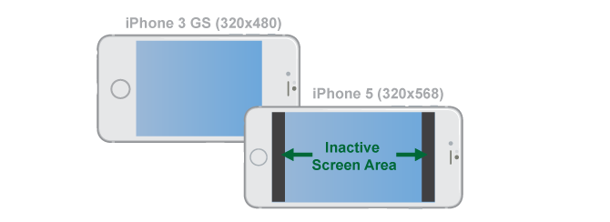
Next, the iPhone 5 came along with a taller screen. Apple once again put a lot of effort into ensuring backward compatibility was easy for designers and developers alike. If you didn’t specify how to handle the larger screen size, the phone would automatically use the older resolution and disable part of the screen to ensure old apps still worked properly. In addition, it was only the height of the device that changed - the pixel density and screen width remained the same. This made the transition to the larger screen size more than palatable for most designers and developers.
The iPhone 6 and 6+
With the release of the iPhone 6 and 6+ however, a much larger jump in the work required to create assets has been added. The iPhone 6 comes with a larger screen and more pixels, though the pixel density is the same as previous models (326 DPI). The iPhone 6+ however has an even higher resolution screen than retina (“Retina HD” or 401 DPI). A third set of images is now required to display optimally on this device - a new, higher resolution set of images at “@3x” resolution.
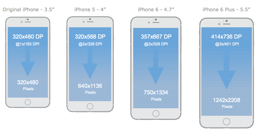
By releasing two new phones at the same time, each with different screen sizes and different pixel densities, Apple have increased the complexity of designing for iOS devices more in one short release than they have for any of their previous releases.
One more thing
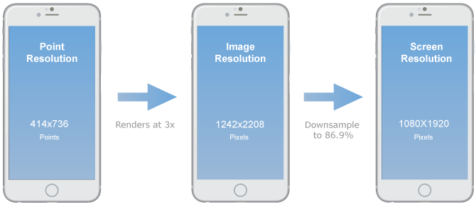
The iPhone 6 also creates one final problem that needs solving. It is the first iOS device to require graphics saved at one size that are displayed on device at a different size. The iPhone 6+ device resolution is 1920x1080, but it requires graphics saved “@3x” of its point resolution - 2208x1242 (three times the point resolution 414x736). Behind the scenes, the phone itself then downsizes them to fit the exact size of the screen.
How can we minimise the time needed to create all the required graphics while maximising productivity and creativity? As it turns out, Android has had this problem for quite some time and it’s worth looking at how they have addressed the problem.
There is a broad set of guidelines about what what constitutes what on different device types. Android applications should have scalable layouts which should never be sized in pixels but rather “density pixels” (almost identical to iOS “points”). Their official documentation states:
The density-independent pixel is equivalent to one physical pixel on a 160 dpi screen, the baseline density assumed by the platform. At run time, the platform transparently handles any scaling based on the actual density of the screen in use. The conversion of dp units to screen pixels is simple: pixels = dps * (density / 160). For example, on 240 dpi screen, 1 dp would equal 1.5 physical pixels. Using dp units to define your application’s UI is highly recommended, as a way of ensuring proper display of your UI on different screens.
Android categorises by width and aspect ratio
The current guidelines for developing Android apps define a means to create flexible layouts where each layout that is defined in the application is bound to an arbitrary minimum required device width. This classification can then be used as a base for defining a list of screen sizes by combining it with most popular aspect ratios (5:3, 16:9 and so on).
These generalized sizes and densities can then cover a wide range of actual screen sizes and densities. Android abstracts these differences away from apps so you can use the general sizes and densities for your design and let the system handle the final adjustments.
Android defines six generalized sizes/densities
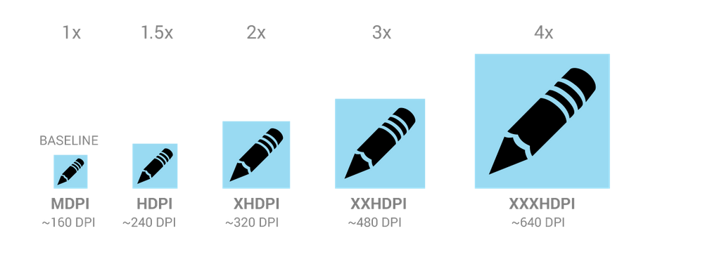
Like iOS does, Android automatically reviews the available assets and will search for the highest resolution available and automatically scale it to suit the exact device dimensions using a similar downsampling approach now in use for the iPhone6+. The densities that are currently used for are as follows.
By saving graphics at these set sizes, Android can support a broad range of screens without troubling the designer for an unsupportable level of device and resolution specific images.
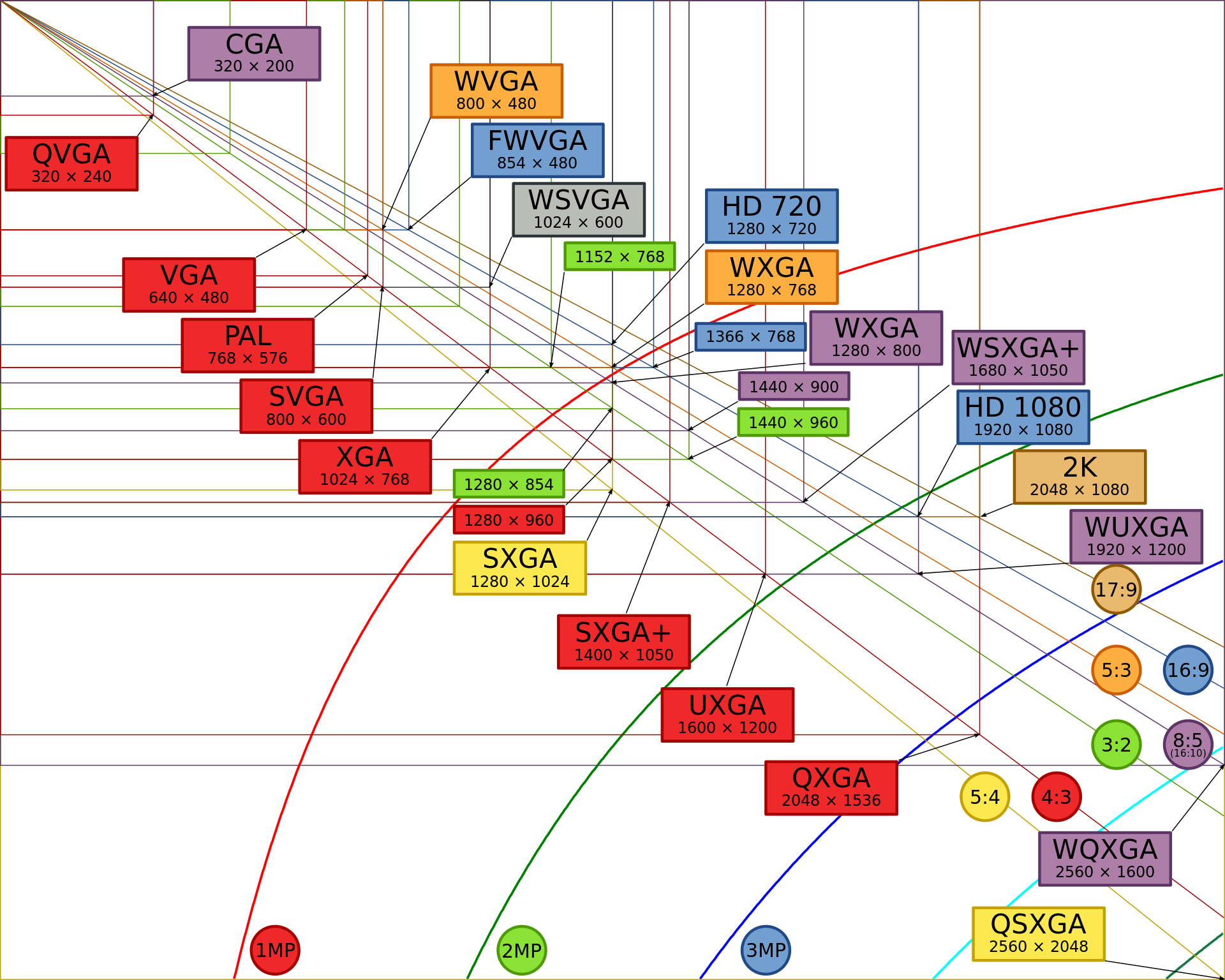
In hindsight, it was inevitable that iOS screen resolutions would fragment, if only at a slower pace than Android. But iOS designers can simplify their workflow with some of the techniques developed by Android developers in the recent years to handle their fragmented environment effectively. Scripts and plugins for Photoshop and other tools are beginning to emerge that help designers manage their assets in a simpler way, meaning more focus on design and productivity. Two such examples include solutions for Photoshop and Illustrator.
I started this post with a view to understanding the current changes afoot between designing for Android and iOS. Fluid UI will be switching to DP/point approach to maintain our goal of been a fast, fun prototyping tools for all manner of mobile app ideas. If you haven’t tried it before - check it out and let us know whether you think it matches your app design/prototyping needs - I cant wait to hear from you!