Building trust in your brand means more people will feel confident sharing their payment details with you. They’ll feel confident that your products are quality and reassured that if something does go wrong, you can be trusted to make things right.
If people think this way about your brand, you’ll receive more conversions because there are no barriers or doubts to stop people from making a purchase.
For many digital businesses who live online, their website or application is the main touchpoint for consumers. This is where they interact with a brand and form their opinions of it. Of course, social media, online advertising and other forms of communication can shape this too, but your website is your best opportunity to inspire trust in visitors.
For online businesses, UX makes up a huge portion of the overall brand experience. No matter what kind of image you are trying to build for your business, you’ll want to be seen as a trustworthy brand. But according to research from Havas Media, less than a quarter of brands have the trust of their prospects.
Here are 6 ways to use UX to build trust for your brand:
Whether we like it or not, we all judge a book by its cover. A high-street store with a dirty window or an old-fashioned decor isn’t exactly going to inspire confidence in consumers. Online, your website’s appearance has a similar impact. And while many UX designers may feel that usability should be the primary focus, if a site doesn’t look right, users will see this as a usability issue.
User experience research group Nielsen Norman describes this phenomenon as the aesthetic-usability effect. Meaning users tend to perceive attractive products as more usable. They consider things that look better, work better - even if they don’t.
2012 study by Google also suggests users will judge a website’s design in 50 milliseconds - before they even start using it. So it’s worth investing time in picking a great color scheme and look for your website to keep users on the page long enough to be impressed by its actual usability.
A positive experience experience on your site is the first step to building trust with consumers.
Be consistent with your design, colors, fonts, language, and tone. This will build trust with your audience and provide them with a smooth journey on your site. This is where a style guide can come in handy.
You want the guide to be as simple and as easy to implement as possible so keep this in mind during the initial design of your branding. Try to limit the number of fonts and colors you use.
Templates and brand asset management software can help everyone in your business stay on-brand. And don’t sacrifice consistency when you need to create landing pages, as this will make for a bumpy customer journey.
Beyond this, do everything you can to keep your design and content consistent with brand values. People can spot a brand that isn’t authentic. If you’re not living up to a stated promise or value, this can compromise trust. Instead, consider how to communicate your values through the UX to build trust.

Panthera, an organization for conserving wild cats and their habitats, is great at communicating the brand’s mission through its content and non-intrusive design.
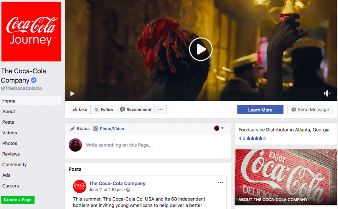
Keep your message consistent across all marketing channels and where possible bring your brand’s design elements to social media, so users recognize it as yours and know they’ve found the right page. Coca Cola is particularly good at this.
In a 2016 survey, 94% of consumers stated they would be loyal to a completely transparent brand. So how can you promote transparency on your site?
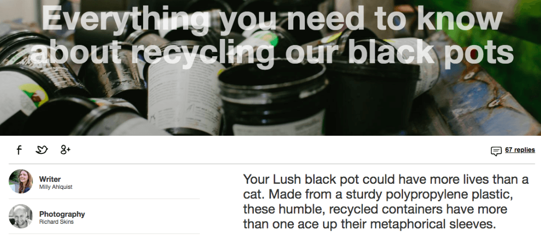
Share information on what your products are made of, where they’re made and whether or not they are recyclable. Even if you’re packaging isn’t recyclable, visitors will be more trustful of your business if they can find this kind of material on your site.
Cosmetics brand Lush has set out a clear environmental policy on its site stating its aim to get rid of packaging altogether. But it also provides information on how to recycle the packaging it does create.
Even a simple thing like using branded links can promote transparency and improve the user experience. Because branded links allow you to customise what comes after the slash, you can indicate to users where your link will send them. They also know a brand wouldn’t associate its name with spam or malicious content, so are more willing to click-through. This promotes trust, transparency and can significantly boost CTR.

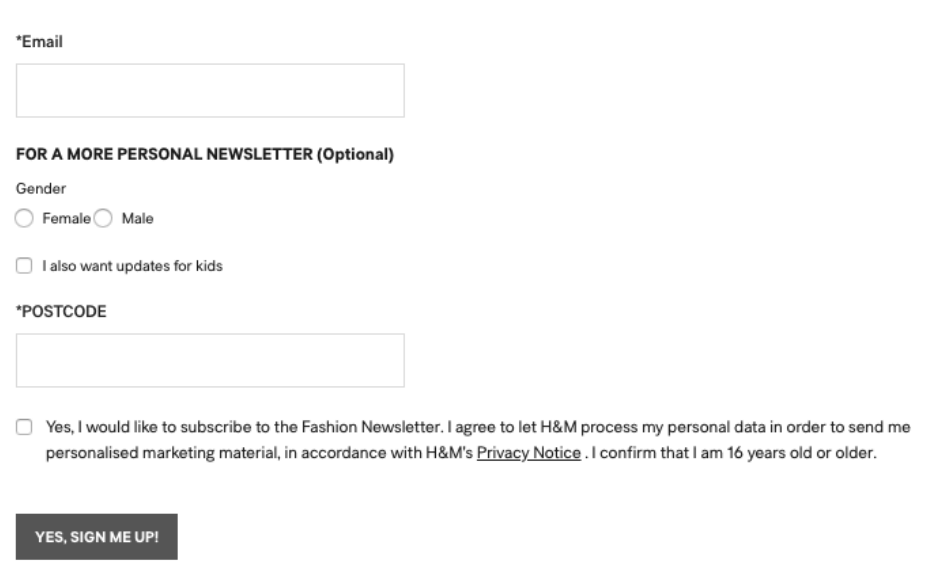
Another important point of transparency is around what your site does with users’ data. When users share data, let them know what you will use it for.
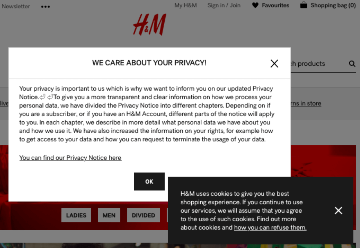
If your site uses cookies, make sure you let visitors know. Do you need to provide a privacy notice? Think about how to present these disclaimers. Do you want users to physically opt-in through a pop up. Or do you want a more subtle fixed footer or header?
Cookies are often about improving user experience, so don’t ruin it with a badly designed notice.
H&M’s newsletter subscribers are told exactly what their data will be used for (above). But the site also bombards visitors with cookie and privacy notices.
As well as letting people know what you’ll do with their data, build trust by sharing yours. A survey from 2015 found that 44% of respondents would leave a vendor site which has no contact information, while 54% said it annoys them when this information isn’t provided. So make sure to make your details available to users.
This is an important aspect of UX, particularly if you want to drive conversions.
Installing an SSL certificate on your site will increase trust in your brand and make for smoother user interactions. SSL certification provides secure, encrypted communications between a website and an internet browser. This ensures users’ data is kept private as it travels across the internet. Often users will check if a website is https:// - indicating it is secure and has a certificate - before entering personal data. It indicates that they can trust your business.
Providing this secure connection to users has become even more important to online brands in recent months. As of last October, Google displays a warning when users enter text in a form on an a unsecured http page.
There are also a number of website secure seals you can use to boost trust, but familiar brands like Visa, Mastercard, PayPal, Norton, and Google are some of the most trusted seals that people want to see when paying online.

Most consumers trust the word of friends, family and even strangers over marketing from a brand. So use social proof to borrow trust from others and grow confidence in your brand.
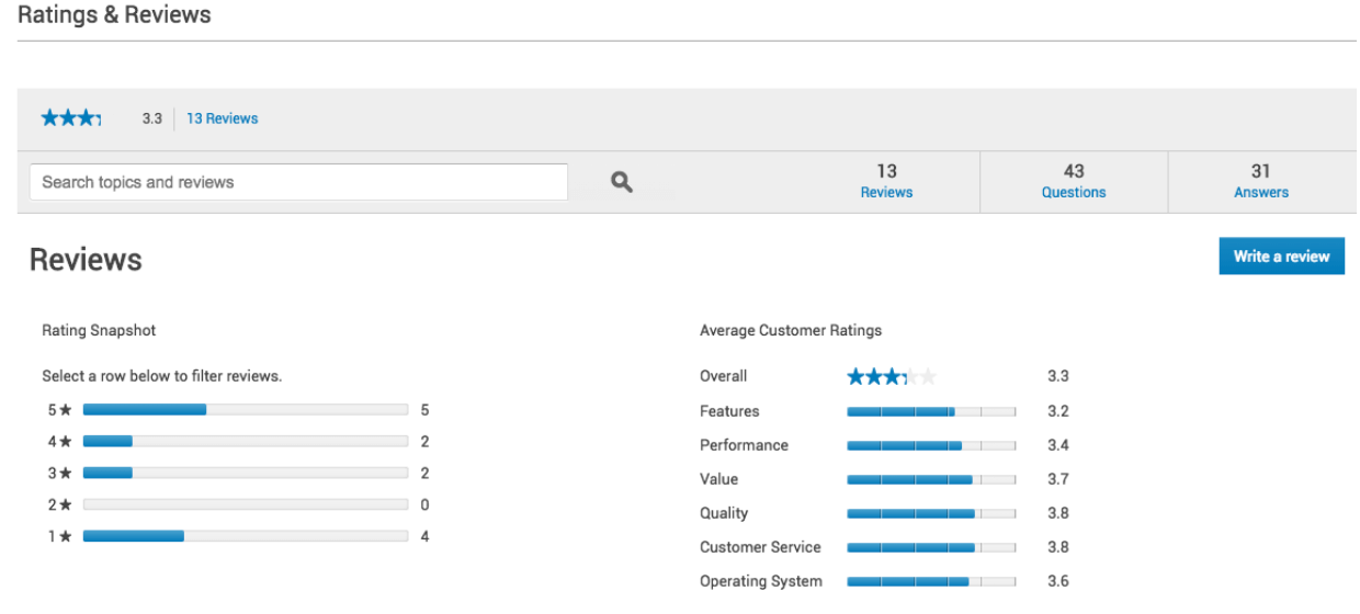
Like Amazon, consider giving users the ability to review, rate and provide product feedback on your site. Check out the below example from Dell.
Leverage anyone who uses your product to build trust with prospects. On your website, include testimonials from customers and influencers. Feature the logos of some big brands who use your product or service. Or, like accounting software Xero, highlight the number of people who have already signed up.

Users will trust a brand and feel better about buying from it once they see other people are doing the same.
Many prospects don’t feel comfortable buying from a faceless brand, so build trust by showing off the team behind the brand.
Zappos have always been known for showcasing its company culture through staff videos and other insights into its workplace. At the moment, the ecommerce site showcases ‘Inside Zappos’ on Twitter, Instagram and Facebook, as well as on the about section of its website.

But businesses don’t need to go quite that far to show off their staff and build trust with their audience. A candid behind the scenes photo or a well thought out ‘Meet the team’ page will turn your brand from a faceless entity into a colorful, welcoming and trustworthy business.
Don’t use stock photos. Instead, opt for photos that communicate showcase your team, the company’s culture and brand personality. Also consider providing your teams’ social handles. This will inspire trust in the same way that featuring your business’ contact details will.
The below example from UK manufacturer Qube Total Solutions shows how you can communicate your brand’s personality through a ‘Meet the team’ page.

Great user experience and trust have a lot in common. A consistent, effective user experience will build up trust and positive associations for your brand. Smooth navigation on your site will let users know you care about their experience. While demonstrating transparency, social proof and a customer-focused approach to business in your design can help with this too.
Author Bio : Louisa McGrath is a content manager at Rebrandly, the URL shortener empowering marketers to put their brand’s name on all the links they share. She can be seen blogging around Dublin city center, except on Sundays when she stays in to pore over the newspapers.