We’re lazy, we’re damn lazy and we’re really busy. We don’t make the best choices - we’d rather just muddle through a process. We don’t take time to figure things out. We’re creatures of habit. Your thing is just not important to me. - Steve Krug.
Before we had even finished sitting down to talk to Dave Power from hiri.com, he was already asking us to use our imaginations.
Imagine, he said, you’re on a ship that’s just been hit by an iceberg. You’re floating dead in the water. It’s the dead of night, water is gushing ominously towards you, the ship slowly tilting and preparing to dive to its final resting place. You’ve got five…maybe ten minutes before you’re dumped into the freezing water from which you have no hope of surviving.
Luck is on your side however. You’ve gotten to the last lifeboat. You peer through the dark to the instructions sheet as the emergency lights flicker and begin to dim. All you have to do is figure out this set of instructions and you’ll be safely on your way to living another day.
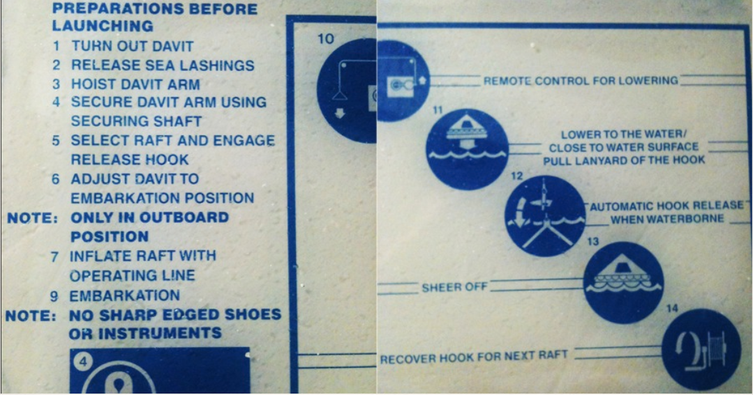
I think I’d probably end up diving overboard and taking my chances. I don’t know what a Davit arm is. I don’t know where the embarkation position is. I’m definitely not going to check whether my shoes have sharp edges or not. I’m just hoping I don’t bang my head on the rudder when I’m falling towards the water.
Dave’s passion for design might start with a morbid touch, but at least he’s caught my attention. He launches into nine fascinating insights he uses to shape how he thinks about design.
Before you start any project you need to have a definitive picture of the user you are designing for.
In order to create great experiences for people, you need to know what’s going on in their heads. You need to understand what motivates them and what terrifies them. You need to create personas and map out your users’ lives. You need to find out how they think and what makes them tick. Only then can you create a design that is really easy to use, has an impact on your users emotionally and makes them want to keep coming back to your product again and again.
If you have to explain a system, chances are, it’s already broken. If you have to give your users a list of instructions on how to use your product then it’s really not working.
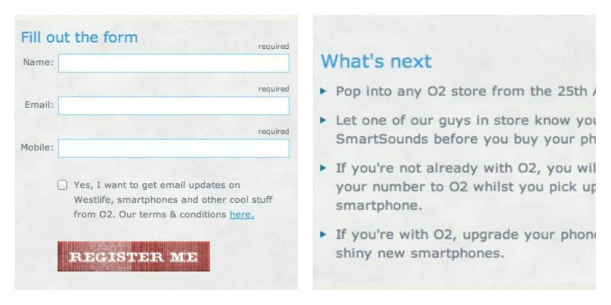
The form below is from a website I was required to design a number of years ago. The user filled out the form and then I had to tell them, in a detailed list, what to do next. This kind of thing happens when an organisation isn’t joined up and everyone is in a different silo. In this case I was in marketing, I was working with a product manager who wanted to deliver an in-store promotion and who needed the digital team to implement the on-line redeem feature. The optimal user flow couldn’t exist simply because the teams never sat down in a room together and they never made a plan to keep everything connected.
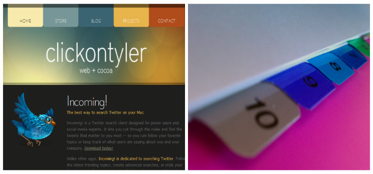
We are creatures of habit and we like repeated patterns, things that we recognise and even have an emotional attachment to. For example, the tabs on a website are the same as the tabs you would be used to seeing on a folder binder, so we already know how to use them.
Remember that people learn from their experiences and the easiest way to make your user understand your product is to make it work in a way they’ve already experienced.
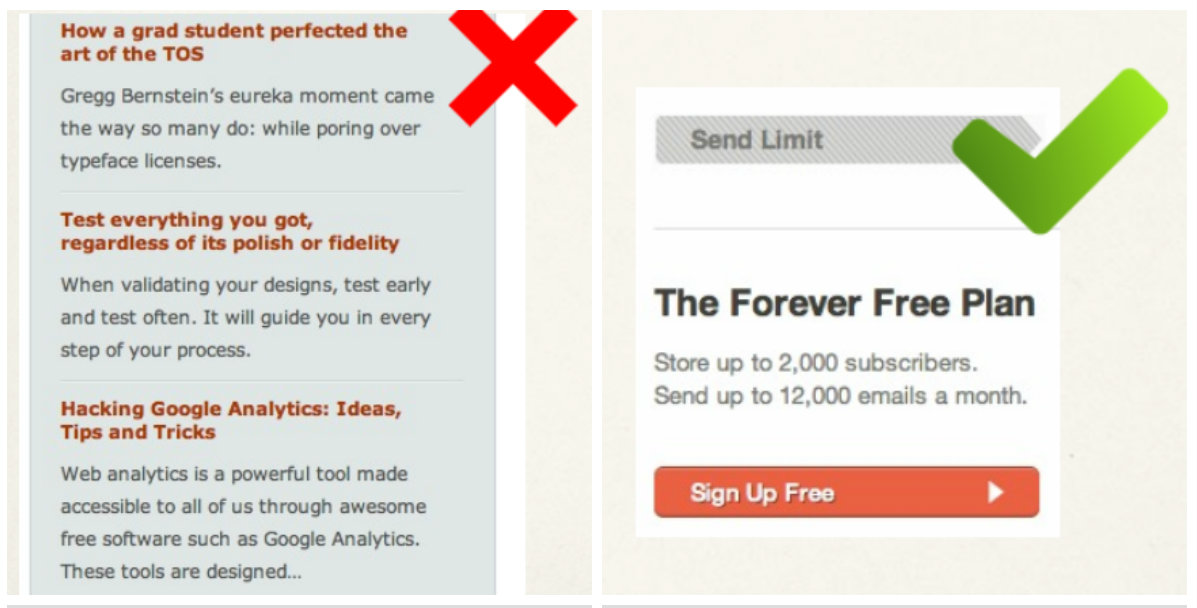
A simple concept that thankfully has become better understood over the last few years. Clear, simple calls to action help users to understand the flow they should take through an application. There is no benefit in adding complexity. Human short term memory works best with 2-3 pieces of information at a time, so if you want to get someone to take an action on a page just show them that action in a really simple way.
We like to try and disguise UX as science but in reality it’s art. After 15 years of experience it’s still really hard to predict how a user is going to interact with a system. People still surprise me every day. That thing you thought was super easy to use, someone will still do something completely different with it.
You could carefully plan everything on the prototype, put in loads of extra things you’re sure people will interact with on the page and then test and experiment. You have ideas as to how people are going to interact with your website and then you look at the data and it’s completely different to what you predicted.
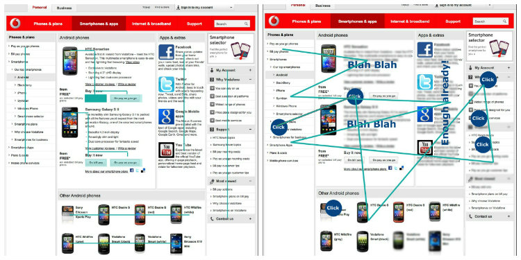
A couple of years ago when I was working on a mobile website we needed to find out what people were doing on this website. We used gaze trackers to find out where people were looking when they got on the page and monitored their interactions. We then gave them a specific task to complete, for example, buying a phone or going to the support website. We then waited to see how they would interact with the website in order to carry out that task.
What we found was they clicked everywhere and looked around the whole page. There was just too much stuff on the page and it was confusing. The page had over 70 navigational options at once. The users just gave up and started clicking wildly all over the page.
When you visit a website you don’t want to read a big pile of text and still not know what the product does. People don’t read lots of text. Instead of writing long paragraphs about your product, create short bites that describe what your product does. Get the reader’s attention and keep it. Remove jargon and use simple language. Use words that are nice or what I call candy pieces.
Always remember that people only hold three pieces of information at a time so anything else is just talking up space on your page. If possible keep text to a minimum and only include the most important information.
Before the internet, people were used to pressing physical buttons on remote controls. Its good to use those conventions in design and simulate those patterns because it’s what people are used to and they’ll know what to do with your product.

Today a lot of design is flat when it comes to navigation. A lot of designers are moving towards a minimal feel and are losing the more human, real life interactions. For example, in iOS8, it’s not always clear what the action is. They are using suggestions instead of clear indications. Apple are paring the look back too much and forgetting about the user experience.
It’s much better to test with real people before going to the expense and time of coding the new features into a product.
Ask people around the office to test the product every time you make a change. There’s nothing worse than not planning properly or not investigating your users’ needs.
People don’t want to be bombarded with choice.
I was working with a phone company a couple of years ago where we made a big mistake because we didn’t do the proper research. We decided to build a price plan builder into the website. It cost over $700,000 to code and in the end we discovered that people didn’t want to build their own price plan.
They want everything handed to them, easy to understand with not too much thinking. We decided on the price plans ourselves and let the user choose between three. This ended up costing a lot less and was appreciated far more by the users. You have to be careful with core assumptions.
We spent 8 months on that price plan builder, with endless meetings with IBM and we had to scrap it. Sometimes, the most successful thing is also the cheapest.

Dave is the founder of hiri.com, a next generation email client designed to help employees save time, organise their day and make them better communicators. Dave is a designer who loves all things tech but tries to spend time outdoors (though not very successfully this year).