When building a new website or mobile application, it’s essential to focus on user interface (UI) and user experience (UX). Nailing both ensures that visitors download the app and engage as intended.
Yet, having strong UI and UX elements is not enough to guarantee a successful website.
Why not…?
Because even the most stylish and modern sites can have security vulnerabilities that will threaten to expose user data (cybercrime hit $1.5 trillion in revenue this year - that’s about the size of Russia’s economy) or take down an entire back-end infrastructure. In fact, the more interactive a website is, the more points of weaknesses it will have.
This article will provide a range of tips for UI and UX developers and highlight some of the common design mistakes that can lead to security problems online.
Before any mock-ups are created or any lines of code are written, your entire design team should collaborate on the security essentials for their new project. During this time, it’s important to review common threats that are aimed at websites and mobile applications and the best practices for protecting against them.
The goal of UI and UX should be to only display the information and tools that a user is allowed to see. This concept of access control must be emphasized by all team members, including those who work at the database and network layers.
When designing an interface, always assume that a hacker will do whatever it takes to manipulate your website or app and expose a flaw. Elements that allow external input, such as search fields and comment boxes, are especially vulnerable and should be secured before any code is published and released.
Web designers use an element known as a cookie to track an individual’s session from a single computer. A cookie is a small piece of text data that identifies the person on a website and allows them to view account information without having to log in each time they open their browser.
While this approach does offer a level of convenience, designers should consider adding login limitations for the sake of security. For example, by setting up a 24-hour automatic logout timer on a website or mobile application, you can ensure your users’ security even if their computer or phone is stolen.

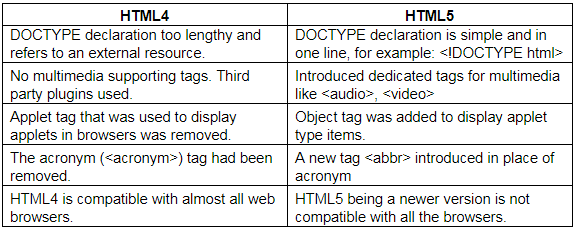
The latest version of the HyperText Markup Language is known as HTML5 and is supported by popular web browsers like Google Chrome and Mozilla Firefox. This update of HTML represents a major shift forward and incorporates a number of new elements that can boost your site’s security.
Thanks to HTML5, web and mobile designers no longer have to rely on the Adobe Flash platform to add native support for audio and video content to their projects. Flash was found to have a number of security vulnerabilities that could allow hackers to extract source code elements and access back-end servers.
Although HTML5 is considered to be the web standard today, it still has certain limitations when it comes to online security. If your website relies on JavaScript code for interactive elements, then you remain at risk for cross-site scripting (XSS) attacks.

Most internet users will recognize the padlock symbol at the top of a web browser as a sign of a secure website. It indicates that the current URL address is equipped with a secure sockets layer (SSL) certificate for encrypting all communication between the browser and the site’s web server.
With a valid SSL certificate, your users can be assured that password entry and credit card payments are secure and cannot be hacked by others on the local network. With so much focus on internet privacy in the news, it’s critical to offer your userbase this kind of protection.
As a UI and UX designer, you may want to go beyond the padlock icon and create another way of emphasizing your site’s security measures. For example, you could add security seals from Paypal and credit card companies to indicate that your company or organization is a trustworthy manager of financial transactions.
Most websites and mobile applications have dedicated space set up for advertisements. Although UI and UX designers primary focus is on the internal elements they are creating they also need to consider the external references that end up in the project.
Designers need to keep in mind that these ad blocks will often point to external HTML sources that could contain links and other interactive content. As a result, they represent vulnerabilities to a variety of common attacks and should be controlled as much as possible. Otherwise your users’ data could be put in danger and damage the company’s reputation in the process.

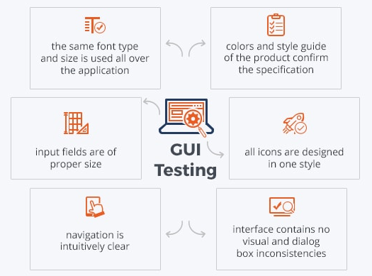
Interface designs are never perfect, and that’s why quality assurance (QA) is a pivotal step in the engineering process. Most web and mobile companies will have a dedicated QA team of experts as well as automated QA tools. Still, the importance of testing should be emphasized among every team and individual contributor.
As a UI or UX designer, part of your daily work needs to be running tests against each element on the website or mobile app. You need to think like a user and try different combinations of actions to see if any sequence will cause unexpected results that could be an indication of a security flaw.
Avoiding regression bugs is a critical concern for engineering teams, especially those with a large number of contributors. A regression bug is any issue or problem that surfaces after a code or design change. UI and UX designers are expected to thoroughly test all new features they release so that the entire organization can be confident that the changes will not pose any risk to end users.
Author Bio :
Sam Bocetta is a freelance journalist specializing in U.S. diplomacy and national security, with emphases on technology trends in cyberwarfare, cyberdefense, and cryptography.