If you have prototyped, designed or simply used iPhone applications you will have noticed that certain screen layouts (design patterns) crop up time and time again. Here is our quick guide to the 11 essential iPhone Design Patterns. All of the iPhone prototype screens featured here were created using Fluid UI - the upcoming mobile prototyping tool - Fluid allows designers to mockup Android and iPhone mobile apps at lightning speed and then easily preview directly on the mobile device.
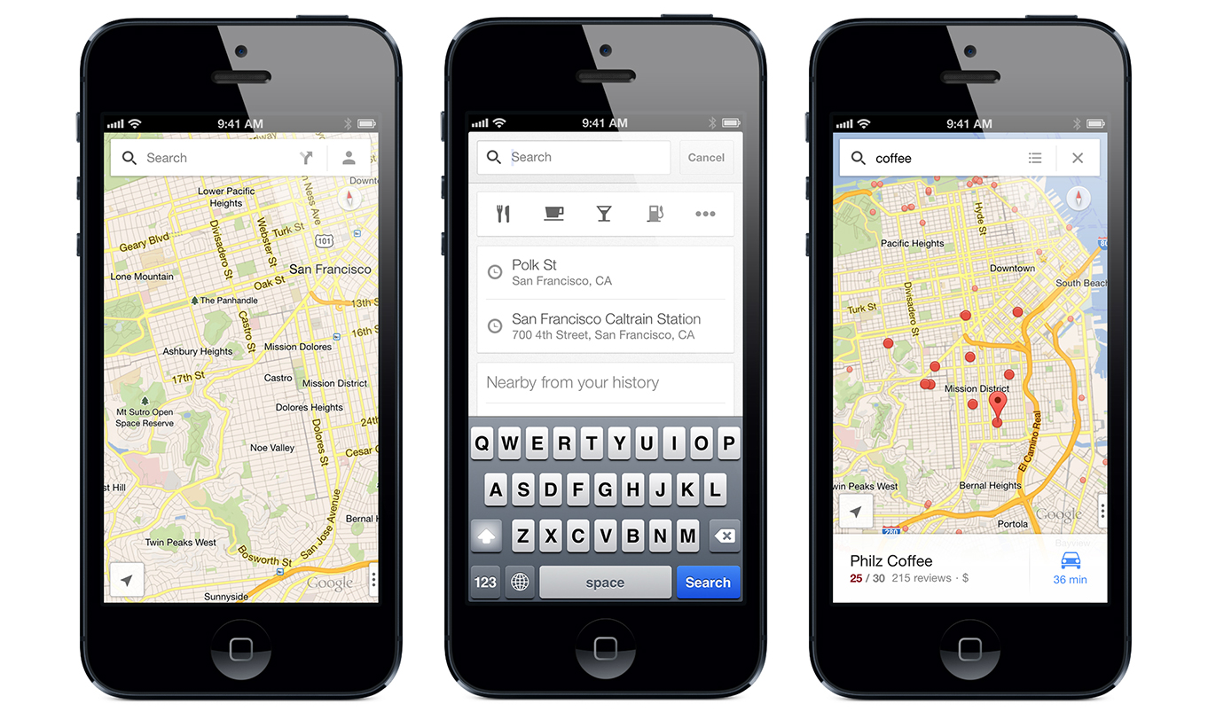
Map screen design patterns are becoming increasingly common with the rise of location based GPS services and applications. The majority of screen space is dedicated to the actual map data which is fully viewable using zoom and pan actions on the iPhone. A red pin indicates destination and a green pin indicates origin. The blue blip icon and surrounding radius indicate the users approximate location and the info panel provides additional information about the selected location.
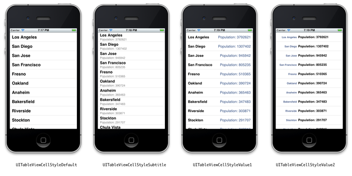
The Table View is one of the most common screen design patterns in iPhone applications. Frequently used to present lists or tables of key application features, contacts or search results. The Table View pattern may contain tabbed navigation at the bottom of the screen to allow users easily switch between multiple Table Views.
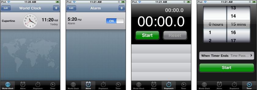
Used to group major areas of an application across two or more pages up to a normal maximum of 4 or 5 tabs. Generally should not exceed 4 or 5 tabs - if more are needed add a “More” or “Ellipses” tab that links to a page with additional tab headings. TabBars offer a simple and clear way for the user to switch between multiple screens without losing their place in the overall navigation.
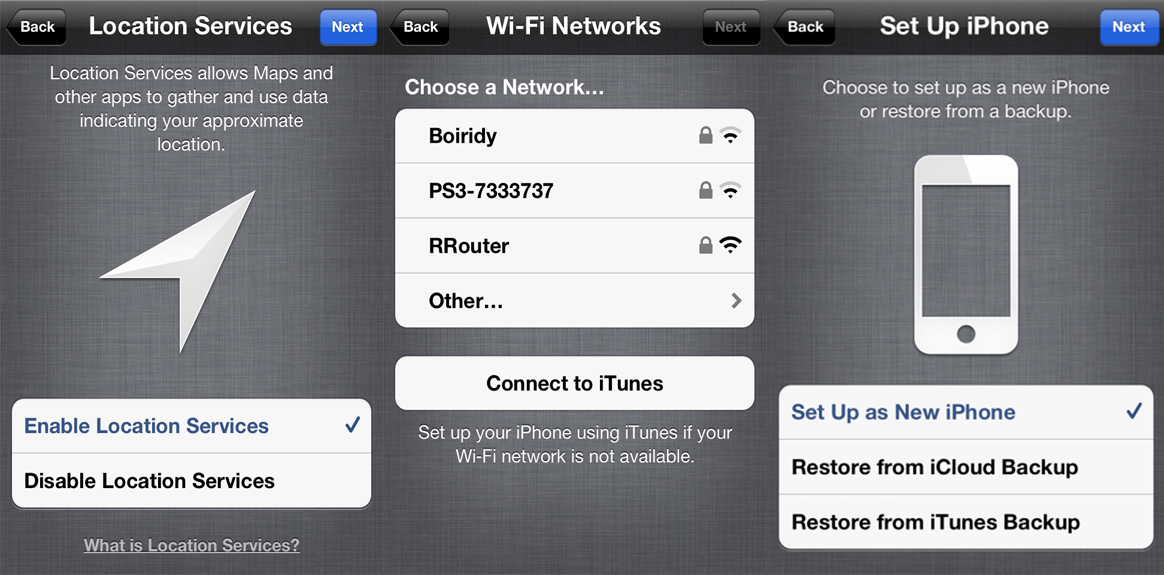
Most iPhone applications will contain some type of settings page. Settings are generally arranged in sensible groups of related functionality.
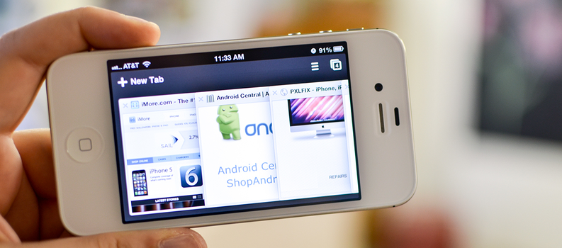
The browser pattern is one of the most generic design patterns on the iPhone. This pattern is reasonably simple considering it allows for browsing of the entire mobile web - all wrapped up in one “epi”pattern. The top navigation bar scrolls with the main page body and tends to fade off screen after a short delay to devote the maximum possible screen space to the web content. Web pages are scrolled to reveal content below the fold and can rotate to landscape orientation if the phones orientation changes.The lower bar contains simple navigation controls and multiple browsers open at the same time.
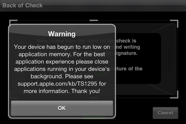
iPhone applications frequently feature some form of alert / notice design pattern. An alert allows the user to permit or decline potentially destructive actions. A notice tends to differ from an alert in that it usually contains only a single acknowledgement action. The background screen area behind an alert is generally tinted or otherwise frozen out to draw a users attention to the alert.
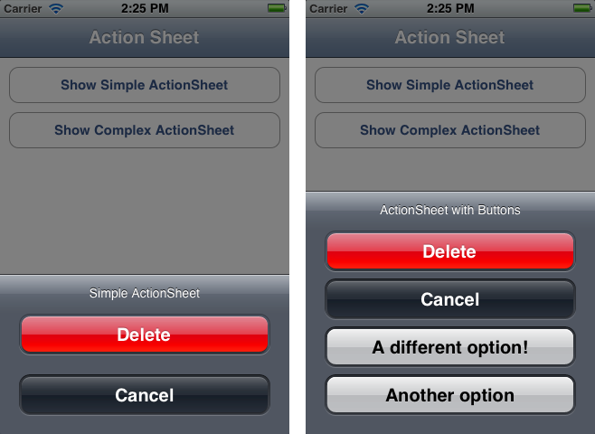
The action sheet is an extremely common iPhone design pattern. The action sheet tends to contain a list of key application options. Primary actions are highlighted with a bright colour (yellow in this case), as are negative / destructive actions (red) and other task presented as regular buttons (grey).
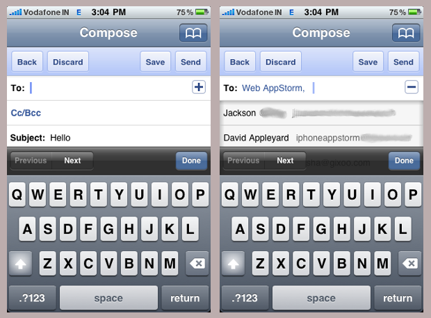
Messaging is ubiquitous in mobile applications due to their connected nature. The compose message pattern contains several key elements. “Cancel” or “Done” action buttons in the navigation bar. “To”, “Subject” and “Message” Fields as well as the keyboard. The “To” field contains a small icon that allows users to choose the message recipient from their contacts list.
Splash screens are often the first screen you will see when you load an iPhone app. Generally used to introduce an application and /or to display company and product logos and related info. Splash screens generally have few, if any, interactions - possibly “tap to skip” any associated delay. A clever way to background load resources. Splash screens should be used intelligently - do not needlessly delay the user, always allow tap to skip unless loading resources. If loading resources display a loading bar.
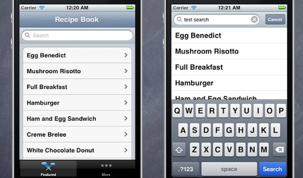
Search patterns are both common and generally quite simple. Composed of two key areas - the search field and the results. The search field may or may not contain a button to execute the search and the results are usually presented as a simple scrollable list. Selecting a result highlights it and shows the detail of the result on a new screen.
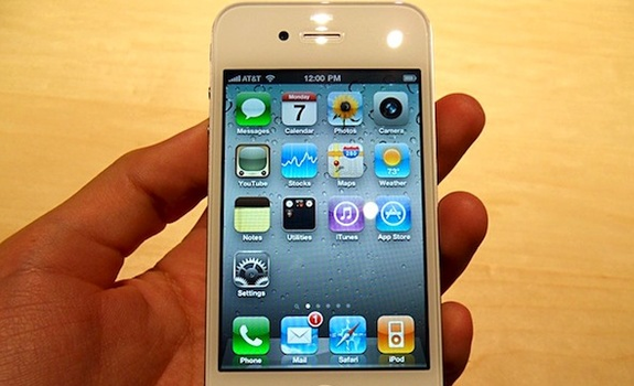
Panels are a simple and effective means of presenting content areas side-by-side - the user swipes across the screen to reveal the next panel in the direction of the swipe. The indicator below the panel tells the user both their current position in the set and the total number of panels.
If you are unsure how to get started you can try out the iOS library in Fluid UI or check out the Human Interface Guidelines from Apple.
Do you notice any missing iPhone design patterns? Please tell us! As always we love to hear from our readers here on the Fluid UI blog so please do leave a comment. Check out more articles on mobile design here and be sure to signup here to Fluid UI.