A few months ago I was invited to write a chapter for a Brazilian book about Digital Marketing focused on High Performance. Professionals from different fields would write about different topics. My mission was to write about how UX can help improve conversion. The book was launched a few weeks ago and because of it, I was invited to talk about this topic to Brazilian entrepreneurs in an online conference. And I would like to share with you a few tips and tools from it, hoping it can help you to improve your conversion.
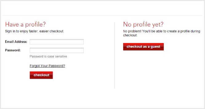
You might have already heard about the $300 million button. A small adjustment suggested by UX specialist Jared Spool to a major e-commerce website, in 2009, increased the revenue of a major e-commerce website in 45%, which represented that time an amount of about $300 million.
Spool in an article published in 2009for the UserTesting website:
“It’s hard to imagine a form that could be simpler: two fields (email and password), two buttons (Login and Register), and one link (Forgot Password). Yet, it turns out this form was preventing customers from purchasing products from a major e-commerce site, to the tune of $300,000,000 a year. What was even worse: the designers of the site had no clue there was even a problem,”
After conducting Usability Tests, Spool and his team realised that the issue was not exactly about the design itself or the form’s layout, but what it represented to the users. New customers were suspicious of the registration form. For them, this was a way for the site to increase their e-mail marketing basis. A great number of the returning customers, didn’t remember their login/password. They either gave up purchasing or ended up creating a new account. Which could explain the number of 45% of users with multiple accounts on theirs user basis.
The suggested solution was simple: taking away the “Register” button and, in its place, putting a “Continue” button with a simple message: “You do not need to create an account to make purchases on our site. Simply click Continue to proceed to checkout. To make your future purchases even faster, you can create an account during checkout”.
“The results: The number of customers purchasing went up by 45%. The extra purchases resulted in an extra $15 million the first month. For the first year, the site saw an additional $300,000,000”, said Spool in conclusion.
Since then the “$300 million button” has been been one of the best illustrative cases to convince sceptical clients that UX can definitely improve conversion.
Designers around the world have been using UX techniques to drive the user to a specific place on their websites or apps, by facilitating their steps until there. But as UX specialist Jennifer Winter reminded us in her article for the User Testing Blog, “you can lead a horse to water, but you can’t make it drink”. Her analogy is interesting to remind us what exactly conversion means:
“Conversion isn’t about making someone do something, it’s about providing an environment that makes doing that thing irresistible.”
According to her, we UX Designers should think about what would be the horse’s perspective.
“Imagine you’re a horse, and there’s a big trough of water nearby. What would drive your decision to go check it out? What would convince you there was something better two farms down the road? If we don’t pay enough attention to the entire experience a user has when interacting with a company, we can’t motivate them to the action we want.”
Different aspects should be considered to create a great experience for the users which will drive them to a conversion. To help us with this mission, reminds Jenifer, we have the great Peter Morville’s UX honeycomb, which illustrates the facets of user experience:
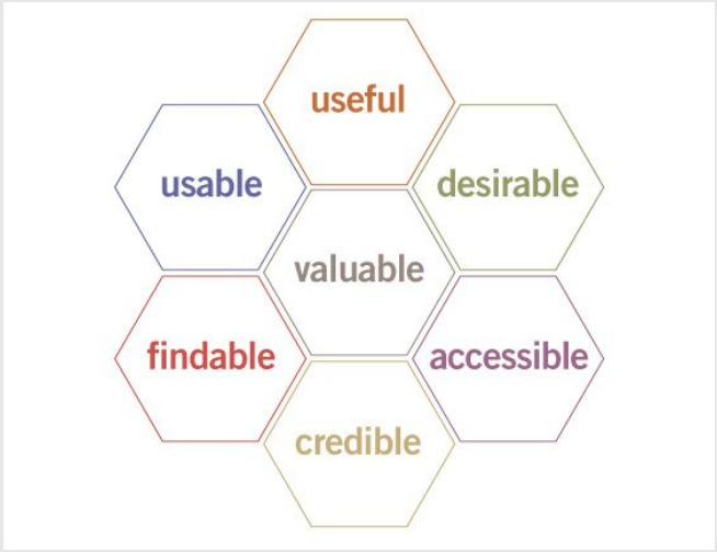
Looking at this diagram made by Mr Morville, drives us to think of other horse’s questions that we should be able to answer:
To help us answer those questions and understand and make better use of Morville’s diagram, we can use a few UX techniques.
One of the first things that we should do is definitely understand our users. For this mission, we have a bunch of methodologies which are going to help us. For each project we will use a combination of them. The idea here is not only to know about demographic from a Marketing perspective, but deeply understand the whole user journey and their real needs and thoughts related to your service or product.
Thinking about the horse analogy, our goal should be understanding the horse’s feelings:
For this, I would suggest:
If you already have an app or a website, I hope you are already using an analytics tool. It will give you specially quantitative data which can help you figure out the user behaviours on your product or service. Google Analytics, for example, will give important information such as the most links clicked, the most accessed pages, the time spent on you site, the conversion points and abandonment. These metrics can help UX designers make better decisions about re-designing or design adjustment (even with a simple button).
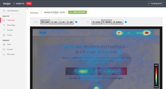
Another very nice tool is Hotjar, which records videos of your user’s actions (clicks, page scrolling), creates heatmaps and conversion funnels, besides allowing you to create surveys and polls.
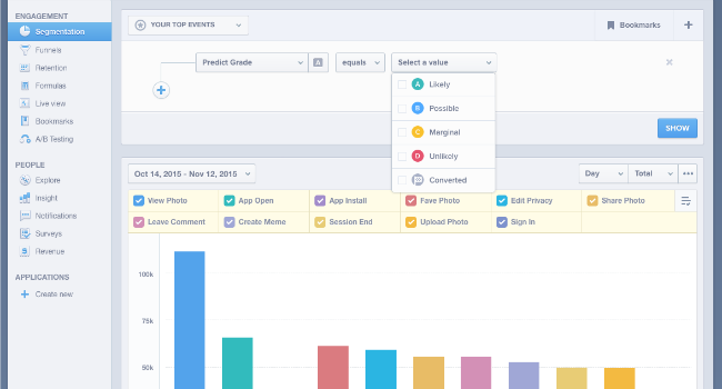
Mixpanel is another interesting tool that monitors events on your website or application, in other words, user actions that do not generate page view. Another nice point of Mixpanel is the possibility of real time analysis.
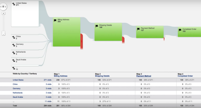
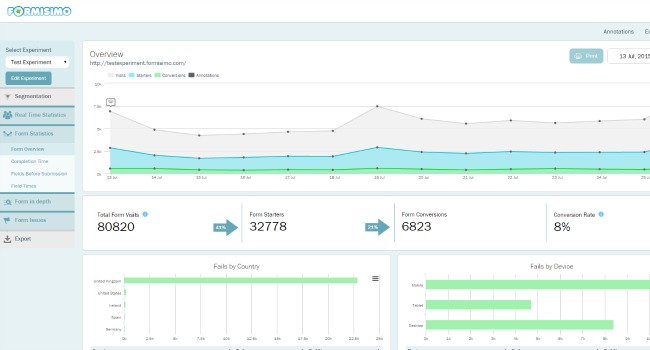
Formisimo is a specialized tool in monitoring form’s, dropout and checkout. In addition to analysing what users are doing on the online checkout, registration forms and consultation it also measures the dropout rate of a website.
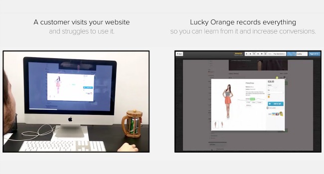
A similar tool to Fortissimo is Lucky Orange, which also records user navigation.
These are just a few tools that can be used in data and information collection on your user behaviour. There are numerous other great analytics tools on the market such as SessionCam, CrazyEgg and KISSmetrics, among others. The important thing here is to collect relevant information for decision making in the design of your product or digital service.
Besides using Analytics tools, it is important also to listen to users and potential users. The idea here is understanding the user behaviour in a more contextual way. Through analytic tools you can understand and monitor the user navigation, now you will better understand why.
Doing a Survey can be a starting point. There are a bunch of tools to help you such as Google Forms, Survey Monkey, Typeform and Polldaddy. It’s important that the survey questions being quick, objectives and easy to understand.
In addition to surveys, we can also do user interviews. The goal here is to talk individually to the users and potential users who represents your target audience. For recruiting (crucial phase of the user interview process), it is important to understand who your target audience are, where they live, where they work, if they study or not etc etc etc.
Besides the “whys” behind the user behaviour during navigation, it is a great opportunity to better understand the context of using your site or App: where the users are when accessing your site or application? At what times of the day or week do they access it? What are their motivations?
Interviews can take place online or in person, in a laboratory, in a user-chosen location (or wherever they can be found - a school, pub or shopping mall, for example) or even in your company office, although some experts believe that because they are in your company, the answers can be biased. I would say that the result of an interview is not about a location, but about the interviewer focus and experience.
There are other interview methodologies (which can be combined with usability testing) such as Ethnography , when the researcher follows the day-to-day user; the Contextual Enquiry when the researcher goes to a place where you can be around your target audience like beach, shopping, bookstore, restaurant (I’m careful to ask authorisation if it’s a commercial environment); or Diary Study , when the user agrees to develop a diary that includes the use of the site or application. Please, be aware that to interview kids and teenagers you must ask their parent’s permission.
It’s important to remember to record all interviews, and take notes during the conversation with the written consent of the interviewee. Also compensate the respondent with some toast, a cash value voucher or gift card.

In the case of online interviews, there are some good tools that can help you, such as Silverback and Morea. Plus video chat tools such as Skype, Google Hangouts or even Facebook Messenger. Just make sure to record these video chats!
At the end of the interview, remember to confirm with the user their availability to provide additional information or to participate in a second round, testing the redesign.
Usability Testing can be combined with the user interview. So you can better use your time with the same user, the ideal time would take between 45 and 60 minutes.
It is important to test the script prepared in advance. Although it is not strictly followed, it is important to know the purpose of the test and what questions we want to answer. Ask the user to give his first impressions on entering the site or application, if they do not know your service or product. If they have already used your site or application, ask where they usually navigate.
Another important point is to remind the user at the beginning of the test that their participation aims to improve the navigation of the product or service tested, in other words, what is being tested is the site or application and not the user. Let them feel free to speak (do not interrupt them) and encourage them to “think out loud”, allowing some quiet time so that they can think, as you analyse their navigation.
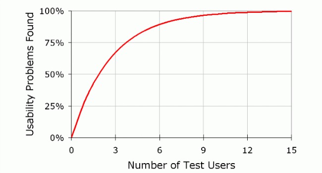
For the usability test, expert Jakob Nielsen, suggests 5 test users as the ideal number to obtain valid results. According to him, the results begin to be be repeated from the sixth user.
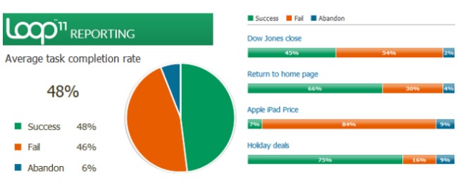
The test can take place in person, in a laboratory, in your company, or somewhere indicated by the user (home or office), or using online platforms, as was said earlier. You can also do tests that don’t involve an interviewer using tools like: usertesting.com, UserZoom.co.uk, UsabiltyHub.com, Loop11.com, WhatUsersDo.com, among many others.
In this case, the UX Researcher will be able to use the same test script, defining tasks that must be performed (and are being tested) by the online user. The user is encouraged to speak/explain his actions while browsing and this is all recorded.

There are also other test methods you can use combined with User Interview as the CardSorting (activities with cards to test organizational areas or content of your website) or Tree Testing (to test the site navigation tree).
Creating personas is a technique that seems simple, but it is very powerful. It is a tool widely used by marketers, designers, product developers, etc. The idea here is to create a detailed user profile that represents your target audience groups. Therefore, it is important to have the most information possible about your users, collected with the analytics tools, interviews, surveys, usability testing, and information from your support department, the sales team and the marketing team.
To build Personas, you can organise a group activity, bringing together professionals from different areas of your team. It is amazing how each area can see specific and distinct aspects from each other. Having these professionals in this activity, will help everyone see at your target audience from another point of view.
Do not worry if you are a “team of one” though, the important thing is to make the effort to look at your target audience from different perspectives. I mean, you can develop the persona in an individual activity, the important thing is just to make sure you are using different information and different sources (analytics tools, interviews, usability tests, surveys)
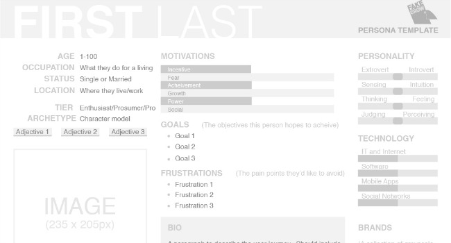
The format and information that will make up the persona will depend greatly on your product or service. But it is important to be as personalised as possible: give a name for your persona, add a photo, set an age (no age range), where they live, study, work. It should contain information about what their daily challenges are (what your product or service will solve) and their motivations.
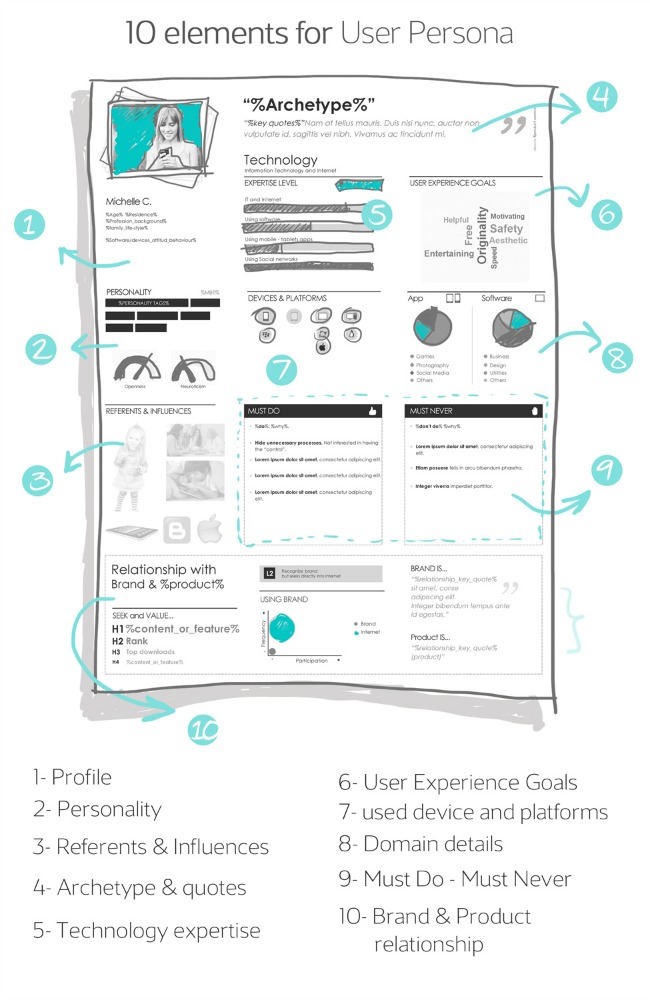
It is important that the persona represents your target audience realistically (you must believe that it is a real person), which also reflects the data and information collected. When you are designing your site or application and creating solutions to the design, you will base your decisions on this persona (or personas). You are creating your product or service for them.
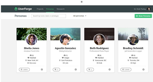
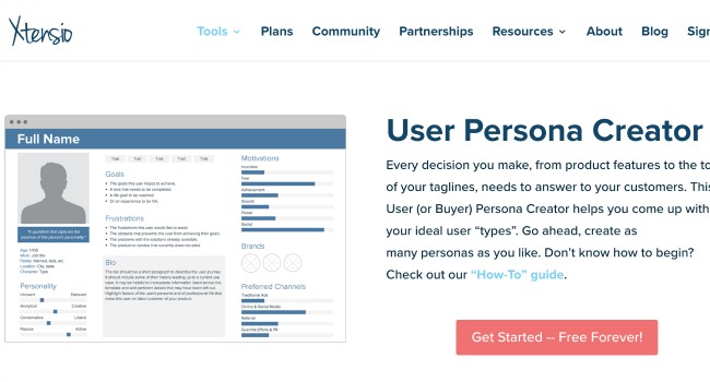
I prefer to draw my own Persona templates, but there are some online tools to help you in this task as Xtensio.com, makemypersona.com and Userforge.com.
Now you already know enough about your user and all this information will help you make design decisions that will contribute to the success of your site focusing on conversion and better experience. Now, it’s time to design!
Here is a list of 100+ best web design tools that will help you speed up your workflow.