Constant updates can be a serious sore spot for users. How many times have you opened Facebook and thought to yourself, “Again?!”
But the truth is brands change – sometimes it’s to stay relevant by adding new solutions and other times it’s simply reworking existing services to better suit the user. At the end of the day, your app design should reflect your brand, and that means it has to go through its own changes.
An app design rebrand without rhyme or reason is a waste of time. All of the brands listed below made big changes with a specific goal or outcome in mind.
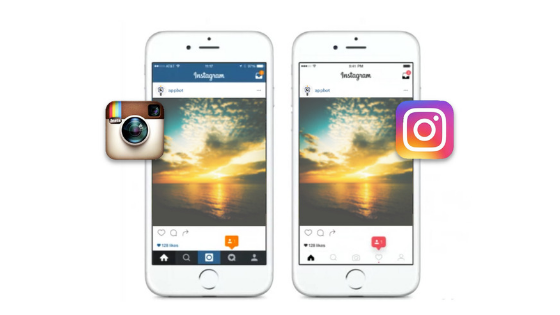
Instagram cleaned up its user interface with a fairly sizeable overhaul, including the logo. The app stripped out color in favor of a black and white display. This allowed users to focus more on the images in the feed, and not draw the eye elsewhere. The updated logo did the exact opposite, in fact the brand opted for a vibrant icon.
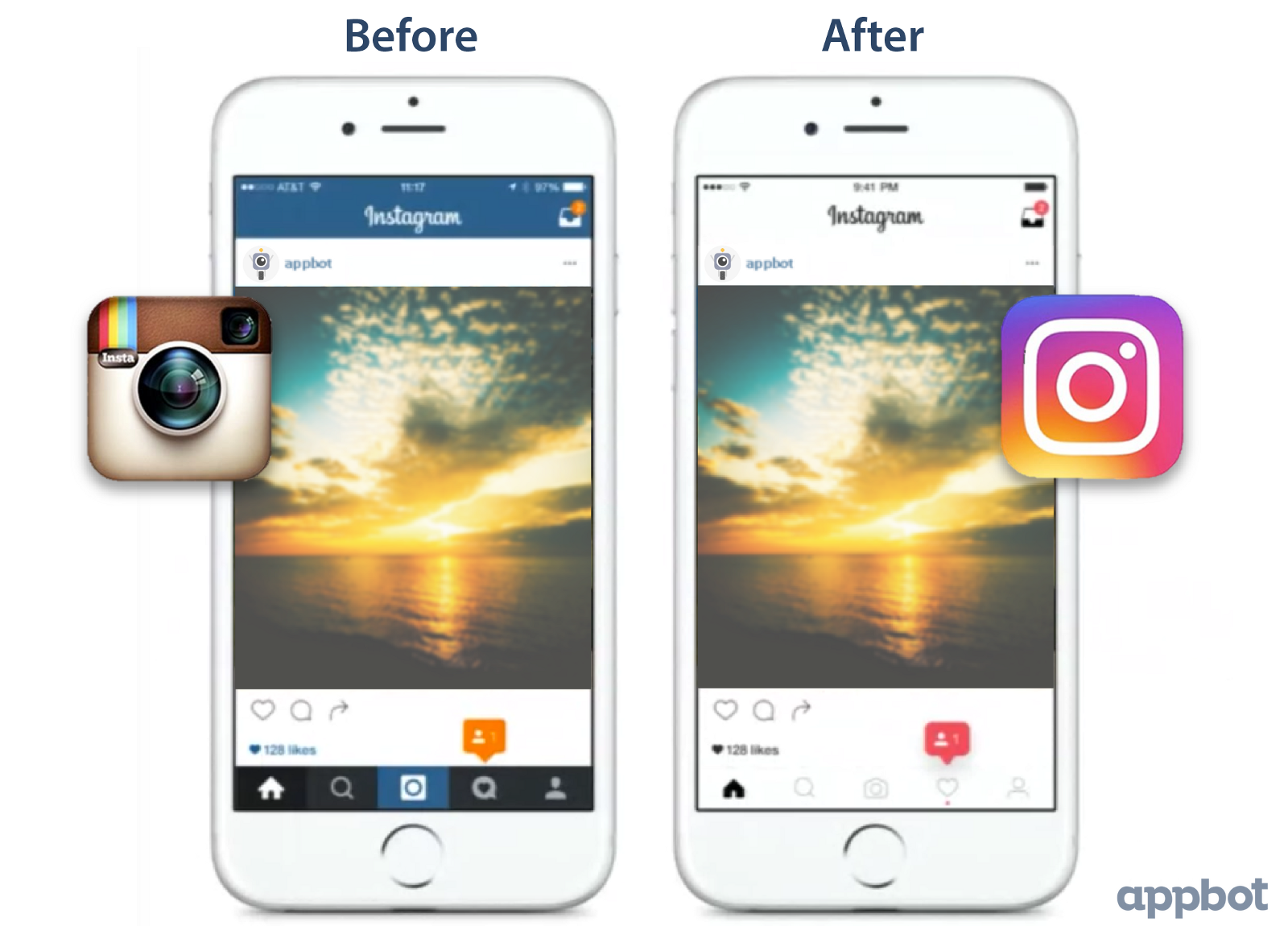
While users were resistant to the change at first, the general consensus was that the rebrand was more modern and minimalistic. Plus, at the end of the day, the app still functions exactly the same – just needed a little facelift. Since this major redesign, Instagram has tweaked its UI slightly, such as swapping out the send and inbox icons. They have also enhanced many aspects of the UX, including the addition of Instagram stories and other features.
The newspaper’s digital transformation kept its readers around. The New York Times has both a mobile app and a web app, to capture as many mobile readers as possible. The web app redesign focused on consistency across devices.
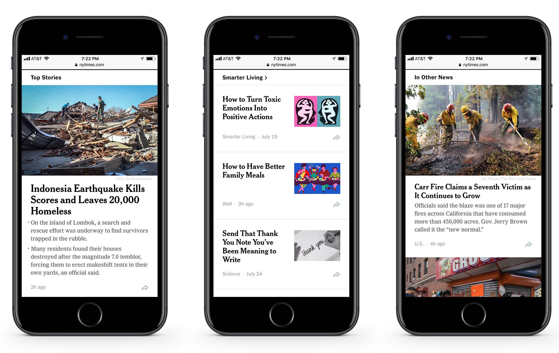
The new home page groups similar stores together, such as “Top Stories” and “Editor’s Picks.” This makes it easier for users to quickly find what they are looking for, time and time again. The app has a considerable amount of white space, allowing the headlines and feature images to breathe. The result is a very simple, straightforward brand design.
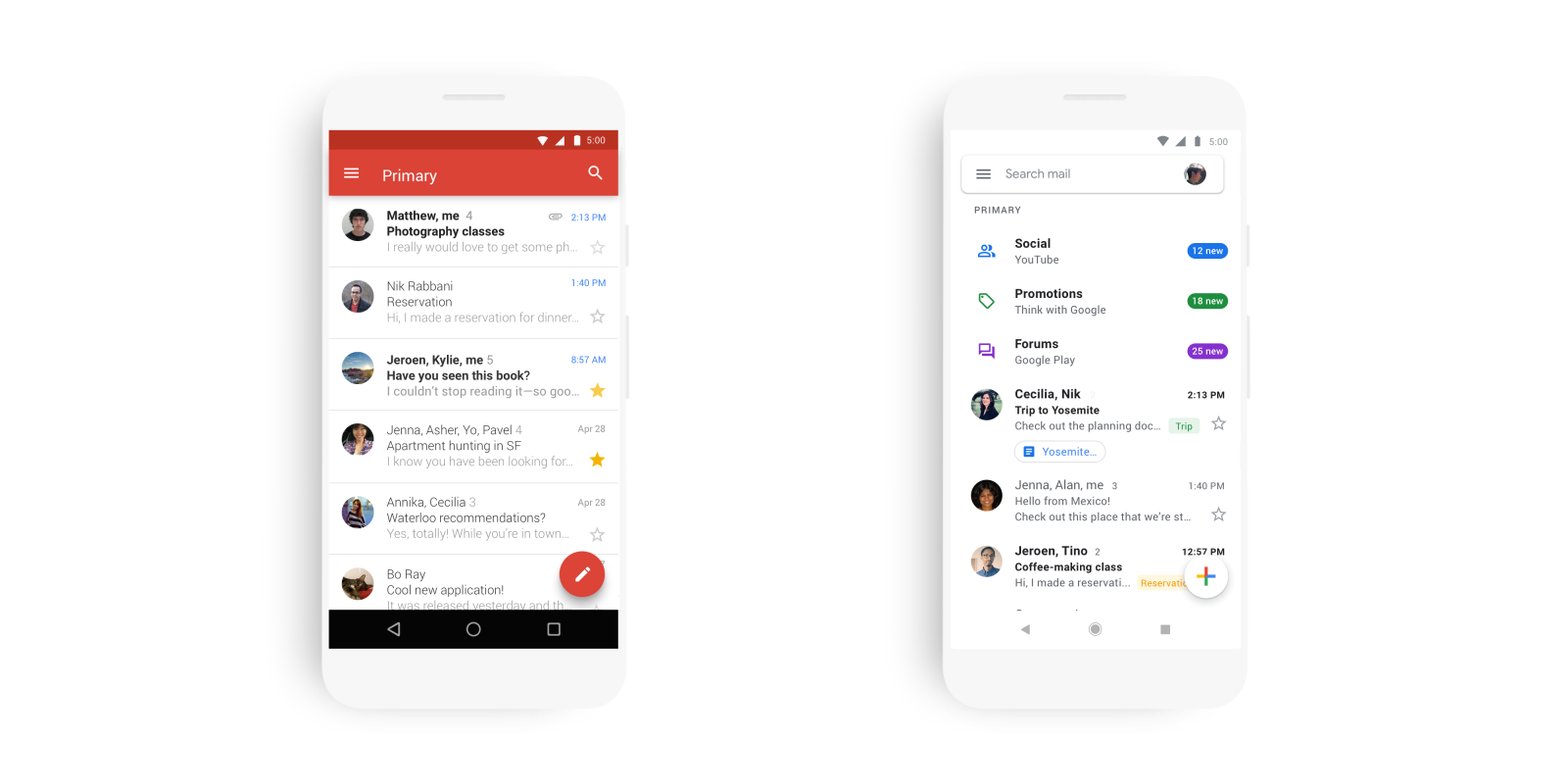
Announced late last month, Facebook’s redesign will be “the biggest change to the app and website in the last five years,” according to CEO Mark Zuckerberg. The massive undertaking will happen in stages. Facebook’s Messenger App gave us a sneak peek of the new interface last year.
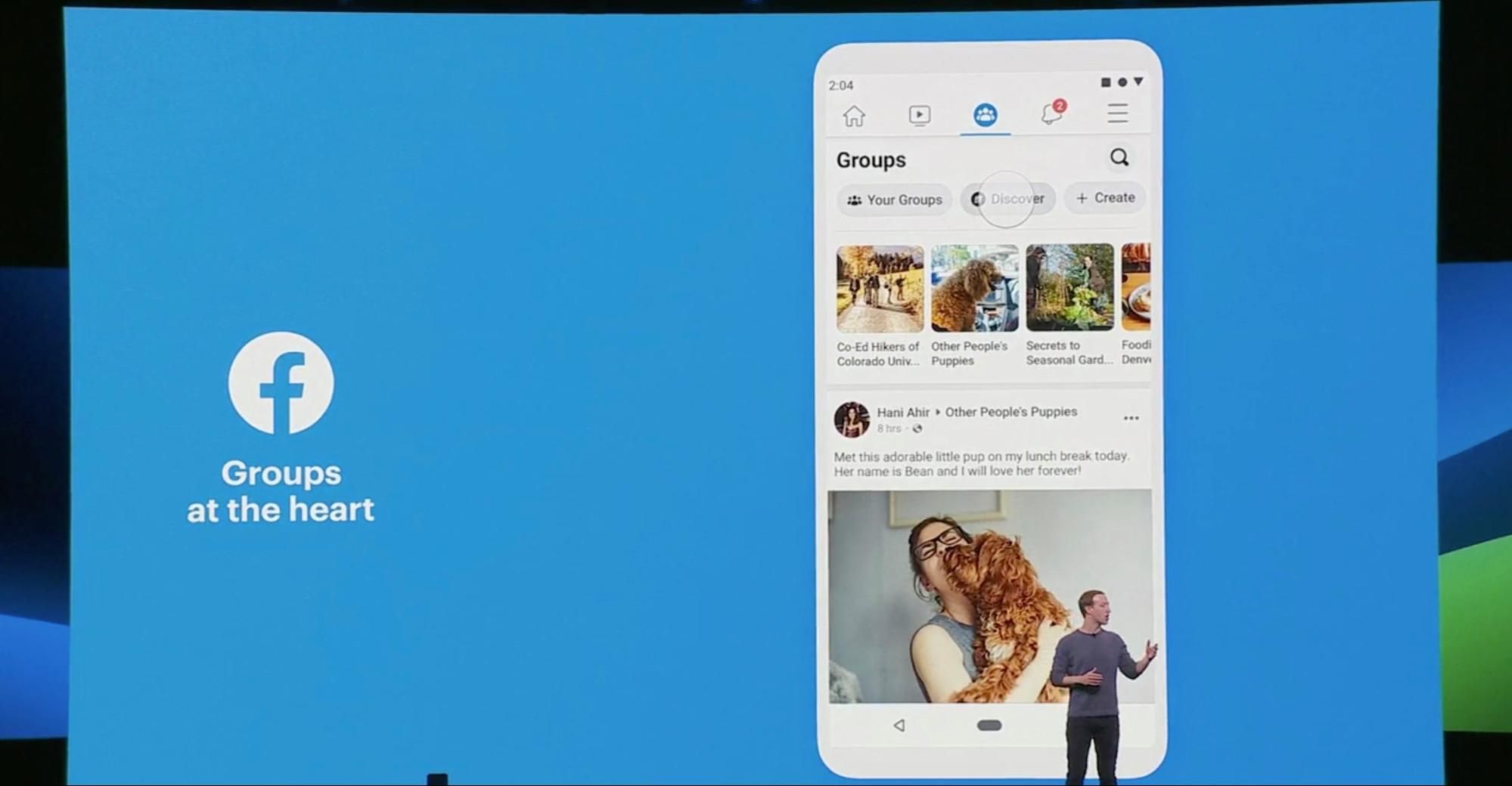
The new ‘FB5’ design will place more emphasis on Facebook Groups, allowing users to better connect with people that have shared interests. The mobile app and web app will feature clean lines and more white space. With this total rebranded identity, Facebook will also update its logo. The rounded square will become a circle, keeping the same essence with a younger feel. Stay tuned to see how this one shakes out.
Google rebranded its many productivity apps as G Suite, to reflect its “total package” offering. The biggest issue being the eight apps, Google Drive, Forms, Docs, Hangouts, Slides, Sheets, Calendar, and Gmail, looked totally different.
Google identified this problem and came up with a plan of attack – focus on consistency and cohesion. Leveraging internal resources, the G Suite team worked closely with the Material Design team. A major pain point for users was that they were learning each individual interface over again when jumping from one app to the next. That’s not productive. The redesign aimed to tidy up elements across the different apps, and streamline these processes. Even the logos and brand font got a makeover.
Spotify made some tweaks to make browsing and searching simpler and faster. The app’s navigation used to features five options – Home, Browse, Search, Radio, and My Library. Spotify has cut that down to just three – Home, Search, and My Library – in an attempt to declutter the interface.
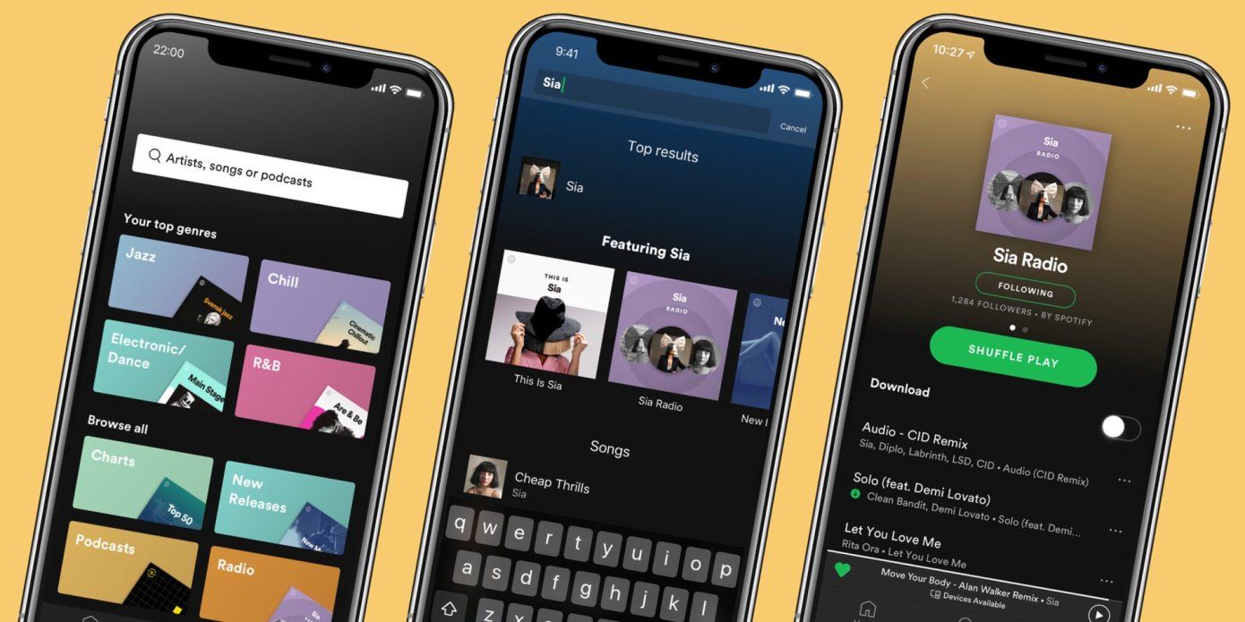
All of these options are still accessible but are housed in different locations or within one of the three broader options (i.e. “Browse” is now inside “Search”). One of the biggest updates is that the “Search” page is now personalized, to show your own “Top Genres” below the search bar. This app redesign was a hit because in the end it still allows the users to access the music they know they want or discover new artists, just quicker.
Uber’s rebrand was more about function than fashion. The UI is built around a solid UX strategy, first asking the user “Where to?”. That is now the jumping off point for interface fly-ins, route overviews, and more.
As the brand expanded its service offerings, with additions like UberPool and the ability to schedule future rides, the screen wasn’t big enough to accommodate all of the options at once. Through user research and many rounds of prototyping, Uber started to realize that not everyone wants everything. By asking for your destination first, and then giving you pricing up front, the app now makes you a more informed, and happier, buyer.
The Amazon Alexa app is used to set up and manage a variety of smart devices within its smart home ecosystem. As the product adoption took off, first with the virtual assistant itself, then to other devices it could control within the home like smart lights and power outlets, the app desperately needed a rework.
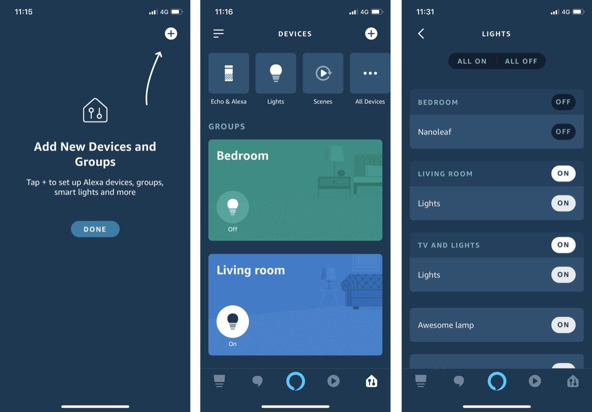
The user interface was redesigned to categorize the connected tech into “Groups,” like rooms for example. Now users can turn on and off all of the different devices in a single room from one screen. No more back and forth.
While there is a lot to gain from an app design rebrand, they have to be done with a
“user-first” approach if you want to be successful. Think about why they use the app to begin with and how you can tweak the interface to enhance their overall user experience. Listen to feedback, identify the pain points, and align your strategy.
Get started with these 10 design trends we’re likely to see in 2019.
Author Bio:
Bridget Poetker is a Senior Content Marketing Specialist at G2, with a focus on app development and design. Connect with her on LinkedIn.