Last year, while I was living in Los Angeles, I got talking to a CEO from a startup in “Silicon Beach” (Santa Monica area). He invited me for a coffee as he was curious to understand why someone who was doing well working in social media had decided to work focusing almost exclusively in UX.
He was amazed because I was able to increase the number of Facebook page fans from 250K to 1M in one year. “How did you do that?”, he asked me. “Well…(trying to find a fancy explanation) actually the only thing that I did was deeply understand the page’s fans and what they were truly interested in”, I honestly answered.
“Girl, you were doing UX for social media by trying to understand the users… imagine that!”. BOOM! I said to myself.
Looking back over the last 16 years of my career, I’ve always used UX knowledge, even before the term existed (all the way back to the early 2000’s), including in the social media roles that I held.
As well as spending time doing UX Research, I also apply UX techniques to the whole social media process. Every month I give a class: “How to Manage Social Media Content Creation”. I’ve got a few great tips that I give students that I’d also like to share with you.
![]()
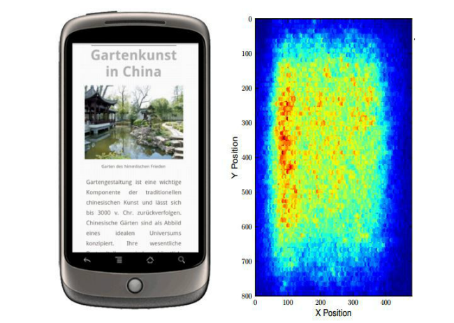
Back in 2006, Jakob Nielsen published an article about the “F-Shaped Pattern For Reading Web Content”. In an eye tracking study 232 users were recorded navigating thousands of web pages, Nielsen’s team found that the users scanned the web content in the so called F-shaped pattern.
According to the article: “Users first read in a horizontal movement, then move down the page a bit, then read across and finally scan the content’s left side in a vertical movement. This creates an F - shaped reading pattern (which can sometimes look like an E).
I always highlight the importance of choosing a good avatar and a good user name on social media because of the impact this F-shaped reading pattern can have.
The discovery of the F-shaped reading pattern has been influencing the way we design and organize content on our web pages ever since. Even after all these years, amazingly it still applies, especially with social media timelines where the user scans vertically, paying attention to the left side (the avatar and user names).
A study by Mashable done back in 2011 showed this F-reading pattern also on old Facebook’s pages.
![]()
You might be thinking that this is old news and that it does not apply anymore, especially for new mobile devices. Well, at the German Research Centre for Artificial Intelligence (GRCAI) researchers found a similar “F” pattern for reading on smartphones.
GRCAI researchers pointed out other important findings regarding reading patterns on mobile devices:
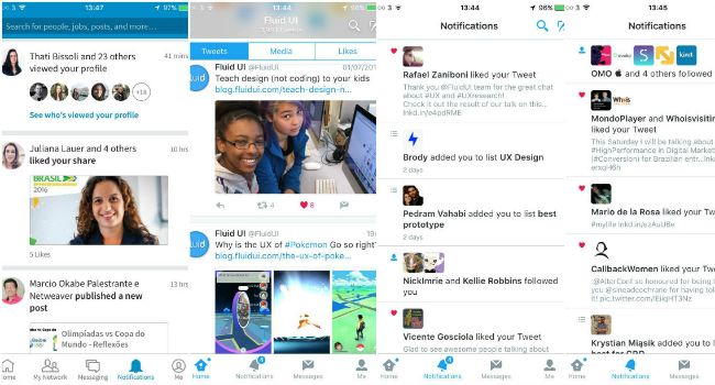
Even though social media timeline formats have been changing (most of major social platforms’ shape and navigation are more and more similar, especially for mobile devices), this F-pattern still applies for areas with less visual and complex design such as notifications, private/inbox messages list, etc. In other words it’s still important to pay attention to the avatar, username and the introductory text.
You might have noticed that all of the major social media platforms heavily incorporate visual content. It is important to state that visual elements have become more and more relevant for Social media, especially concerning the engagement with users. It’s not by chance that Twitter and Facebook have been evolving into more visual spaces. Images, graphs, animated gifs, recorded videos and, most recently, live videos. All of these are as important as text content, links and hashtags.
Studies of learning behavior found that after three days, a user retained only 10-20% of written or spoken information, but 65% of the visual information. Another old eye-tracking study by Nielsen (2010) found that most people prefer information-rich images over similarly dense text.
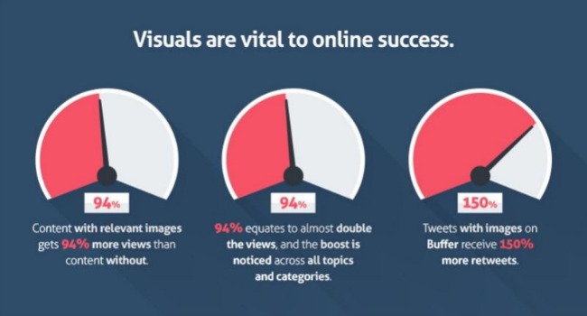
According to research by BufferApp, tweets with images get 18 percent more clicks, 89 percent more favorites, and 150 percent more retweets. Other research by BufferApp showed that visual content has 94% more total views and is 40 times more likely to be shared on social media.
It is important to make sure that all the elements used for social content are balanced and complementary. Also make sure to publish visual content that’s suitable for mobile devices. Visual content should be good quality and load quickly on any device.
Recently, Twitter announced that links and photos will no longer count toward its 140-character limit on tweets. To make sure we are delivering the right copy on social media, testing different ways to say the same things sounds like a great idea. Don’t be afraid of publishing different social posts for the same content (also, social media specialists know that sending the same update more than once is a good strategy to reach more of your fans). Follow the audience engagement with these posts and improve it!
Back in 2009, Jakob Nielsen published an article showing how they had improved a tweet to promote a Usability Week event based on UX techniques. It is interesting to see how they re-wrote the tweet by focusing on the most relevant information about the event: highlighting them with caps, brackets and concentrating on the beginning to the text, which remind us the “F”-shaped pattern. They were bringing more attention to the most important elements by placing them at the top-left side of the content.
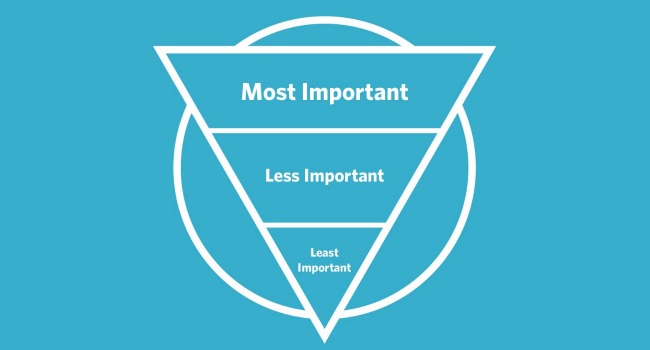
Ok, ok, the inverted pyramid is not exactly a UX technique. It is, in fact, a journalism technique which I think applies very well for the user experience with online copy. In the old journalism age, reporters were asked to writ their articles starting with the most relevant and important information. This was because of the way the editor would cut the text to fit it into the paper pages (with or without Ads) he would do it from the bottom. So by writing using the inverted pyramid method, the editor would save time and the reporter would make sure to include the main points of the story.
Thinking of the length of the content for social media platforms helps to improve not only the readability of copies, for example, but also can engage more or less the users, resulting in a good or bad experience.
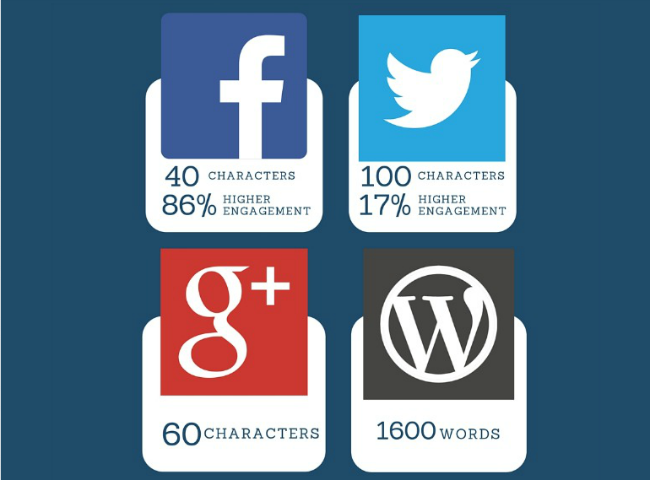
There are different studies that show that less is more when we think about length of copy for social media. An infographic made in partnership between BufferApp and Summal, for example, shows that the optimal length for social media content should be: 40 characters for Facebook posts, 71-100 characters for tweets, 25 words for LinkedIn updates and 3 minutes for YouTube. Hubspot agrees about the ideal length for Facebook posts (40 characters), but suggests 100 characters for tweets and 600 characters for LinkedIn.
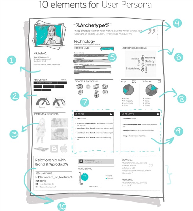
If you create personas carefully, they will help not only with designing flows and UI elements, but also with defining the tone of voice for your social media copy and they will help define the best type of content to share with your audience.
Last but not least, consider the differences between the platforms and how people use them. You should adapt the content for each platform and not simply “copy-and-paste” it. Don’t forget to consider the differences in how the users interact with each social media platform on different devices.
I’ve always believed that a good UX professional should consider the whole user journey to influence improvements in every user experience. Every touch-point adds up to a great (or a bad) experience and social media is one of the major touch points. Every tool, technique, methodology and all of the knowledge from different fields (UX, Journalism, Content Strategy, Product and Project Management) should be used to improve the user experience along their journey. Blending all of these elements helped me design a better social media content experience. I hope these tips can help you all as well. :)
To find out more about Lisandra’s work or chat about social media content strategy, join her on Twitter or LinkedIn.