“People’s behaviour makes sense if you think about it in terms of their goals, needs, and motives.” - Thomas Mann
I am a calm person. Most of the time anyway. But there is one thing that causes me to spew forth vitriol, obscenities and rage. It causes me to look for a coffee mug to hurl at my screen and for suitably fragile windows to violently throw that screen through. Close, escape, X or undo simply cannot be acceptable alternatives when this happens (if they even work at all). Clearly, I am talking about when I encounter a bad user interface.
Thankfully, Dave Power, lead designer from hiri.com is also my design counsellor. My latest session with him has helped me to understand not only how to manage my own emotions, but how to channel them to help make better design decisions myself - this I truly appreciate. From his wisdom, I present these eight laws for inspiring love and devotion in your designs.

Great design influences the beast - that feral, ancient core we’d prefer not to acknowledge.
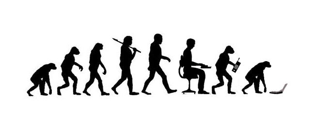
Humans are nothing except error prone social computers. Our brains have two parts - the rational and the subconscious - yet we almost never engage our rational side. Instead, our subconscious rules all and we make snap judgements about design - just like we do for sex, food and everything else. Emotion drives our actions. You must understand the human, but design for the beast.
Onboarding is the most important part of your design. Without it, the rest is irrelevant.
Humans will go out of their way to behave irrationally. We’ll like something before we know what it even does. We’ll hate something before we even see it. We’ll give your product 5 minutes before giving up on it, even if we know it solves our problem. If you convince us, we’ll champion you, even when you give us all the reasons in the world not to. Focus your efforts on challenging our irrational minds in those first few minutes.
When you talk about making a product sticky, it’s about making the user form an emotional attachment to it.

Good marketers know that associating their brand with positive emotions will result in better sales and that this effect is incredibly powerful. Why? Silly human emotions.

Take things people know and love, and replicate them in your designs.
Our weak, subconsciously driven, lizard brains associate the positive experiences we have with the brands that sponsor them and there is nothing we can do about it. Once forged, the bond is incredibly hard to break. We tie these experiences together and we can’t separate the good times we’ve had from the marketing we ingest (which often has nothing to do with the experience). Associating your product with a good experience will forever win over a customer.
A user will use your design according to the mental models already in their head.
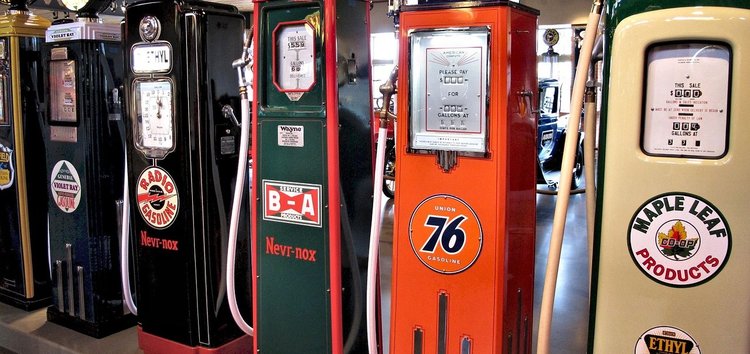
Imagine I ask you to fill your car with gas. You know how to do it right? The design of a gas pump is basically the same since it was first created.

What if I changed how it works? I could add a button to the handle that needs to be switched on before it pumps the gas. I’ve now changed something fundamental about the system and you need to rethink it entirely. I’ve just caused you fanatical rage and untold hatred as a result of my unnecessary changes. The existing system isn’t broken. There is no need to fix it. People use existing, known conventions when learning new things. Use conventions people already know and are familiar with to simplify your designs.
Usability is not an exact science. The only way you can create something meaningful is by having a complete understanding of humanity. Only an artist can do that. And even when she gets it right, it’s still subjective.
UX professionals distance themselves from artists because unlike artists they test and validate (also, they make money). There’s a functional aspect to what a designer does that’s different to an artist’s abstract musings. A designer can test two buttons, one pink and one blue and see which one does better. There is more quantifiable data involved. But all the analytics in the world won’t create meaning.

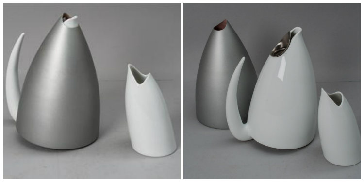
Philippe Starck evokes emotional responses in people with his designs. His teapots are not just functional leaf brewers. Because they take so much time to use, they also work as Zen guides. They make you stop and think about what you’re doing, being mindful in the moment.
He’s gone deeper in understanding the reason why we make tea. It’s not just to rehydrate. It’s to take a mental break. To collectively engage in a social institution and chat with others for a brief moment. His teapot deliberately makes it harder to make tea, and by doing so, extends the real purpose of the tea break: to reflect. A usability engineer could easily create a more efficient solution. In doing so it would fail to understand the purpose. Meaning comes from both art and usability.
The really great experiences are rooted in insights into motivations, desires, emotions, cultural & social patterns, beliefs and other deeper considerations.

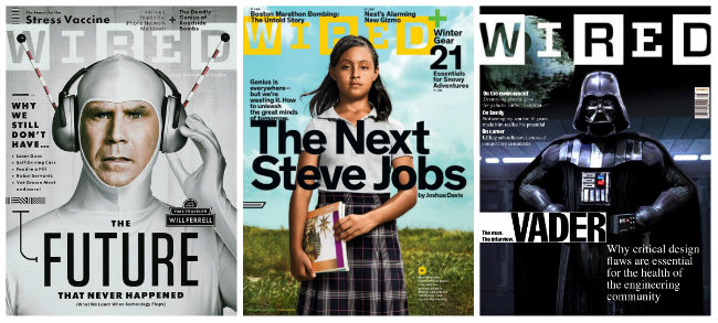
The head of design at Wired does a strange thing. He designs each of his covers following all the rules and best practices of good design. Then he breaks something. Deliberately. He knows that when people look at the slightly broken image they’re going to feel a bit uneasy about it. They don’t understand why, but they’re having an emotional response to the design he’s created.
When you break a design a bit, it makes it more interesting for the user. Imperfection creates an emotional response in us in a way that perfection never can.

“The best and most beautiful things in the world cannot be seen or even touched. They must be felt with the heart” - Helen Keller
The Apple Macbook starts ‘breathing’ when you put it to sleep. Microsoft are now overtaking them, bringing more humanity into their products. Likewise, the games industry has an entire catalogue of techniques to making addictive games, called lenses. We crazy humans have even mathematically calculated the ratios of ‘good looking’ faces. We see beauty in ourselves and what we’re already familiar with. Mirroring the things we already consider engaging and beautiful ensures engagement with products.
Design is not necessarily about taking everything away until just the most important bits are left.

Material design is being used by Google to handle usability issues across many devices. They’ve got a really sound philosophical grounding, but the sentiment has gotten lost. It’s not about personality any more. Everything is naked and minimal. You may get to something that’s convenient to use but we seem to have forgotten about making things meaningful.
Laws should guide UX design - not rules and not guidelines.
Why laws? Why not rules? Why not guidelines? Simple. Because rules must be followed and guidelines only give direction. Laws must first be understood, then interpreted. Laws must be strict. But they must also be able to accommodate the moment, the circumstances, the exact story being told. Justice cannot exist if all laws are uniform and are not subject to interpretation.
Just like society, our greatest design achievements need boundaries just as much as they need freedom. Laws cannot define good design. Design cannot succeed without laws. Beauty only comes when the laws are adhered to - then broken. So break these laws. Just…carefully.
Or I might get angry again.

Dave is the founder of hiri.com, a next generation email client designed to help employees save time, organise their day and make them better communicators. Dave is a designer who loves all things tech but tries to spend time outdoors (though not very successfully this year).
Dave is the founder and CEO of fluidui.com - a prototyping tool which can help you design brilliant apps, simplify design workflows and bring your ideas to life. He’s not a designer by trade, but rather an entrepreneur who is passionate about eliminating bad user experiences anywhere and everywhere they may exist.