A user may not remember what she bought from you last. She may not even remember how much she paid for whatever it was. But one thing that’s hard to forget is the experience she had while shopping with you. Tracy Vides
Try walking down Brick Lane on a Saturday night: How many of the hawkers will convince you to go into their shop? They want to use every trick possible to get you in the door. Some leave you feeling like you ought to get out of there as quickly as your legs can carry you. Some, however, are more appealing and put more thought into their effort to entice you into their restaurant. They are part of the experience of Brick Lane and they are the reason why a lot of people do go into one store or another.
Did you know that 88% of your unique visitors will never return to your website if they are dissatisfied with its initial performance? Sarah Green
The most common CTA to be found today is very simple. It is a request to hand over your email address. It is done in a variety of ways but is based on the marketing assumption that the way to grow a business is by acquiring new customers.

As a result, if you work in a marketing department then you probably spend most of your time trying to get people in the door and to engage with your product. How you get them in the door should be as important a question as how many you are getting in the door because 88% of your unique visitors will never return to your website if they are dissatisfied with its initial performance.
There are organisations who design better CTAsand who realise that if you treat your users well it will be the beginning of a long relationship. However, they remain the exception rather than the rule.
Splash screens are the perfect introduction to a dynamic digital experience on mobile devices. They bring a whole new essence to mobile web designs, using animated graphics that make user interactions on the internet all the more exciting. Eric Haskell
Splash screens (what is the correct term? Loading screen / landing page/ pop-ups / CTAs: are they all essentially the same thing?) are an integral part of web design.
I don’t really care what they are called to be honest, they are all equally annoying. But, does that have to be the way? No, is the very short answer to that question. But, for them to work they have to add to the experience, they have to be something that have value in themselves. There are a growing number of websites that take this as an opportunity to add value to the user’s interaction with their brand rather than attempt to get their email at the first opportunity.

In a recent post James Richman looked at some of the more innovative landing pages (it’s the same thing no matter what you call it) and showed that it is possible to re-imagine this part of a website’s design. One of the most striking aspects to the landing pages highlighted in that post, in addition to their general high quality, is the resonance with some truly original billboard advertising.
The key here is that these landing pages are not overtly attempting to get anything from you as a visitor to the site. They do however make your engagement more memorable and plant a seed that will at some point build connections in your brain and add value to the brand. For that reason none of these brands need your email address and can instead focus on creating a high quality user interaction.
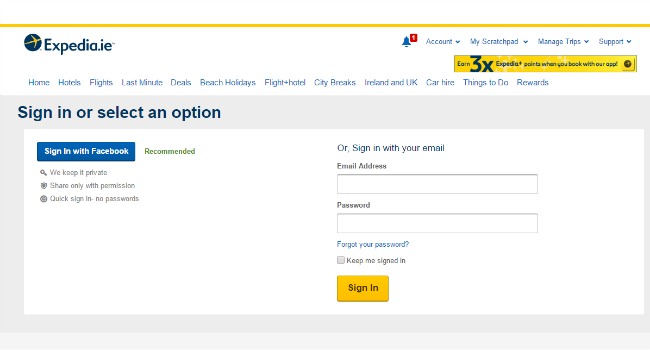
One extra data field was costing Expedia $12m a year. After we realised that we just went onto the site and deleted that field - overnight there was a step function change, resulting in $12m of profit a year, simply by deleting a field. Nick Heath
Someone made the mistake of telling a marketing person that they might get more leads and conversions and now everyone is using splash screens as a marketing opportunity. However, according to the iOS Human Interface Guidelines they are viewed as a marketing technique that slows down load time. While Apple might have rather more technical reasons to dislike splash screens; mine are a little more emotional. Personally, I think they are one of the most annoying aspects of website design and the sooner it becomes a part of history then the happier I will be.
It has become all too common for websites to look for your details (name, email) in the first moments of your first interaction with a site. There is no doubt that this is a decision made by the marketing department. The UX department might have a very different view on when and how these early interactions ought to happen. There is no reason why you should not put some thought into these early interactions because they will determine whether or not this particular user will return to your site. Having some UX design standards for passwords and registration forms would be a start. Thinking that one minor change is going to make all the difference, that is big mistake.
But, what about your potential customers and your users? From their perspective, is this an interaction that is acceptable? There is, of course, no one answer to this question. What one person will find acceptable another will hate. I know what I consider to be an acceptable interaction but I am a particular demographic and may not even be the best representative.
In my mind, I think that you would not walk into a shoe store and, before you have even said hello, hand over your name and email. If someone in the shop attempted to extract this information from you at the start of your visit to the shop then I am pretty sure that your reaction would not be positive. I for one would simply turn around and leave. I get the same feeling when I am faced with a website asking me for this information. There are a number of reasons why I think like this.

Born before 1985? Then you’re a ‘digital immigrant’. Lauren Laverne
I am a digital immigrant. That is a simple chronological fact of life which not even a time machine would be able to solve.
For those who are trying to engage with users, it is pretty important to know what sort of users you are engaging with. One of the benefits of the focus on UX in recent years has been the growing focus on user personas. If you can’t convince your boss to spend any money on UX research then the one thing that you need to put down as a red line is research into user personas. What is the point in designing a product if you do not know who you are designing the product for?
I am aware of the potential consequences of handing over information such as your email details and the bother that this can cause. I am not talking about identity theft or anything as extreme as that but do you really want people you don’t know having access to your information.
Some sites are very good at providing an unsubscribe option, but this is not the norm. So, as a result I am a conscious and slightly cynical traveller through the interweb. I use the term interweb for a reason; it is very sticky and it is very easy to get caught in this web.
Did you know that 3 in four millennials would prefer to purchase an experience over buying a product? Blake Morgan
Here we are moving back towards the point we started at. People do not go to Brick Lane for dinner, they go there for an experience. People travel from all over the world to London for an experience. Some of these experiences are not so good, but that is inevitable. Good experiences do not happen by accident.

Brian is part of the communications team at Fluid UI, a design tool used for early stage product validation, UI design and user experience testing.