How do you make your mobile app stand out from the crowd? This has been, and will always be, a major focus for mobile app developers. Among so many applications that there are in the market, it is necessary to stand out. In addition to a good App Store Optimization (ASO) positioning, the design of the applications is the key. Let’s see what factors must be taken into account to generate a positive perception in terms of user experience or UX.
What is the User Experience of an App?
(This is intended for the uninitiated, skip on if you are already confident that you know what this is)
Most of this post is about optimizing the UI of your new mobile app. But, let’s face it. If UX is not part of every conversation, then something is always missing. So, I want to start with a quick run through. If you are too confused already then have a look at this post on why UX is not UI.
The user experience is the set of factors or elements related to user interaction with the mobile application. Depending on how that interaction is, the user will have a perception or another of the usability of the application. It can be said that it is an indicator of the level of user satisfaction with the application.
An app with a good usability facilitates navigation and user interaction when you want to carry out some task. That’s when we can say that the user experience generated by that application is positive.
The UX takes into account many aspects related to the visual aspect or navigability, but it also has a strong emotional component, when variables such as trust, feelings or the ability to transmit a brand come into play.
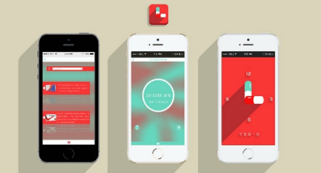
The design of applications should have this concept in a privileged place. When the management of an application is complicated or unintuitive, it is very likely that it will not end up triumphing in the market.
So, here are our tips for designing applications with a great UX. If you are immersed in the development of apps and want to get the best user experience or you have to introduce changes in the design of your application to improve it, take note of these tips that will also improve the user interface (UI).
Right from the kickoff, app development should start from a clear idea. The best way to do this is with a one-pager but whatever the process you need to have one. The whole team: design, dev, customer support, ux research etc need to be able to feed into the process. Whoever is leading the project needs to bring the original concept to the rest of the group and then let them all discuss and work through the concept. Feedback is essential. It is also essential that all team members make a contribution.

During this process, you can make sketches to visualize the flow of navigation and the way in which it can be optimized in terms of user experience. Pen and paper are fine at this stage. You can then turn your design into a mobile mockup. Get the team together again and gather some more feedback to make sure that the mockup is right. Getting your design to the stage of a prototype will save you a lot of problems in the long run as you will have ironed out many flaws with a fraction of the cost.
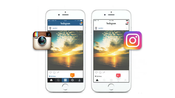
Once you have chosen the overall design of the application, it must be defended until the end. The user cannot be confused if the colors or typology are changed on each screen of the application. It is about being consistent with the aesthetics and structure throughout the development of the app. Maintaining this will be faced with a consistent app design.
The layout of the icons and the text must form a whole without including empty spaces inside. By integrating the different elements that make up the design of the application, the dispersion will be reduced and a sense of continuity will be generated. To facilitate the user’s location within the interface, the installation of breadcrumbs will be beneficial.

When choosing the color scheme for the design of the mobile app, it is best to opt for a model that does not have many colors to avoid visual saturation for the user. A maximum of three is usually fine. It can be done in conjunction with the logo or with a different range of colors, but you are always aiming to maintain the same line and consistency within the design of your app.
In addition to the amount, you also have to avoid using very strident colors and mix them together. This can be done but you really need to know what you are doing. The user’s attention would not be focused and would end up disengaging. It is always more pleasing to the eye to opt for warm colors that provoke certain sensations such as tranquility or confidence according to the criteria of the psychology of color.

Normally, 80% of users use 20% of the total application.Victor Paretto, here it is also known as the Paretto principle, first came up with the 80-20 rule and it has since been applied to a variety of situations. If the design of the application is the extension of an online portal, you can estimate what are the features that monopolize that 80% of users and dispense with those that are considered unnecessary (by the users). In the event that you launched the app already and you are reviewing the user experience, you can do the same by consulting the monitoring data on user usage. If users are using a feature, there is probably a good reason for this.
Including a brief description in text of what will happen if a certain button is clicked is very useful (essential even) for the user. If a button must have a numerical component that avoids doubts and illustrates the navigation, it will also be very beneficial for the user experience.
Another important tip in this area is to stop and think about accessibility. If the text is not clear for someone who cannot see or is otherwise impaired then you need to rethink the design.
Smartphones are usually handled with just one hand and there are certain gestures that are already completely rooted in the use of the phone. Maintaining these gestures as a way of interacting with the application is a great success when defining your design. Normally we are used to touching or sliding in a certain way on the screen. The design of your app must maintain it to facilitate its handling and, therefore, provide an excellent user experience. In addition, remember how important the thumb is in the user experience and how often that is used to do all the work.
The ideal user experience requires a good perception of the function and design of the application. To do this, in the case that errors occur, they must be able to clearly identify and not waste the user’s time in guessing what is happening. If something goes wrong then tell the user clearly what they need to do. Things will go wrong and users will make mistakes and end up in places you did not even think possible. Make sure to prepare for this event.
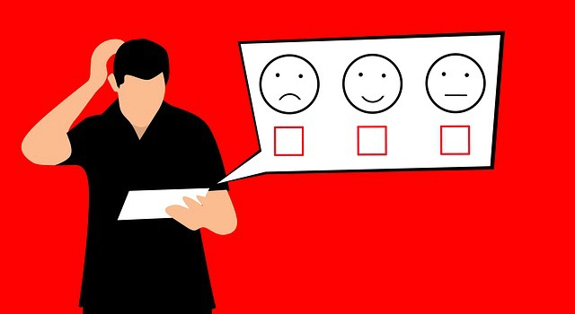
It may be the case that once the application is launched, the user experience is not as expected or has evolved and it is necessary to introduce changes (if you do not have to do this then congratulations, you are a master). Through the constant advances that occur in the field of app development and with the data that is handled, the user experience can be improved by introducing new features and incorporating more modern trends. Being such a flexible and dynamic business, the head must always be evaluating possible improvements. This means user research. While everyone is talking about UX it is surprising how many app developers do not integrate UX research into their product development.
The usability of your app is not an optional extra. Once you have the functionality ironed out, usability is the next step. That is not to say usability is not part of the process from the start but when testing you have to prioritize. Never forgot that the moment users begin to have doubts about the usability of an application, they will be gone before you know what has happened. And they won’t be back to tell you what went wrong. You need to be proactive and ask. Try implementing an exit interview for example or collect some feedback as part of the cancellation process.
When an application is intuitive, the user can interact with the app in a fast and efficient way, so their perception will be positive.
Thanks for reading and if you liked the post make sure to share it with others.
Author Bio:
Harnil Oza is a CEO of Hyperlink Infosystem, a mobile app development company based in USA & India having a team of app developers who deliver the best mobile solutions for Android and iOS platforms. He also loves blogging on the latest tech news and trends.
Image Credits : www.pixabay.com