It’s difficult to get away from UX at the moment. It’s a term that has been dominating many discussions over the last eighteen months. Every day there is another slew of articles appearing, all of which offer a new insight into UX. While I have read some excellent articles on various aspects of UX design; I am still left with a sense of confusion about what UX which is a bit odd because I always thought I had a good handle on the subject. The aim of this post is to look at that question and attempt to offer one possible answer.
UX is kind of stepping on some toes and the owners of some of those toes have decided to kick back.
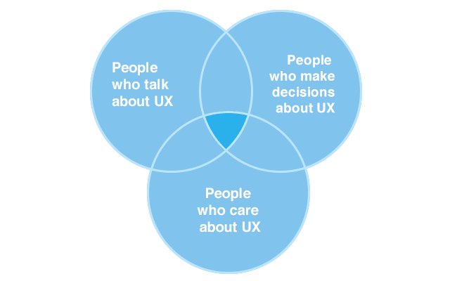
It might help at this stage if I just briefly explain what I mean by UX. For me, UX is an acronym for user experience. Simple, right? It describes all interactions between the user and a service: usually understood as a digital service but in practice it can refer to any service digital or physical.
Already, we are in trouble. It seems to me that the parameters surrounding UX, as I describe them, have two consequences.
In the first place it relates to the interaction between the user and the service. So, in many organisations, that means a money making opportunity. As a result a lot of people have jumped on the UX bandwagon as a means to increase the bottom line. Now, before I am accused of being a socialist, I would like to add that this is not a crime. However, it is an important consideration when discussing the design of a user’s journey through a particular service.
UX design is not just a means to improve profits.
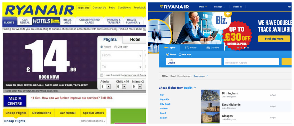
Sometimes, it can be very difficult to convince an organisation that providing a good user experience is really worth it. However, Ryanair, who are the largest and most profitable airline in Europe, totally overhauled their booking website in recent years. This was done as part of wider package of measures which were all aimed at improving the user experience on their website. Without putting to fine a point on it, Ryanair did not have the best image when it came to UX. It was eventually decided that some improvements were necessary. But, if the new UX design also had an impact on sales, that would be a happy coincidence.
In the second place, it covers all of the interactions, digital or otherwise between the user and the service. UX is kind of stepping on some toes and the owners of those toes have decided to kick back. The result is we have a plethora of designers and information architects morphing into UX professionals almost overnight.
These two factors have one rather profound result. There are a lot of people in organisations talking about UX and only a subset of these have any idea what they are talking about. Even less people have the power to make any changes that will have a real impact on the user experience.
A website costs me three dollars.
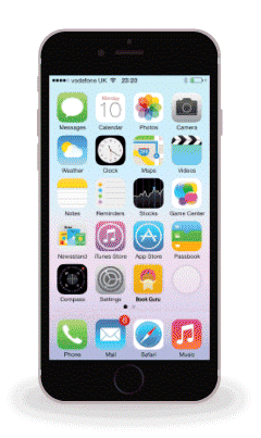
I recently read an article on UX design which reviewed the websites of some of the leading candidates for the US presidency.
The post is most interesting because it focuses on the usability of the website. How easy are they to navigate? How are the menus organised? Do they use splash pages? A bit of design thinking makes the websites more usable, right?
Donald Trump’s famous (or infamous) statement about websites is difficult to argue with. Websites are not very expensive. But, a good website. One that is designed with careful planning and research into user needs. Well, that is an entirely different story.

On each of these points the website of the leading Republican candidate Donald Trump falls down. For example, he is the only candidate who does not have an ‘En Espanyol’ button. This may reflect his general stance on immigration but it is viewed as a negative user experience anyway.
If the whole point of the website is to introduce Trump to the electorate then, to build a website that goes against his basic beliefs would amount to an attempt to dupe his audience.
Amazon are taking rather tentative steps into the world of the physical bookshop. Their prices in-store match those in the online store. The number of books being displayed is much less than in a regular bookshop because they are placed cover out rather than the more traditional spine out. So, what exactly are Amazon trying to achieve? The cynical might say that they are simply trying to drive the last few real book stores out of business. But, is something else going on?
By pushing pricing to the app, Amazon enables every offer, every recommendation and potentially every price to be personalized to each customer and timed to optimize every transaction.
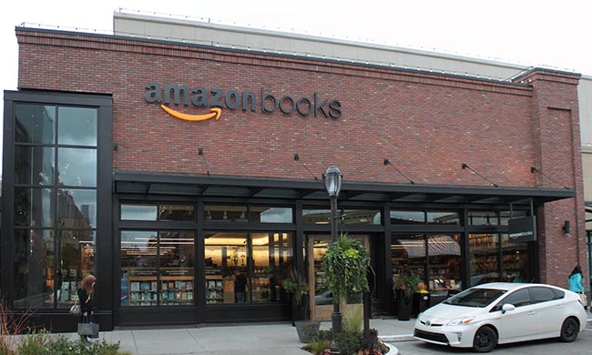
I haven’t been to the store myself but I did come across an article on it while looking at digital/ physical mergers. Rob Salkowitz provides an intriguing discussion of the potential motives behind Amazon’s decision to open this store. This is an experience that has been designed down to the last detail. It is not surprising that Amazon, one of the first and still strongest of the Digital behemoths, is leading the way in this field of design experience in a world where the physical and digital collide. They have, unlike many others, made a lot of money from combining the old world of the book and the new technologies, allowing people to make purchases without the need to leave their armchair.
Sephora is another store that now attempts to combine the digital and physical experience while retaining the best of both worlds. They have become synonymous with a positive and innovative customer experience. For example, those digital natives who are not so keen on interacting with real people but who still want to try out some real products are catered for in both the physical and digital stores. This may improve the bottom line but there is no doubt that Sephora as an organisation that wants their stores, digital and online to provide a positive user experience. When a Sephora customer walks out the door of the physical store or logs out of the online store they feel good.
I mention these stores for two specific reasons. First, they are both bridging the divide between the digital and physical space. This is something that many are trying to achieve but not so many have designed the space with the user in mind. Second, the user is at the centre of the experience that is being offered in both of these stores.
So whether you’re designing a website, a user experience in a physical store or an election campaign, the same principles apply. User experience design is important. If it’s done well it’s an addition which the user and your accountant will love.